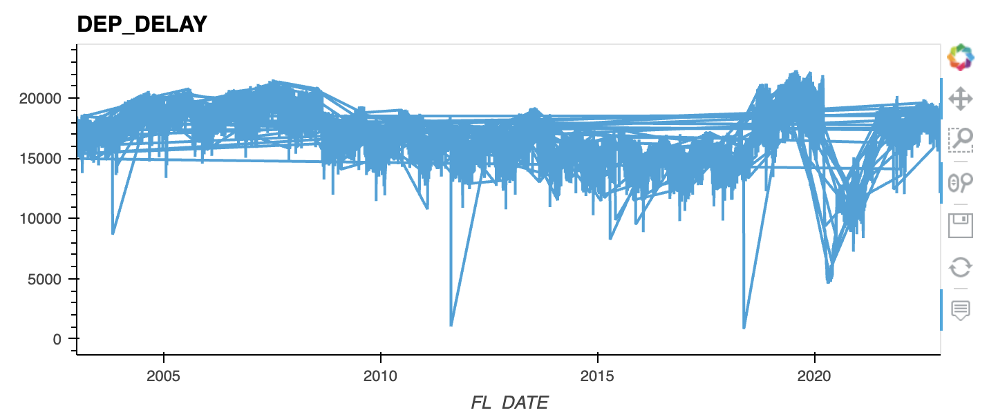
I seem to be getting some spurious lines when I plot a dask dataframe timeseries with hvplot, has anyone seen this before. My guess is that each partition is including an extra date maybe?
flights.groupby('FL_DATE')['DEP_DELAY'].count().hvplot()
flights.groupby('FL_DATE')['DEP_DELAY'].count().compute().hvplot()
`
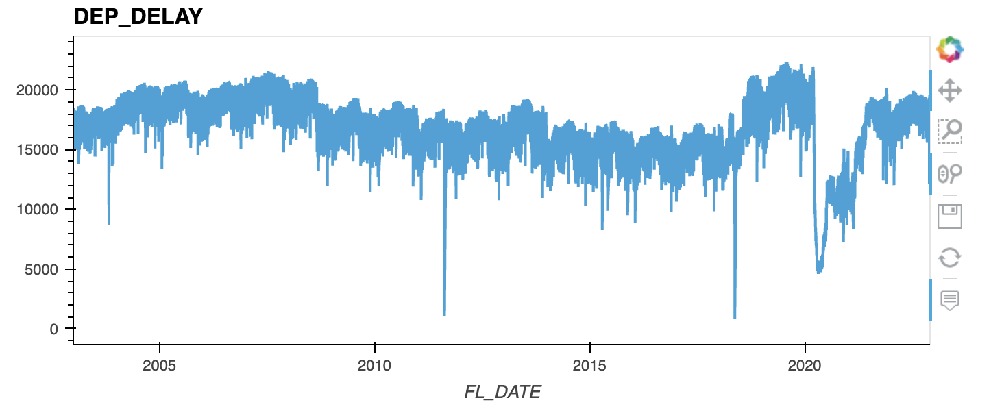
Ok looks like sorting on the date column before plotting fixes the issue. I guess that makes sense, sorting a dask dataframe is an expensive computation and doing that automatically might be problematic. Thanks to @Hoxbro for the pointer in the right direction.
solution:
flights = flights.sort_values("FL_DATE")
flights.groupby('FL_DATE')['DEP_DELAY'].count().hvplot()
2 Likes