        Quantity
day  hour
WE  0     12
    1     13
    2     14.5
    3     17
    4     22
           Quantity
day hour
WE  0     5
    1     9.5
    2     17
    3     35
    4     14
When plotting this dataframe, I would expect a graph with nested categories as per this bokeh exemple but holoviews ignore the index and just display number from 1 to 48.
Welcome to the community. Could you please provide a minimum, reproducible example to try to start from? This would make it much easier to try to help. Thanks.
Thank you @Marc,
This solution is indeed working, may I ask you if there is a possibility to achieve the same using hvplot? I tried to pass kdims to df.hvplot.bars but the keyword can’t be passed ?
I am asking because the rest of my panel app is using hvplot and so all my graph have nice hover information when using the mouse on the graph.
Thank you again for your help !!
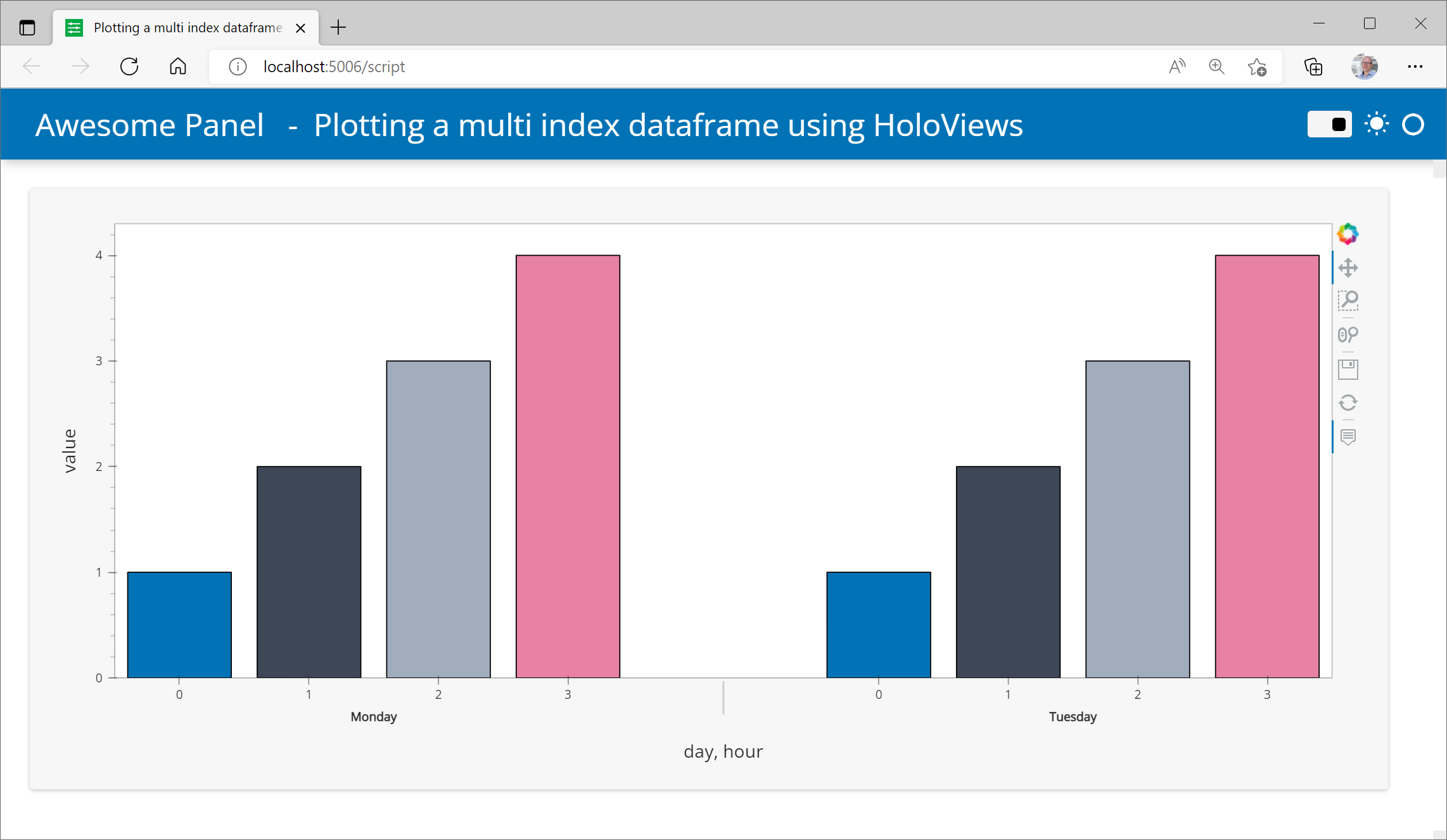
Perhaps the following, seems to be exactly much the same but with hvplot though I noted with @Marc I get hover information. I attempted to use the groupby but for whatever reason it wasn’t jigging for myself, maybe because it needed like a sum function or something but I haven’t explored further so I gave the dataframe a multi index with pandas and hvplot seems to work out the box. Hope it helps.
import hvplot
import pandas as pd
import hvplot.pandas
import panel as pn

pn.extension()

data=pd.DataFrame([
    ("Monday", 0, 1.0),
    ("Monday", 1, 2.0),
    ("Monday", 2, 3.0),
    ("Monday", 3, 4.0),
    ("Tuesday", 0, 1.0),
    ("Tuesday", 1, 2.0),
    ("Tuesday", 2, 3.0),
    ("Tuesday", 3, 4.0),
],
 columns=["day", "hour", "value"])

#setup multi index with pandas as couldn't make groupby function work but this seems to do the trick
x = data.set_index(['day', 'hour'])

plot = x.hvplot.bar()
plot.opts(height=500, cmap=["#0072B5", "#3D4756", "#A1ACBD", "#E782A5"], tools=["hover"])

pn.panel(plot).show()