mbu_stat_all_new.csv (1.3 MB)
I have problem adding/editing or data and value labels in hvplot subplot groupby
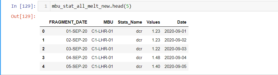
I have uploaded the sample working file csv
following are code
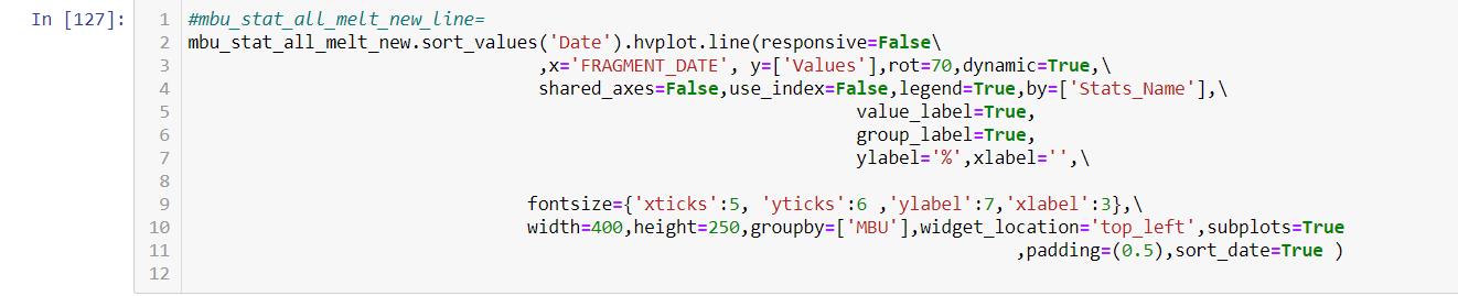
  mbu_stat_all_melt_new_line=mbu_stat_all_melt_new.sort_values('Date').hvplot.line(responsive=False\
                                 ,x='FRAGMENT_DATE', y=['Values'],rot=70,dynamic=True,\
                                 shared_axes=False,use_index=False,legend=True,by=['Stats_Name'],\
                                                               value_label=True,
                                                               group_label=True,
                                                               ylabel='%',xlabel='',\
                                                         fontsize={'xticks':5, 'yticks':6 ,'ylabel':7,'xlabel':3},\
                                width=400,height=250,groupby=['MBU'],widget_location='top_left',subplots=True
                                                                              ,padding=(0.5),sort_date=True )
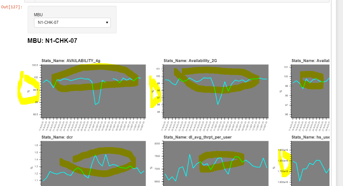
**Above Code result in following subplot output controlled by select options
i want to change /edit and access and data and value labels for each of subplots **
then i used the hvplot label
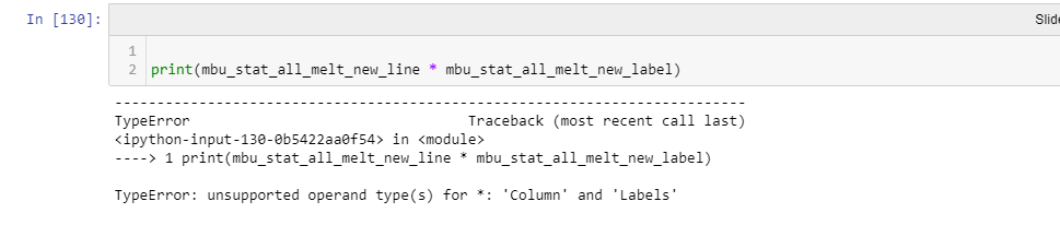
opts.defaults(opts.Curve(color='cyan',bgcolor='grey'),hv.opts.Labels(text_font='Ubuntu',text_font_size='6pt'))
mbu_stat_all_melt_new_label=mbu_stat_all_melt_new.dropna().hvplot.labels(responsive=False\
                                             ,x='FRAGMENT_DATE', y='Values',by=['Stats_Name'],\
                                             rot=70,dynamic=True,\
                                             shared_axes=False,use_index=False,legend=True,\
                                            text='Values', text_baseline='top', hover=False,\
                                             value_label=True,group_label=True,\
                                            ylabel='%',xlabel='',\
                                             fontsize={'xticks':5, 'yticks':6 ,'ylabel':7,'xlabel':3},\
                                              width=400,height=250,padding=(0.5),subplots=True)
i combine label and line with following error
i want to change /edit and access and data and value labels for each of subplots
Kindly guide
