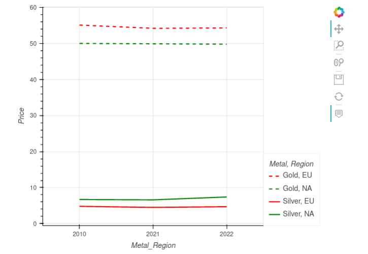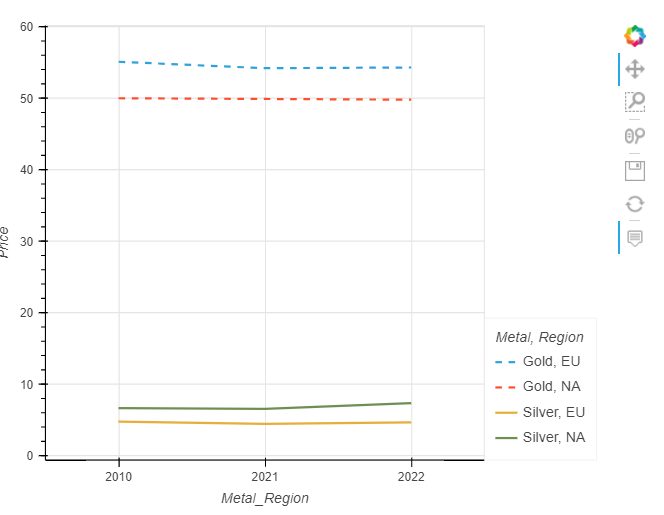
I am using the below code to create a graph (shown above) using hvplot
I am grouping the data using the values [“Metal”, “Region”]. I have four curves on the graph for “Gold_EU”, “GOLD_NA”, “Silver_EU” and “SilverNA”. The Silver curves are presented in Solid line where as the Gold ones are dashed.
I want the coloring for the graph as:
Gold_EU: Solid + Red
Gold_NA: Solid + Green
Silver_EU: Dashed + Red
Silver_NA: Dashed + Green
I am able to create the graph with solid and dashed lines, however the color-coding using cmap fails.
Any tips on how to fix this ?
import pandas as pd
import hvplot.pandas
data = [
[‘2010’, “Gold_NA”, “Gold”, “NA”, 50],
[‘2010’, “Gold_EU”, “Gold”, “EU”, 55.1],
[‘2010’, “Silver_NA”, “Silver”, “NA”, 6.7],
[‘2010’, “Silver_EU”, “Silver”, “EU”, 4.8],
[‘2021’, “Gold_NA”, “Gold”, “NA”, 49.9],
[‘2021’, “Gold_EU”, “Gold”, “EU”, 54.2],
[‘2021’, “Silver_NA”, “Silver”, “NA”, 6.6],
[‘2021’, “Silver_EU”, “Silver”, “EU”, 4.5],
[‘2022’, “Gold_NA”, “Gold”, “NA”, 49.8],
[‘2022’, “Gold_EU”, “Gold”, “EU”, 54.3],
[‘2022’, “Silver_NA”, “Silver”, “NA”, 7.4],
[‘2022’, “Silver_EU”, “Silver”, “EU”, 4.7]
]
df = pd.DataFrame(data, columns=[‘Year’, ‘Metal_Region’, “Metal”, “Region”, “Value”])
graph = df.hvplot(
x=“Year”,
y=“Value”,
grid=True,
width=600,
height=450,
ylabel=“Price”,
xlabel=“Metal_Region”,
by=[“Metal”, “Region”],
cmap=[“red”, “green”, “red”, “green”],
line_dash=[“dashed”, “dashed”, “solid”, “solid”]
)
hvplot.show(graph)