Implement a real and user friendly indicator with the consideration of automaic sizing for all the indicator's features

Hi @Marc and Panel team,
I am trying to implement the below indicator (if possible, a very similar one) with Dial in Panel.

I am using this:

import panel as pn
import pandas as pd
pn.extension()
df = pd.read_csv(“https://discourse.holoviz.org/uploads/short-url/xQriadGkvYVmP3vnRyYl7tdovxn.csv”)

custom_style_Dial = {
‘background-color’: ‘#f2f2f2’,
‘border-radius’: ‘80%’,
‘padding’: ‘2px’,
}

pn.indicators.Dial(name=‘Weight’,
bounds = (df[‘weight’].min(), df[‘weight’].max()),
value = round(df[‘weight’].mean(), 2),
format=‘{value}’,
colors = [(0.3, ‘red’), (0.7, ‘gold’), (1, ‘green’)],
max_width = 150,
align = “center”,
styles = custom_style_Dial)
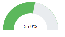
The output is here:

(1) I am really struggling to configure the size of this indicator as it does not fit a small size, I am using max_width = 150 and it messes up everything and I cannot see the background color like the sample image.
(2) Is there any way to resize/rescale the indicators automatically? such as setting to 20% size, and getting everything in the indicator (text, size, …) to 20%?
(3) and what about drawing very similar indicator as the first picture?

Any help, I really appreciate it.

1 Like

Hi @BlueBit

I’ve reported this as a bug Small Dial does not look ok · Issue #5399 · holoviz/panel (github.com).

Let me try to see if I can find a workaround.

ECharts provides a Gauge Examples - Apache ECharts

But unfortunately small sizes do not look well either

image

import panel as pn
import pandas as pd

df = pd.read_csv("https://discourse.holoviz.org/uploads/short-url/xQriadGkvYVmP3vnRyYl7tdovxn.csv")

pn.extension('echarts')
# Echarts dial: https://echarts.apache.org/examples/en/index.html#chart-type-gauge

config = option = {
  "series": [
    {
      "type": 'gauge',
      "startAngle": 180,
      "endAngle": 0,
      "min": 0,
      "max": 240,
      "splitNumber": 12,
      "itemStyle": {
        "color": '#58D9F9',
        "shadowColor": 'rgba(0,138,255,0.45)',
        "shadowBlur": 10,
        "shadowOffsetX": 2,
        "shadowOffsetY": 2
      },
      "progress": {
        "show": "true",
        "roundCap": "true",
        "width": 18
      },
      "pointer": {
        "icon": 'path://M2090.36389,615.30999 L2090.36389,615.30999 C2091.48372,615.30999 2092.40383,616.194028 2092.44859,617.312956 L2096.90698,728.755929 C2097.05155,732.369577 2094.2393,735.416212 2090.62566,735.56078 C2090.53845,735.564269 2090.45117,735.566014 2090.36389,735.566014 L2090.36389,735.566014 C2086.74736,735.566014 2083.81557,732.63423 2083.81557,729.017692 C2083.81557,728.930412 2083.81732,728.84314 2083.82081,728.755929 L2088.2792,617.312956 C2088.32396,616.194028 2089.24407,615.30999 2090.36389,615.30999 Z',
        "length": '75%',
        "width": 16,
        "offsetCenter": [0, '5%']
      },
      "axisLine": {
        "roundCap": "true",
        "lineStyle": {
          "width": 18
        }
      },
      "axisTick": {
        "splitNumber": 2,
        "lineStyle": {
          "width": 2,
          "color": '#999'
        }
      },
      "splitLine": {
        "length": 12,
        "lineStyle": {
          "width": 3,
          "color": '#999'
        }
      },
      "axisLabel": {
        "distance": 30,
        "color": '#999',
        "fontSize": 20
      },
      "title": {
        "show": False
      },
      "detail": {
        "backgroundColor": '#fff',
        "borderColor": '#999',
        "borderWidth": 2,
        "width": '60%',
        "lineHeight": 40,
        "height": 40,
        "borderRadius": 8,
        "offsetCenter": [0, '35%'],
        "rich": {
          "value": {
            "fontSize": 50,
            "fontWeight": 'bolder',
            "color": '#777'
          },
          "unit": {
            "fontSize": 20,
            "color": '#999',
            "padding": [0, 0, -20, 10]
          }
        }
      },
      "data": [
        {
          "value": 100
        }
      ]
    }
  ]
}

dial = pn.pane.ECharts(
    config,
    max_width = 150,
    align = "center",
)
dial.servable()

You might also use a css based solution like

Gauge chart with css only (codepen.io)

image

import panel as pn
import pandas as pd

df = pd.read_csv("https://discourse.holoviz.org/uploads/short-url/xQriadGkvYVmP3vnRyYl7tdovxn.csv")

pn.extension()
# Source: https://codepen.io/fsbraun/pen/XQQpgb

CSS = """
.gauge {
    position: relative;
    border-radius: 50%/100% 100% 0 0;
    background-color: var(--color, #a22);
    overflow: hidden;
}
.gauge:before{
    content: "";
    display: block;
    padding-top: 50%;   /* ratio of 2:1*/
}
.gauge .chart {
  overflow: hidden;
}
.gauge .mask {
  position: absolute;
  left: 20%;
  right: 20%;
  bottom: 0;
  top: 40%;
  background-color: #fff;
  border-radius: 50%/100% 100% 0 0;
}

.gauge .percentage {
    position:  absolute;
    top: -1px;
    left: -1px;
    bottom: 0;
    right: -1px;
    background-color: var(--background, #aaa);
    transform:rotate(var(--rotation)); 
    transform-origin: bottom center; 
    transition-duration: 600;
}
.gauge:hover {
    --rotation: 100deg;
}
.gauge .value {
    position:absolute; bottom:0%; left:0;   
    width:100%; 
    text-align: center;
}

.gauge .min {
    position:absolute; 
    bottom:0; left:5%;   
}
.gauge .max {
    position:absolute; 
    bottom:0; right:5%;   
}
"""

def html(value, width="100%", color="#5cb85c", background="#e9ecef"):
    percent = round(value/100*100,0)
    rotation=round(value/100*180,0)
    
    return f"""
<div class="gauge" style="width: {width}; --rotation:{rotation}deg; --color:{color}; --background:{background};">
    <div class="percentage"></div>
    <div class="mask"></div>
    <span class="value">{percent}%</span>
</div>
    """

pn.pane.HTML(html(value=55), stylesheets=[CSS], width=100).servable()
1 Like

Dear @Marc,
Thanks a lot for your effort and guidance here.

It seems that Panel is not mature enough to invest on it for data visualization and GUI design, as I can see there are lots of bugs and incompleteness.

Hi @BlueBit

Thanks for your feedback.

Please note that Panel builds on top of other frameworks. You could also try the Plotly Gauge. I did just not try it because it did not look as well as the ECharts one.

In the examples above the Indicator is a Bokeh Indicator. I also tried using the ECharts Gauge. So with your argument you would also claim those frameworks are not mature? They are downloaded millions of times each month and used by many, many thousands of users. But it is true that many open source frameworks are work in progress. They are built with small to no resources by a group of people that believe they should exist.

I think the question is really whether the intended use of the Indicator or Gauge is for small widths like 150px? I would have loved if they worked. But maybe there are other indicators that are really a better design for small widths?

2 Likes

Hi @Marc,
I am really a big fan of Panel Holoviz and I teach this library to Data Science apprentices in UK.
My concern here is that, if you wanna create an advanced dashboard there are lots of bugs, usually related to layout design. However, there are lots of updates as compared to release 0.X and It is a great improvement.

1 Like