Hello, I found a phenomenon that didn’t work as I expected while using hvplot.pandas.
Let me share the code and the result I got.
import datetime
import numpy as np
import hvplot.pandas  # noqa

datetimeindex = pd.date_range(start=datetime.datetime(2023, 10, 1, 0, 0, 0), end=datetime.datetime(2023, 10, 1, 1, 0, 0), freq="1S")
size = len(datetimeindex)

x1 = np.linspace(1000, 1500, num=size)
y1 = np.linspace(1200, 1600, num=size)
A = pd.DataFrame({"x": x1, "y": y1}, index=datetimeindex)

x2 = np.linspace(10, 20, num=size)
y2 = np.linspace(5, 15, num=size)
B = pd.DataFrame({"x": x2, "y": y2}, index=datetimeindex)

display(A.head(5))
display(B.head(5))

(A.hvplot.line(y=["x", "y"], ylim=(900, 1800)) + B.hvplot.line(y=["x", "y"], ylim=(0, 30))).cols(1)
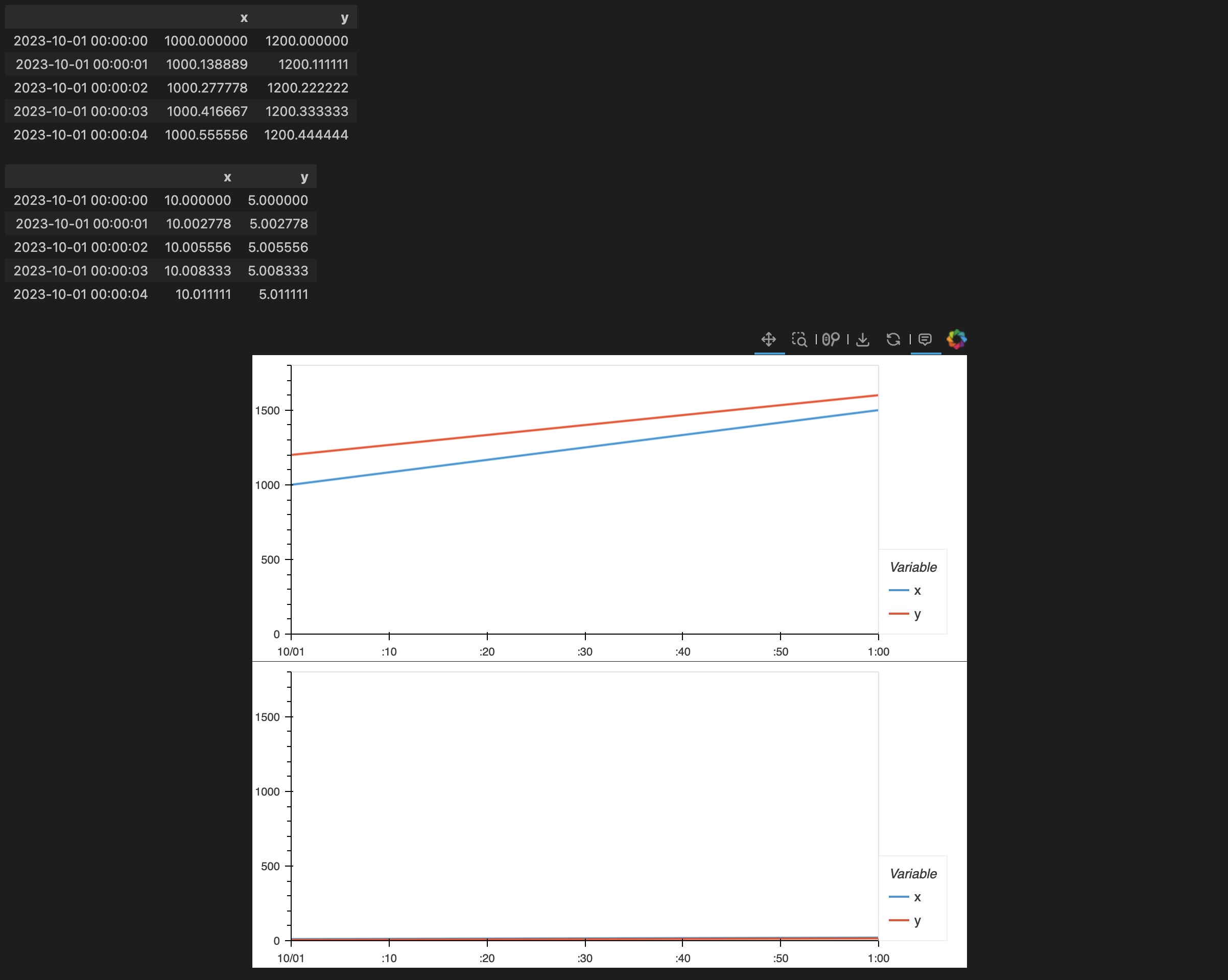
As you can see, A and B have:
- x-axis: same dimension and similar (In this example, same) distribution
- y-axis: same dimension and not similar distribution
So I implicitly assigned proper ylim options to each multi-graph, but the result’s ylim is concatenated. (from min(0, 900) to max(30, 1800))
I don’t want to concat 2 dataframe, and want to visualize 2 multi-graph at once.
How to make them share only x-axis? Thank you for any suggestions!