In the hvPlot tutorial home page, there is an example of overlaying two plots generated from dataframe.hvplot() directly. This is from the ability of HoloViews.
import hvplot.pandas # noqa
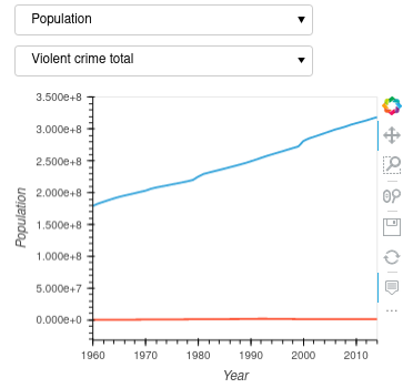
from hvplot.sample_data import us_crime as df
plot1 = df.hvplot(x='Year', y='Violent Crime rate', width=400)
plot2 = df.hvplot(x='Year', y='Burglary rate', width=400)
plot1 + plot2
However I haven’t seen any example of overlay of two plots turned from the data pipline by interactive(). Ideally, I would like to created two plots with their own individual widgets from the data pipeline and be able to overlay them with common x-axis and y-axis and eventually turn them into a dashboard app. It seems the " * " operator does not work with two interactive data pipelines.
If looked at more specifically, a dataframe.hvplot generates a type of holoviews.core.overlay object while dataframe.interactive() generates a hvplot.interactive.Interactive object.
Is it possible to overlay them with hvPlot, or should drill down to HoloViews? I guess the question is how to obtain the underlying holoviews figure object from hvplot.interactive.Interactive.