Hi @zartarr88
Welcome to the community.
Templates
The basics of the templates are very similar. But much more effort has been put into the Fast templates so far. So they much, much better support for example dark mode. I would pick the Fast templates - but I’m biased as I contributed those initially.
Awesome Panel
If you cannot get it working please describe the issue here.
Refresh the server
When you start the Panel server with panel serve name_of_notebook.ipynb --autoreload --show, the Panel server will automatically refresh when you save the notebook.
Another page
If what you want is multiple pages in your app its as simple has having multiple notebook files and then run panel serve name_of_file_1.ipynb name_of_file_2.ipynb --autoreload --show.
Panel name
Yes a name that is easier to Google would probably have been chosen if there had been more focus on search engine optimization when the project started in 2018.
HoloViz for everything
HoloViz is a data visualization framework containing hvPlot, HoloViews, Panel and more. The recommended starting point is hvPlot. Then use HoloViews if you need more advanced plotting and Panel if you want to build more advanced (and live) dashboards.
You should be able to stay in those frameworks for everything. But if you are a Matplotlib/ Seaborn user and want to add just a bit of interactivity to it, Panel is the tool to use.
Getting Started
The Getting Started Guide should be a good place to start. If it is not please help the community by describing the issues or what you need at Issues · holoviz/panel.
Matplotlib Examples
If you just want to add a bit of interactivity to Matplotlib you can learn how to combine Matplotlib with Panel via the Matplotlib Reference Guide.
A basic Matplotlib example would look like.
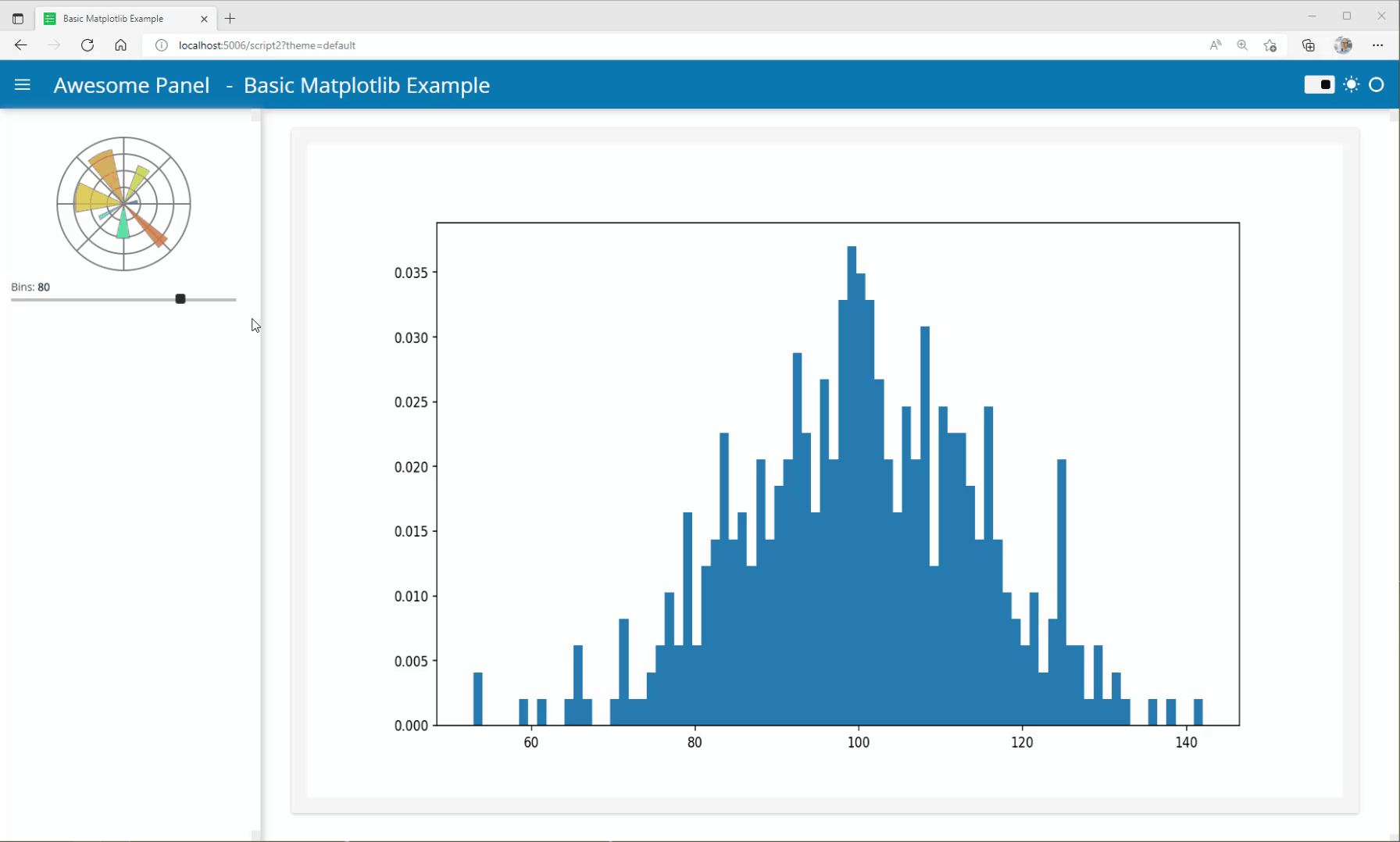
import numpy as np

from matplotlib.figure import Figure

def plot(bins=5):
        np.random.seed(19680801)
        x = 100 + 15 * np.random.randn(437)

        fig = Figure(figsize=(12, 6))
        ax = fig.subplots()
        ax.hist(x, bins, density=True)
        return fig

import panel as pn

pn.extension(sizing_mode="stretch_width", template="fast")
pn.state.template.param.update(site="Panel", title="Basic Matplotlib Example")

pn.Row(
    pn.layout.HSpacer(),
    pn.pane.PNG(
        "https://upload.wikimedia.org/wikipedia/commons/thumb/8/84/Matplotlib_icon.svg/180px-Matplotlib_icon.svg.png",
        sizing_mode="fixed",
    ),
    pn.layout.HSpacer()
).servable(target="sidebar")
bins = pn.widgets.IntSlider(value=20, start=20, end=100, step=20, name="Bins").servable(target="sidebar")
iplot = pn.bind(plot, bins=bins)

pn.panel(iplot, sizing_mode="scale_width", height=500).servable()
You can learn how to style it via the MatplotlibStyle Example.
Seaborn Examples
As seaborn is built on top of Matplotlib, you can indirectly learn how to combine Seaborn with Panel via the Matplotlib Reference Guide.
A basic Seaborn example would look like
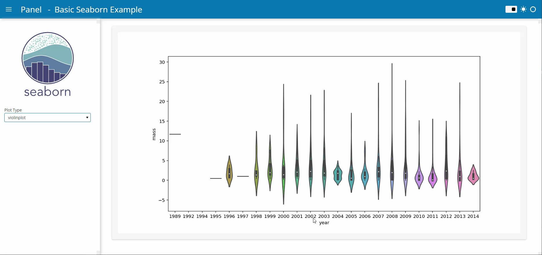
import matplotlib.pyplot as plt
import seaborn as sns
from matplotlib.figure import Figure


def plot(data, plot_type="violinplot"):
        fig = Figure(figsize=(12, 6))
        ax = fig.add_subplot(111)

        if plot_type=="violinplot":
            sns.violinplot(x = "year", y = "mass", data = data, ax=ax)
        else:
            sns.stripplot(x = "mass", y = "distance", data = data, ax=ax)
            ax.xaxis.set_major_locator(plt.MaxNLocator(10))
        return fig

import panel as pn

pn.extension(sizing_mode="stretch_width", template="fast")

pn.Row(
    pn.layout.HSpacer(),
    pn.pane.SVG(
        "https://seaborn.pydata.org/_images/logo-tall-lightbg.svg",
        sizing_mode="fixed",
        width=210,
    ),
    pn.layout.HSpacer()
).servable(target="sidebar")
plot_type = pn.widgets.Select(name="Plot Type", value="violinplot", options=["stripplot", "violinplot"]).servable(target="sidebar")

# To avoid reloading data and recalculating the plot for each user we cache the data and plot
planets = pn.state.as_cached("seaborn-planets", sns.load_dataset, name='planets')
def cached_plot(data, plot_type="violinplot"):
    if not plot_type in pn.state.cache:
        pn.state.cache[plot_type]=plot(data, plot_type)
    return pn.state.cache[plot_type]
interactive_plot = pn.bind(cached_plot, data=planets, plot_type=plot_type)

pn.panel(interactive_plot, sizing_mode="scale_width").servable()

pn.state.template.param.update(site="Panel", title="Basic Seaborn Example")
If you want to style seaborn you can get inspired by the below example
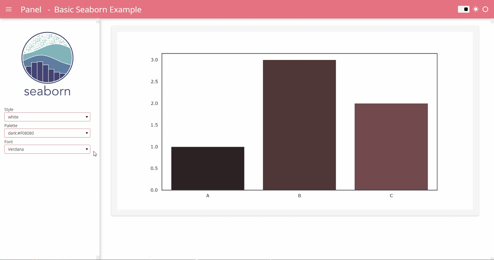
import seaborn as sns
from matplotlib.figure import Figure
import matplotlib.font_manager

NICE_ACCENT_COLORS = [
    "#00A170",  # Mint
    "#DAA520",  # Golden Rod
    "#F08080",  # Light Coral
    "#4099da",  # Summery Sky
    "#2F4F4F",  # Dark Slate Grey
    "#A01346",  # Fast
]

ACCENT = NICE_ACCENT_COLORS[2]

STYLES = [
    "dark",
    "ticks",
    "white",
    "whitegrid",
]
PALETTES = [
    "bright",
    "colorblind",
    "dark",
    "deep",
    "hls",
    "husl",
    "muted",
    "pastel",
    f"dark:{ACCENT}",
    f"light:{ACCENT}",
]
FONTS = sorted(set([f.name for f in matplotlib.font_manager.fontManager.ttflist]))

RC_DARK = {
    "axes.labelcolor": "white",
    "axes.facecolor": "black",
    "figure.facecolor": "black",
    "xtick.color": "white",
    "ytick.color": "white",
}


def plot(style="white", palette="deep", font="sans-serif", theme="default"):
    if theme == "dark":
        rc = RC_DARK
    else:
        rc = {}
    # See https://seaborn.pydata.org/generated/seaborn.set_theme.html#seaborn.set_theme
    sns.set_theme(style=style, palette=palette, font=font, rc=rc)
    fig = Figure(figsize=(12, 6))
    ax = fig.add_subplot(111)

    sns.barplot(x=["A", "B", "C"], y=[1, 3, 2], ax=ax)
    return fig


import panel as pn

pn.extension(sizing_mode="stretch_width", template="fast")


def get_theme():
    return pn.state.session_args.get("theme", [b"default"])[0].decode()


THEME = get_theme()
if THEME == "dark":
    PALETTE = f"light:{ACCENT}"
else:
    PALETTE = f"dark:{ACCENT}"

pn.Row(
    pn.layout.HSpacer(),
    pn.pane.SVG(
        "https://seaborn.pydata.org/_images/logo-tall-lightbg.svg",
        sizing_mode="fixed",
        width=210,
    ),
    pn.layout.HSpacer(),
).servable(target="sidebar")

style = pn.widgets.Select(name="Style", value="white", options=STYLES).servable(target="sidebar")
palette = pn.widgets.Select(name="Palette", value=PALETTE, options=PALETTES).servable(
    target="sidebar"
)
font = pn.widgets.Select(name="Font", value="Verdana", options=FONTS).servable(target="sidebar")

interactive_plot = pn.bind(plot, style=style, palette=palette, font=font, theme=THEME)

pn.panel(interactive_plot, sizing_mode="scale_width").servable()

pn.state.template.param.update(
    site="Panel", title="Basic Seaborn Example", header_background=ACCENT, accent_base_color=ACCENT
)
How to get more specific help
Try to describe the kind of app or dashboard you would like to make. Try describe the plotting frameworks you would like to use. That would make it easier to point to examples that are relevant for you.