Hi @sudo_reboot
Welcome to the community. That is a great question.
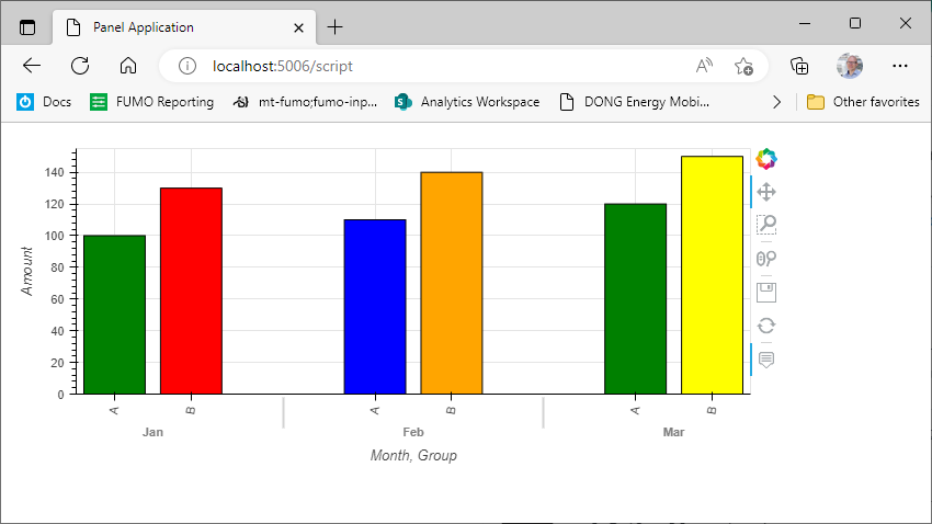
You can use the color attribute as I do below.
import pandas as pd
import hvplot.pandas

df = pd.DataFrame({
    "Month": ["Jan", "Feb", "Mar", "Jan", "Feb", "Mar"],
    "Amount": [100, 110, 120, 130, 140, 150],
    "Group": ["A", "A", "A", "B", "B", "B"],
    "Type": ["green", "blue", "green", "red", "orange", "yellow"],
})

plot = df.hvplot.bar(
    x="Month",
    y="Amount",
    by="Group",
    rot=80,
    color="Type",
    stacked=False,
    legend = True,
    grid=True,
)

import panel as pn

pn.extension()

pn.panel(plot).servable()
Documentation
Regarding navigating the documentation - we really want to improve this. But there is actually already a lot of it right at your fingertips 
For example after defining the plot you can write print(hvplot.help(plot)) to get the below help string.
That is where I found the documentation for the color attribute.
A vertical bar plot
A `bar` plot represents categorical data with rectangular bars
with heights proportional to the values that they represent. The x-axis
plots categories and the y axis represents the value scale.
The bars are of equal width which allows for instant comparison of data.
`bar` can be used on dataframes with regular Index or MultiIndex.
Reference: https://hvplot.holoviz.org/reference/pandas/bar.html
Parameters
----------
x : string, optional
Field name to draw x-positions from. If not specified, the index is used.
y : string, optional
Field name to draw y-positions from. If not specified, all numerical
fields are used.
stacked : bool, optional
If True, creates a stacked bar plot. Default is False.
color : str or array-like, optional.
The color for each of the series. Possible values are:
A single color string referred to by name, RGB or RGBA code, for instance 'red' or
'#a98d19'.
A sequence of color strings referred to by name, RGB or RGBA code, which will be used
for each series recursively. For instance ['green','yellow'] each field’s line will be
filled in green or yellow, alternatively. If there is only a single series to be
plotted, then only the first color from the color list will be used.
**kwds : optional
Additional keywords arguments are documented in `hvplot.help('bar')`.
Returns
-------
A Holoviews object. You can `print` the object to study its composition and run
.. code-block::
import holoviews as hv
hv.help(the_holoviews_object)
to learn more about its parameters and options.
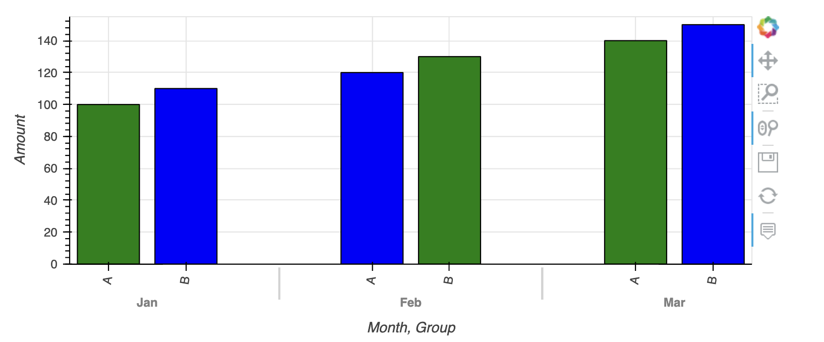
Example
-------
.. code-block::
import hvplot.pandas
import pandas as pd
df = pd.DataFrame(
{
"actual": [100, 150, 125, 140, 145, 135, 123],
"forecast": [90, 160, 125, 150, 141, 141, 120],
"numerical": [1.1, 1.9, 3.2, 3.8, 4.3, 5.0, 5.5],
"date": pd.date_range("2022-01-03", "2022-01-09"),
"string": ["Mon", "Tue", "Wed", "Thu", "Fri", "Sat", "Sun"],
},
)
bar = df.hvplot.bar(x="string", y="actual", color="#f16a6f", legend="bottom", xlabel="day", ylabel="value")
bar
You can overlay for example a line plot via
.. code-block::
forecast_line = df.hvplot.line(x="string", y="forecast", color="#1e85f7", line_width=5, legend="bottom")
forecast_markers = df.hvplot.scatter(x="string", y="forecast", color="#1e85f7", size=100, legend="bottom")
bar * forecast_line * forecast_markers
.. code-block::
df.hvplot.bar(stacked=True, rot=90, color=["#457278", "#615078"])
References
----------
- Bokeh: https://docs.bokeh.org/en/latest/docs/reference/models/glyphs/vbar.html
- HoloViews: https://holoviews.org/reference/elements/bokeh/Bars.html
- Matplotlib: https://matplotlib.org/stable/api/_as_gen/matplotlib.pyplot.bar.html
- Pandas: https://pandas.pydata.org/docs/reference/api/pandas.DataFrame.plot.bar.html
- Plotly: https://plotly.com/python/bar-charts/
- Wiki: https://en.wikipedia.org/wiki/Bar_chart
Generic options
---------------
clim: tuple
Lower and upper bound of the color scale
cnorm (default='linear'): str
Color scaling which must be one of 'linear', 'log' or 'eq_hist'
colorbar (default=False): boolean
Enables a colorbar
fontscale: number
Scales the size of all fonts by the same amount, e.g. fontscale=1.5
enlarges all fonts (title, xticks, labels etc.) by 50%
fontsize: number or dict
Set title, label and legend text to the same fontsize. Finer control
by using a dict: {'title': '15pt', 'ylabel': '5px', 'ticks': 20}
flip_xaxis/flip_yaxis: boolean
Whether to flip the axis left to right or up and down respectively
grid (default=False): boolean
Whether to show a grid
hover : boolean
Whether to show hover tooltips, default is True unless datashade is
True in which case hover is False by default
hover_cols (default=[]): list or str
Additional columns to add to the hover tool or 'all' which will
includes all columns (including indexes if use_index is True).
invert (default=False): boolean
Swaps x- and y-axis
frame_width/frame_height: int
The width and height of the data area of the plot
legend (default=True): boolean or str
Whether to show a legend, or a legend position
('top', 'bottom', 'left', 'right')
logx/logy (default=False): boolean
Enables logarithmic x- and y-axis respectively
logz (default=False): boolean
Enables logarithmic colormapping
loglog (default=False): boolean
Enables logarithmic x- and y-axis
max_width/max_height: int
The maximum width and height of the plot for responsive modes
min_width/min_height: int
The minimum width and height of the plot for responsive modes
padding: number or tuple
Fraction by which to increase auto-ranged extents to make
datapoints more visible around borders. Supports tuples to
specify different amount of padding for x- and y-axis and
tuples of tuples to specify different amounts of padding for
upper and lower bounds.
rescale_discrete_levels (default=True): boolean
If `cnorm='eq_hist'` and there are only a few discrete values,
then `rescale_discrete_levels=True` (the default) decreases
the lower limit of the autoranged span so that the values are
rendering towards the (more visible) top of the `cmap` range,
thus avoiding washout of the lower values. Has no effect if
`cnorm!=`eq_hist`.
responsive: boolean
Whether the plot should responsively resize depending on the
size of the browser. Responsive mode will only work if at
least one dimension of the plot is left undefined, e.g. when
width and height or width and aspect are set the plot is set
to a fixed size, ignoring any responsive option.
rot: number
Rotates the axis ticks along the x-axis by the specified
number of degrees.
shared_axes (default=True): boolean
Whether to link axes between plots
transforms (default={}): dict
A dictionary of HoloViews dim transforms to apply before plotting
title (default=''): str
Title for the plot
tools (default=[]): list
List of tool instances or strings (e.g. ['tap', 'box_select'])
xaxis/yaxis: str or None
Whether to show the x/y-axis and whether to place it at the
'top'/'bottom' and 'left'/'right' respectively.
xformatter/yformatter (default=None): str or TickFormatter
Formatter for the x-axis and y-axis (accepts printf formatter,
e.g. '%.3f', and bokeh TickFormatter)
xlabel/ylabel/clabel (default=None): str
Axis labels for the x-axis, y-axis, and colorbar
xlim/ylim (default=None): tuple or list
Plot limits of the x- and y-axis
xticks/yticks (default=None): int or list
Ticks along x- and y-axis specified as an integer, list of
ticks positions, or list of tuples of the tick positions and labels
width (default=700)/height (default=300): int
The width and height of the plot in pixels
attr_labels (default=None): bool
Whether to use an xarray object's attributes as labels, defaults to
None to allow best effort without throwing a warning. Set to True
to see warning if the attrs can't be found, set to False to disable
the behavior.
sort_date (default=True): bool
Whether to sort the x-axis by date before plotting
symmetric (default=None): bool
Whether the data are symmetric around zero. If left unset, the data
will be checked for symmetry as long as the size is less than
``check_symmetric_max``.
check_symmetric_max (default=1000000):
Size above which to stop checking for symmetry by default on the data.
Datashader options
------------------
aggregator (default=None):
Aggregator to use when applying rasterize or datashade operation
(valid options include 'mean', 'count', 'min', 'max' and more, and
datashader reduction objects)
dynamic (default=True):
Whether to return a dynamic plot which sends updates on widget and
zoom/pan events or whether all the data should be embedded
(warning: for large groupby operations embedded data can become
very large if dynamic=False)
datashade (default=False):
Whether to apply rasterization and shading (colormapping) using
the Datashader library, returning an RGB object instead of
individual points
dynspread (default=False):
For plots generated with datashade=True or rasterize=True,
automatically increase the point size when the data is sparse
so that individual points become more visible
rasterize (default=False):
Whether to apply rasterization using the Datashader library,
returning an aggregated Image (to be colormapped by the
plotting backend) instead of individual points
x_sampling/y_sampling (default=None):
Specifies the smallest allowed sampling interval along the x/y axis.
Geographic options
------------------
coastline (default=False):
Whether to display a coastline on top of the plot, setting
coastline='10m'/'50m'/'110m' specifies a specific scale.
crs (default=None):
Coordinate reference system of the data specified as Cartopy
CRS object, proj.4 string or EPSG code.
features (default=None): dict or list
A list of features or a dictionary of features and the scale
at which to render it. Available features include 'borders',
'coastline', 'lakes', 'land', 'ocean', 'rivers' and 'states'.
Available scales include '10m'/'50m'/'110m'.
geo (default=False):
Whether the plot should be treated as geographic (and assume
PlateCarree, i.e. lat/lon coordinates).
global_extent (default=False):
Whether to expand the plot extent to span the whole globe.
project (default=False):
Whether to project the data before plotting (adds initial
overhead but avoids projecting data when plot is dynamically
updated).
tiles (default=False):
Whether to overlay the plot on a tile source. Tiles sources
can be selected by name or a tiles object or class can be passed,
the default is 'Wikipedia'.
Style options
-------------
alpha
bar_width
cmap
color
fill_alpha
fill_color
hover_alpha
hover_color
hover_fill_alpha
hover_fill_color
hover_line_alpha
hover_line_color
line_alpha
line_cap
line_color
line_dash
line_join
line_width
muted
muted_alpha
muted_color
muted_fill_alpha
muted_fill_color
muted_line_alpha
muted_line_color
nonselection_alpha
nonselection_color
nonselection_fill_alpha
nonselection_fill_color
nonselection_line_alpha
nonselection_line_color
selection_alpha
selection_color
selection_fill_alpha
selection_fill_color
selection_line_alpha
selection_line_color
visible
None