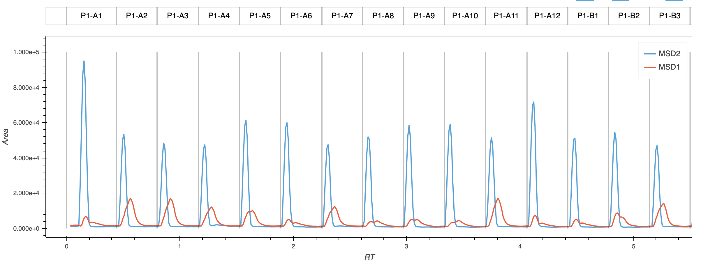
I am making an interactive plotting function that takes XY data and plots it with names of the sample above the data. I am plotting grey vertical lines to separate the samples (though I have picked an arbitrary height of those lines. It’d be nice to make them infinite). I have achieved this by making two plots that are stacked on top of one another. The top plot has the names, and the bottom plot has the actual data. They drag together so the label is always over it’s respective sample.
Ideally, I’d like these plots to be stacked immediately over one another rather than having the gap between them. I see that through the matplotlib backend, this might be remedied by using ‘vspace,’ but have not been able to determine if I can do the same with a bokeh backend.
I believe the solution will be within the last few lines of this function, where I actually compose the overlaid plot:
def _get_chromatograms(self, directory):
    '''This function finds any .csv chromatogram signals that you
    have manually exported. Export utf code is 44 on Agilent Chemstation.
    '''

    csvs = glob.glob(directory + '/*.CSV')

    signals = []
    for i, sig in enumerate(csvs):
        signal = pd.read_csv(sig, encoding = 'utf_16', header = None)
        signal = signal.rename({0:'RT', 1:'Area'}, axis = 1)
        name = sig.rsplit('/',1)[1][:-4]
        signals.append([name, signal])

    # Generate all of the curves data
    curves=[]
    for sig in enumerate(signals):
        curve = hv.Curve(
            sig[1][1],
            'RT',
            'Area',
            label=sig[1][0]
        ).opts(
            height=400,
            width=1200,
            xlim=(0, 5),
            ylim=(-10, 100000),
            tools=['hover'],
            show_legend=True,
        )

        curves.append(curve)

    # Generate the labels that will float above the curves
    # Get all of the data from the excel sheet on where each sample starts and stops
    label_data = self.fiaseriesinfo
    label_data = label_data.rename({0:'RT', 'RT':'Start_RT'}, axis=1)
    label_data['Stop_RT'] = [ label_data['Start_RT'][i+1] if i<len(label_data)-1 else np.nan for i, row in label_data.iterrows()]
    label_data['RT'] = (label_data['Start_RT'] + label_data['Stop_RT'])/2

    # Making an arbitrary plotting y value for the label
    label_data.loc[:,'Alignment'] = 7.5


    labels = hv.Labels(
        label_data,
        kdims=['RT','Alignment'],
        vdims='Sample'
    ).opts(
        text_font_size='10pt',
        height=50,
        width=1200,
        xlim=(0, 5),
        ylim=(5, 10),
        xaxis=None,
        yaxis=None,
    )

    # Generate the spikes that will be used to denote separation of samples
    spikes = hv.Spikes(
        self.fiaseriesinfo['RT']
    ).opts(
        height=400,
        width=1200,
        spike_length=100000,
        line_alpha=0.25,
        line_width=2,
    )

    # Generate the plots of the different signals
    plot = curves[0]
    for curve in curves[1:]:
        plot *= curve

    final_plot = (labels * spikes + plot * spikes).cols(1)

    return final_plot