Having a tough time moving my functional dashboard over into a version that can handle the hundreds of thousands of datapoints I’d like to be able to handle using datashader. As a minimum reproducible example I’m just focusing on the point plot that is the main component of my dashboard. These are roughly my requirements:
- Selection streaming
- show selected points as colored, nonselected points as grey (ideally with an adjustable alpha but I’ll accept if that’s not possible)
- Use of a widget to control which column is used to color the point plot. Some of these are categorical, and some are numerical, which creates some issues due to a bug, so I am using pn.bind as a workaround (DynamicMap Issue: AttributeError: unexpected attribute 'factors' to LinearColorMapper · Issue #5591 · holoviz/holoviews · GitHub)
- legend/colorbar
Been having a lot of trouble getting something working but now I have this:
import numpy as np
import pandas as pd
import hvplot.pandas
import holoviews as hv
from holoviews.operation.datashader import datashade, dynspread
from holoviews import opts
import panel as pn
import datashader as ds
from colorcet import palette
from holoviews.streams import Selection1D

# Create a sample dataset
np.random.seed(42)
data = pd.DataFrame({
    'x': np.random.randn(10000),
    'y': np.random.randn(10000),
    'color': np.random.choice(['A', 'B', 'C', 'D'], size=10000)
})

# Define the points function
def points(dataset, colorby=None):
    return dataset.data.hvplot(kind='points',x='x', y='y', legend=False, tools=['box_select'])

# Create widgets
color_by_widget = pn.widgets.Select(name='Color by', options=['color'], value='color')
cmap_widget = pn.widgets.Select(name='Colormap', options=['kbc', 'fire', 'bgy', 'bgyw', 'bmy', 'gray', 'rainbow4'], value='kbc')

# Create the initial static_points plot
static_points = hv.Dataset(data).apply(points, colorby=color_by_widget)

# Create Selection1D stream
index_stream = Selection1D(source=static_points)

# Create a filtered dataset (use your own filter criteria)
def filter_ds(dataset, x):
    df = dataset.data
    df = df.loc[df['x'] > x]
    return hv.Dataset(df)
filtered_data = hv.Dataset(data).apply(filter_ds, x=0)

# Define the points_bind function
def points_bind(data, static_points, color_by_column, cmap):
    static_points = static_points.opts(opts.Points(color='gray', size=5))

    cmap_dict = {cat: color for cat, color in zip(data[color_by_column].unique(), palette[cmap])}

    dynamic_points = data.hvplot.points(x='x', y='y', c=color_by_column, cmap=cmap_dict, colorbar=True, legend=False, size=5)

    shaded_static = datashade(static_points, aggregator=ds.reductions.any(), cmap=['gray'])
    shaded_dynamic = datashade(dynamic_points, aggregator=ds.reductions.count_cat(color_by_column), color_key=cmap_dict)

    return shaded_static * shaded_dynamic

# Create the interactive plot
interactive_plot = pn.bind(points_bind, filtered_data.data, static_points, color_by_widget, cmap_widget)

# Create the dashboard
dashboard = pn.Column(
    pn.Row(color_by_widget, cmap_widget),
    interactive_plot,
    index_stream.param
)

dashboard.servable()
Which is as far as I’ve been able to get without completely losing my mind. This is what the result looks like:
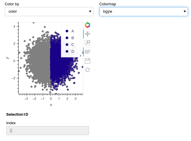
It’s a bit buggy but the biggest issues right now is that everything is just being given the same color, and I don’t know how to stream from this. The way I was streaming before was by using static_points for selection streaming and then combining that with dynamic points within the bind function, but I had to switch away from that approach to get the datashade coloring to work. I’d like to return to using the points function applied to a hv.dataset within the pn.bind function if that’s possible. Any advice would be greatly appreciated!