Jitter for y-axis

Hello,

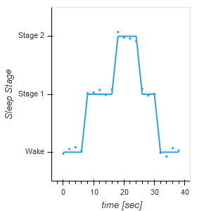
I am trying to overlay a scatter plot onto a curve. The y-axis of my data is categorical and my x-axis is time. I want to jitter my scatter plot in the y-axis but it does not seem to let me. I tried inverting my axes for the scatter plot, and when I plot the scatter plot by itself it looks the way I want it, but once I try to overlay the curve plot, things get weird with the axes. Bellow is an example of the data I am working with. If you have any advice or suggestions I would much appreciate it. Thank you!

import pandas as pd
import hvplot.pandas
import holoviews as hv
import panel as pn
hv.extension('bokeh')

df = pd.DataFrame(columns=['time [sec]','Sleep Stage'],index=range(0,20))
df['time [sec]']  = 2*df.index
df['Sleep Stage'] = ['Wake','Wake','Wake','Wake','Stage 1','Stage 1','Stage 1','Stage 1','Stage 1','Stage 2','Stage 2','Stage 2','Stage 2','Stage 1','Stage 1','Stage 1','Wake','Wake','Wake','Wake']
scatter  = hv.Scatter(df,vdims=['time [sec]'],kdims=['Sleep Stage']).opts(jitter=0.2,invert_axes=True)
curve = hv.Curve(df,'time [sec]','Sleep Stage')

scatter*curve

One of the reasons I really do not like categorical axes…
You can use numerical axes and specify the axis tick labels instead.
My HoloviewsPlayground on github is getting a bit outdated, but here is an example from StatisticalPlots.ipynb:

import seaborn as sns
iris            = sns.load_dataset("iris")
iris['species'] = iris['species'].astype('category')

def strip_plot(df,x,y,jitter=.2):
    ticks = [(i,v) for i,v in enumerate(df[x].cat.categories)]
    return hv.Points((np.array([df[x].cat.codes, df[y], df[x].cat.codes.astype(float)]).T), kdims=[x,y],vdims=['color'])\
             .opts(xticks=ticks, color_index=x)

strip_plot( iris, 'species', 'sepal_length')\
.opts( hv.opts.Points(width=500, jitter=.4, tools=['hover'], size=5, color=hv.Cycle(['green','blue','red'])))\
.redim.range(species=(-.5,2.5),sepal_length=(4,8.5))

Something weird about colors though. If anybody sees the problem, I’d love to know!

Hi, maybe I don’t understand what you want to do, but if you specify the same kdims and vdim for both your curve and your scatter you should be able to make the overlay.

import pandas as pd
import hvplot.pandas
import holoviews as hv
import panel as pn
hv.extension('bokeh')

df = pd.DataFrame(columns=['time [sec]','Sleep Stage'],index=range(0,20))
df['time [sec]']  = 2*df.index
df['Sleep Stage'] = ['Wake','Wake','Wake','Wake','Stage 1','Stage 1','Stage 1','Stage 1','Stage 1','Stage 2','Stage 2','Stage 2','Stage 2','Stage 1','Stage 1','Stage 1','Wake','Wake','Wake','Wake']
scatter  = hv.Scatter(df,vdims=['time [sec]'],kdims=['Sleep Stage']).opts(jitter=0.2,invert_axes=True)
curve = hv.Curve(df,vdims=['time [sec]'],kdims=['Sleep Stage'])

scatter*curve

bokeh_plot-1

Thank you! That worked.