Legend entry for rasterized curve

When plotting several hv.Curves using the bokeh backend, when clicking on a legend entry, the corresponding curve gets muted, i.e., its alpha is set to 0.5, so it becomes semi-transpared and, thus, it loses highlight when compared to the unmuted ones.

I’ve followed the tutorial in the “Working with time series” section of holoviews’ user guide on Working with large data and applied holoviews.operation.datashader.rasterize on a hv.Curve, but I’m unable to get the same legend behavior as described above for regular hv.Curves. In fact, I can’t even get holoviews to show an entry for the rasterized curve in the legend.

I think I’ve read in some github issue (can’t find the ref now…) that this is somehow related to the fact that rasterize returns some sort of Image object (maybe gv.Image?).

So, the question would be, how does one go about showing a legend entry for a rasterized curve?

1 Like

Wondering if I’m seeing the same issue, as the following code doesn’t produce a legend and I don’t understand why:

import holoviews as hv
import datashader as ds
from holoviews.operation.datashader import datashade
import panel as pn
import numpy as np
import pandas as pd

hv.extension('bokeh')

# Alternative random dataframe creation
df = pd.DataFrame(np.random.randint(0, 100, size=(50000, 2)), columns=['YZF12500', 'YZF12525'])

# Create curves for each parameter
c = hv.Curve((df.index, df['YZF12500']), kdims=['Time'], vdims=['Value'])
c2 = hv.Curve((df.index, df['YZF12525']), kdims=['Time'], vdims=['Value'])

line_overlay = hv.NdOverlay({'YZF12500': c, 'YZF12525': c2}, kdims='k')
pn.serve(datashade(line_overlay, pixel_ratio=2, line_width=4, aggregator=ds.by('k', ds.count())).opts(width=800))

Hi, I’m having the same issue as you! have you found any solution to add the legend back?

Since my last comment above, I learned that applying datashade/rasterize does not currently allow automatic creation of legends. On the following page,

https://holoviews.org/user_guide/Large_Data.html

search for text “legend” and you’ll find the statement:

" Note that Bokeh only ever sees an image come out of datashade, not any of the actual data. As a result, providing legends and keys has to be done separately, though we are hoping to make this process more seamless. For now, you can show a legend by adding a suitable collection of “fake” labeled points (size zero and thus invisible):"

… followed by an example workaround.

Ok, this, indeed, offers a way to show the legend. However, the behavior I was looking for was, actually, the ability to toggle visibility of individual traces. Sorry if my initial message hasn’t clearly conveyed this. Perhaps the final question should read something like “[…] go about using the legend to select which curves to show/hide” instead of my original formulation. However, I hope the answer above has helped answer the other questions.

Thanks for replying so fast, I was thinking about doing what you suggest, and it worked fine. I was just wondering if there is an easier way to do it.

Thanks again!

Hi @bbudescu,

I think what your looking for is half implemented or maybe more than half but is not all the way there just yet by the looks of it. Some code to demo, if it is all the way I’m not sure myself how to do but I’ve not really checked in on it in a while. I guess only other way might be to create manual legend, if possible monitor the selection of legend (I was looking at bokeh to see if possible, seen hints it maybe but hadn’t found anything concrete this evening) and trigger an appropriate re-plot from a callback.

The implementation I’m aware of is something like this I’ve come across and piece mealed together, it does allow me to click on the legend and hide the curves (edit: I’ve used hvplot, not sure if line, curve) however my take on the legend currently is it’s not very intuitive or visually fitting at this time in my opinion but kinda loosely works and may be enough

import pandas as pd
import numpy as np
import holoviews as hv
from holoviews.util.transform import dim
from holoviews.selection import link_selections
from holoviews import opts
from holoviews.operation.datashader import shade, rasterize
import hvplot.pandas
hv.extension('bokeh', width=100)

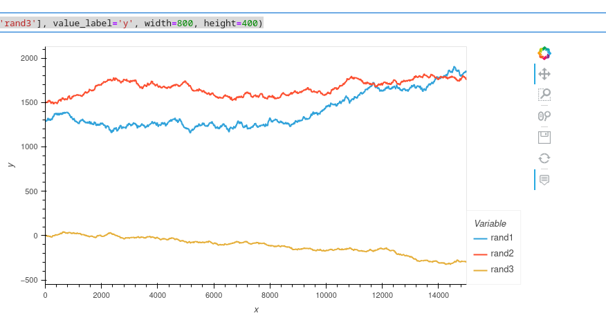
## create random walks (one location) ##
data_df = pd.DataFrame()
npoints=15000
np.random.seed(71)
x = np.arange(npoints)
y1 = 1300+2.5*np.random.randn(npoints).cumsum()
y2 = 1500+2*np.random.randn(npoints).cumsum()
y3 = 3+np.random.randn(npoints).cumsum()
data_df.loc[:,'x'] = x
data_df.loc[:,'rand1'] = y1
data_df.loc[:,'rand2'] = y2
data_df.loc[:,'rand3'] = y3
data_df.hvplot(x='x', y=['rand1', 'rand2', 'rand3'], value_label='y', width=800, height=400)

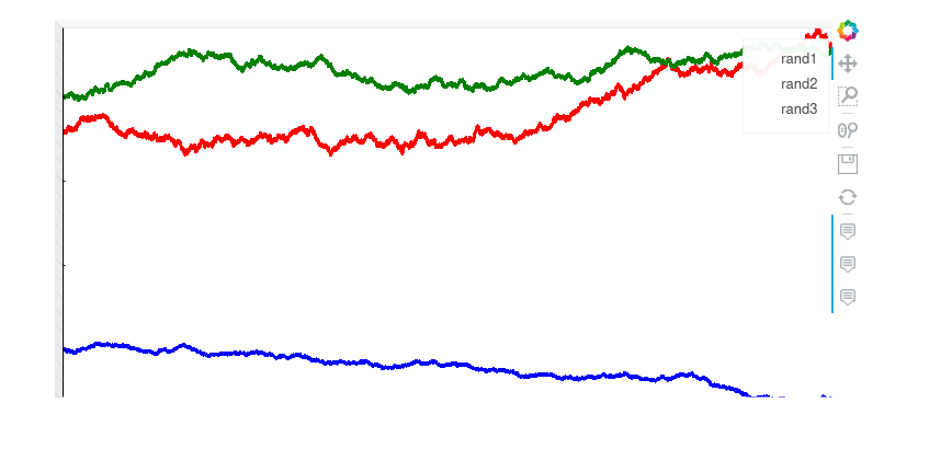
df = data_df.drop(['x'],1)
red = df['rand1'].hvplot(value_label='y', 
               width=800, 
               height=400,
              rasterize=True,
              cmap=['red'],
              colorbar=False)
green = df['rand2'].hvplot(value_label='y', 
               width=800, 
               height=400,
              rasterize=True,
              cmap=['green'],
              colorbar=False)
blue = df['rand3'].hvplot(value_label='y', 
               width=800, 
               height=400,
              rasterize=True,
              cmap=['blue'],
              colorbar=False)
layout = red * green * blue
layout

Hi @CrashLandonB,

The answer I believe lies in the link @bbudescu posted in original question. My simple understanding is by using rasterize inbuilt to hvplot/holoviews information is exposed to bokeh that then takes care shading aspect and legend aspects to some extent. By using datashader (which is rasterize + shade from what I take) you bypass some of the plotting features offered by bokeh. So by using datashader specifically you won’t get some of the features you’ll gain by using rasterize, I think it mentions to make use of rasterize where possible.

Hope of some help, thanks Carl.

1 Like