Linked plot is exceedingly slow

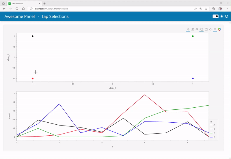
Hi there. I’m trying a linked plot to do a scatter + line plot of a time-series embedding, in order to see if the embedding makes sense (i.e. close points in the embedded space should be similar in the time domain).
Anyway, the plot is extremely slow when I select a point, so I was wondering what I did wrong. I have a toy example that is exactly the same as my plotting code except for the fact that I have 60 time series, not 4, and each has 100 time steps, not 10.

import pandas as pd
from holoviews.selection import link_selections
import holoviews.pandas

embedded_df = pd.DataFrame([("A", -1, 1), ("B", -1, -1), ("C", 1, 1), ("D", 1, -1)], columns = ["id","dim_0", "dim_1"])
timeseries_df = pd.DataFrame(
    {
        "t": [ 0, 1, 2, 3, 4, 5, 6, 7, 8, 9, 0, 1, 2, 3, 4, 5, 6, 7, 8, 9, 0, 1, 2, 3, 4, 5, 6, 7, 8, 9, 0, 1, 2, 3, 4, 5, 6, 7, 8, 9 ],
        "id": [ "A", "A", "A", "A", "A", "A", "A", "A", "A", "A", "B", "B", "B", "B", "B", "B", "B", "B", "B", "B", "C", "C", "C", "C", "C", "C", "C", "C", "C", "C", "D", "D", "D", "D", "D", "D", "D", "D", "D", "D", ],
        "value": [ 0.0, 0.3882388238823883, 0.269126912691269, 0.2187218721872186, 0.11356135613561347, 0.43069306930693074, 0.06075607560756059, 0.09525952595259543, 0.3496849684968495, 0.004050405040504059, 0.0, 0.010850694444444442, 0.05164930555555558, 0.17838541666666669, 0.09592013888888887, 0.5494791666666664, 0.9713541666666666, 0.5716145833333334, 0.5776909722222223, 0.0, 0.0, 0.19696969696969696, 0.0, 0.0, 0.0, 0.030303030303030276, 0.43181818181818166, 0.6136363636363633, 0.6515151515151514, 0.7268502872592094, 0.04166666666666667, 0.3044541737723557, 0.7619348244348243, 0.0962301587301587, 0.21771284271284302, 0.030513468013467965, 0.3541666666666663, 0.34328403078403086, 0.30949374699374693, 0.09686147186147182, ], 
    }
)
scatter_plot = embedded_df.hvplot.scatter(x="dim_0", y="dim_1", tools=['hover', 'tap'])
line_plot = timeseries_df.hvplot(x="t", y="value", by="id")
link_selections(scatter_plot+line_plot, index_cols=['id'])

Even in this toy example, selecting 1 point is noticeable (1-2 sec), when using all data in my case it takes 10 seconds I’d say. I don’t really need to see every line plot also, it would be perfect if I only saw the ones whose scatter points have been selected.

I now have this, and I use the pivot version of the above dataframe (so it would be 4 columns and 10 rows).

scatter_plot = embedded_df.hvplot.scatter(x="dim_0", y="dim_1", tools=['hover', 'tap', 'lasso_select'])
selection = hv.streams.Selection1D(source=scatter_plot)

def selection_ts(index):
    index_ = index if index else np.arange(len(timeseries_df.columns))
    # np.arange(len(timeseries_df.columns))
    
    return timeseries_df.iloc[:, index_].hvplot(color='black', alpha=.9/np.sqrt(max(1, len(index_))))

selected_points = hv.DynamicMap(selection_ts, streams=[selection])
layout = (scatter_plot+ selected_points).cols(1)
layout

Which is faster, but it’s bugged. It plots every timeseries when no point is selected (ok), but when you pick a single point it plots NOTHING. If you pick 2 or more points, it plots them, but it doesn’t stop plotting the “default” plot with all timeseries at the same time it plots the selected ones… In other words selection does nothing. I have tried different versions and nothing…

Hi @aberges-grd

I would do it something like the below

tap-selections

import hvplot.pandas
import numpy as np
import pandas as pd
import panel as pn

import holoviews as hv

pn.extension(sizing_mode="stretch_width", template="fast")
pn.state.template.param.update(site="Awesome Panel", title="Tap Selections")

CMAP = {
    "A": "black", "B": "red", "C": "green", "D": "blue"
}

embedded_df = pd.DataFrame([("A", -1, 1), ("B", -1, -1), ("C", 1, 1), ("D", 1, -1)], columns = ["id","dim_0", "dim_1"])
embedded_df["color"]=embedded_df["id"].map(CMAP)
timeseries_df = pd.DataFrame(
    {
        "t": [ 0, 1, 2, 3, 4, 5, 6, 7, 8, 9, 0, 1, 2, 3, 4, 5, 6, 7, 8, 9, 0, 1, 2, 3, 4, 5, 6, 7, 8, 9, 0, 1, 2, 3, 4, 5, 6, 7, 8, 9 ],
        "id": [ "A", "A", "A", "A", "A", "A", "A", "A", "A", "A", "B", "B", "B", "B", "B", "B", "B", "B", "B", "B", "C", "C", "C", "C", "C", "C", "C", "C", "C", "C", "D", "D", "D", "D", "D", "D", "D", "D", "D", "D", ],
        "value": [ 0.0, 0.3882388238823883, 0.269126912691269, 0.2187218721872186, 0.11356135613561347, 0.43069306930693074, 0.06075607560756059, 0.09525952595259543, 0.3496849684968495, 0.004050405040504059, 0.0, 0.010850694444444442, 0.05164930555555558, 0.17838541666666669, 0.09592013888888887, 0.5494791666666664, 0.9713541666666666, 0.5716145833333334, 0.5776909722222223, 0.0, 0.0, 0.19696969696969696, 0.0, 0.0, 0.0, 0.030303030303030276, 0.43181818181818166, 0.6136363636363633, 0.6515151515151514, 0.7268502872592094, 0.04166666666666667, 0.3044541737723557, 0.7619348244348243, 0.0962301587301587, 0.21771284271284302, 0.030513468013467965, 0.3541666666666663, 0.34328403078403086, 0.30949374699374693, 0.09686147186147182, ], 
    }
)
timeseries_df["color"]=timeseries_df["id"].map(CMAP)

scatter_plot = embedded_df.hvplot.scatter(x="dim_0", y="dim_1", c="color", tools=['hover', 'tap'], responsive=True, height=400, size=10).opts(size=10)
selection = hv.streams.Selection1D(source=scatter_plot)

def selection_ts(index):
    df = timeseries_df.copy()
    
    if index:
        selected_ids = embedded_df[embedded_df.index.isin(index)]["id"].unique()
        df = df[df["id"].isin(selected_ids)]
    return df.hvplot(x="t", y="value", by="id", c="color", responsive=True, height=400, size=10)

selected_points = hv.DynamicMap(selection_ts, streams=[selection])
layout = (scatter_plot+ selected_points).cols(1)

pn.pane.HoloViews(layout, sizing_mode="stretch_both").servable()

run it with

panel serve script.py --autoreload --show
1 Like

Well it doesn’t seem to work for my complete dataset… any way to debug? In my (short) experience, holoviews fails silently and your only feedback is the plot not appearing.

Hi @aberges-grd

Would it be possible for you to provide a reproducible example?

Would it be possible to share s screenshot of the non-appearing plot in the browser?

Would it be possible for you to share a screenshot of the browsers developer console?

1 Like