Multi categorical axis boxplot with scatterplot overlay

[Using holoviews version 1.14.1, bokeh version 2.2.3]

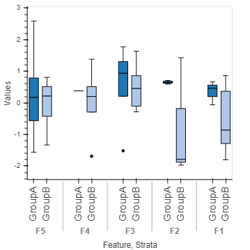
I am trying to generate a boxwhisker plot with two categorical variables in the x-axis, and then overlay the scatter plot (with the same data) over it. The idea is to compare two strata/groups over a set of features and visualize the distributional differences with box+scatter plot. I am struggling to get the dimensions aligned, any hints/tips/direction/advice would be much appreciated.

def changeOrderAndFont(plot,element):
    factors =  itertools.product(['F5','F4','F3','F2','F1'],['GroupA','GroupB'])
    plot.state.x_range.factors = [*factors]
    plot.handles['xaxis'].major_label_text_font_size = '12pt'
    plot.handles['xaxis'].major_label_orientation = pi/2
    plot.handles['xaxis'].group_text_font_size = '10pt'
    plot.handles['yaxis'].axis_label_text_font_size = '10pt'
    plot.handles['yaxis'].axis_label_text_font_style = 'normal'
    plot.handles['xaxis'].axis_label_text_font_style = 'normal'
values = np.random.normal(0,1,size=50)
strata = np.random.choice(['GroupA','GroupB'],size=50)
feature = np.random.choice(['F1','F2','F3','F4','F5'],size=50)
df = pd.DataFrame({'Strata':strata,'Feature':feature,'Values':values})

pp = hv.BoxWhisker(df,kdims=['Feature','Strata'],vdims=['Values']).opts(cmap='Category20',box_color='Strata',height=400,width=400,hooks=[changeOrderAndFont])
# ss = hv.Scatter(df,kdims=['Feature','Strata'],vdims=['Values','Strata']) #gives a warning about a single kdim, and an error on dimension alignment
# ss = hv.Scatter(df,kdims=['Feature'],vdims=['Values','Strata']) #gives an error on dimension alignment
# (pp*ss) # errors here
pp

example boxplot:
bokeh_plot (48)

Thanks!

@zeneofa I’m facing the same limitation, and ended up with a few non-perfect workarounds.

  1. You can use violin rather than boxplot to visualize your data distribution:
pp = hv.Violin(df, kdims=['Feature', 'Strata'], vdims=['Values']).opts(cmap='Category20', box_color='Strata', height=400, width=400, hooks=[changeOrderAndFont])
pp
  1. You may combine boxplot (without the Strava dimension) and then overlay your boxplot with a scatterplot of your data, each point colored according to its Strata value. For instance:
bw = hv.BoxWhisker(df, kdims=['Feature'], vdims=['Values']).opts(cmap='Category20', height=400, width=400)
ss = hv.Scatter(df, kdims=['Feature'], vdims=['Values', 'Strata']).opts(size=6, jitter=0.4, color=dim("Strata"), cmap='Set2')
bw * ss
  1. You can create a holomap with your preferred dimension of interest. Below, an example with Feature as key dimension for the Holomap but you can easily do the same with Strava if you prefer:
def workaround_attempt(group):
    bw = hv.BoxWhisker(df[df['Feature'] == group],kdims=['Strata'],vdims=['Values']).opts(cmap='Category20',height=400,width=400)
    ss = hv.Scatter(df[df['Feature'] == group], kdims=['Strata'],vdims='Values').opts(size=6, jitter=0.4, , color=dim('Strata'), cmap='Set1')
    return bw * ss

plot_dict = {group: workaround_attempt(group) for group in df['Feature'].unique()}
hmap = hv.HoloMap(plot_dict, kdims='Feature')
hmap

layout
This will create the individual figures you want, and allow you to switch between them with a widget. You can also display all oplots on a layout using:

hmap.layout().cols(2)

Again, none of these solutions is perfect but I hope it helps you somehow.

For what I know, the problem is related to bokeh rather than holoviews (I tried to find a solution using bokeh but without success so far), but I may be wrong. The best alternative solution I found so far seems to be the RainCloudPlots package but I never tried it and can’t tell if it works for multi-categorical data.

Best,

I think this is related; until this gets merged, overlaying multi-categories is not possible in holoviews (without dropping down to the matplotlib/bokeh level)

I typically replace a categorical axis with a numerical axis and specify the categories by setting the ticks…

Looks like we all are waiting for holoviews 2.0 (hopefully soon :crossed_fingers:)

I ended up just using a violin plot, which captured the information I needed to convey. My data also scaled up and using seaborn stripplot like plots proved to just be a mess anyway. But glad there are some interesting things heading this way with holoviews 2.0 :smiley:

@FloLangenfeld interesting solution. I also tried a layout approach, for a smaller data set, saved the bokeh plots and used inkscape to stitch them together.