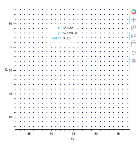
- spread and dynspread can indeed help you make those pixels visible. Until recent versions of Datashader, spreading was supported only on RGB images, specifically the output of
datashade(), but recent versions now support the numerical array output ofrasterize()as well. The error message indicates that you are using an outdated version of Datashader; update withconda install -c pyviz datashader. - Here you’ve enabled hover for the column “feature”, but the rasterized data doesn’t have any such column, and indeed, has no columns at all; it is an image and not a columnar data source. The original data has such a column, sure, but you’ve used Datashader to count the datapoints per pixel and displayed those counts, and what Bokeh sees is now a rasterized hv.Image plot with no other information from the original dataset. Read more at datashader.org to see how that works and why you can no longer access anything from the original dataset. If you want to display the “feature” column in hover, you can aggregate by “feature”, displaying e.g. the average value of “feature” per pixel rather than the counts per pixel; see the
aggregatorargument torasterize. That way Datashader will compute the value offeatureper pixel, rather than the count of datapoints per pixel. - You mean a legend? Sorry; I misled you before; you’ll only get a legend here if you overlay points, not rasterized points. Bokeh does automatically create a legend for overlaid points plots, but these are now overlaid image plots, and it doesn’t currently create the legend in that case. See the Large Data guide about how to fake a legend, which is unfortunately all we support right now.
- I’m not sure what you mean, but I think that can be done with the new
inspect_pointsfeature in HoloViews. See https://examples.pyviz.org/ship_traffic/ship_traffic.html for an example where one selects a point and then it shows a table about that point and a photo corresponding to that point. The example is a bit complicated due to its use of geographic tools, but I’m working to simplify it. I believe you can already use it as you are describing, though.
Here’s an example with some of the fixes discussed above, but note that it doesn’t work to overlay these two plots right now because they overlap entirely, as all the datapoints fall on integer locations. If your actual data is the same way, you’ll need to rearrange it to have a categorical column (e.g. “S” or “R” for each datapoint) and then use Datashader’s categorical plotting support, or else you’ll never see the S datapoints, as they are always covered up by the R datapoints. But I hope that’s not your situation, because the categorical plotting can’t be used together with hover. The categorical support does work with inspect_points, though, as that doesn’t care how you are plotting it.
import random, pandas as pd, numpy as np, holoviews as hv, datashader as ds, colorcet as cc
from holoviews.operation.datashader import datashade, shade, dynspread, spread, rasterize
hv.extension('bokeh')

N=int(10e4)
df = pd.DataFrame(np.random.randint(0,100,size=(N, 4)), columns=list(('x1','y1','x2','y2')))
df['feature']=np.random.random(N)

s=hv.Points( df,['x1','y1'], ['feature'],label='s')
r=hv.Points( df,['x2','y2'], ['feature'],label='r')

S_cord=dynspread(rasterize(s, aggregator=ds.mean("feature")).opts(cmap=cc.kr))
R_cord=dynspread(rasterize(r, aggregator=ds.mean("feature")).opts(cmap=cc.kb))

S_cord*R_cord.opts(tools=["hover"]).opts(height=500, width=500)
