Created a dashboard for exploring ocean glider data.
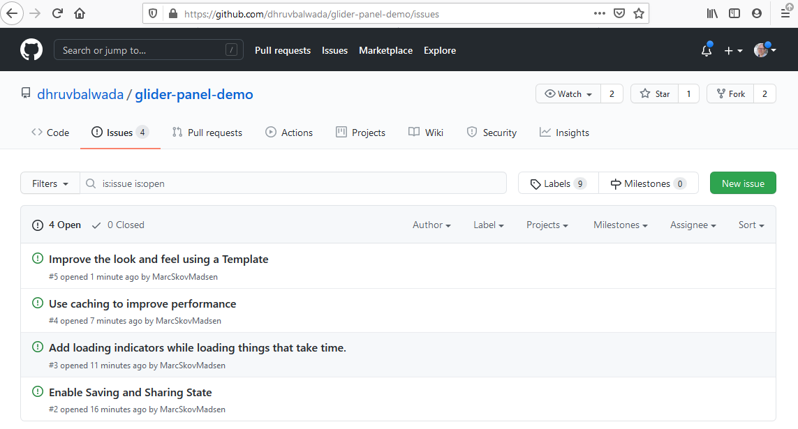
I think it works quite well, but there are still some items left on the wishlist that have to do with holoviz (as noted in on the github repo linked below). Was wondering if someone with more experience would be willing to help out, particularly with optimizing it so it runs more smoothly. The other big one has to do with turning off auto axis and colorlim resetting every time someone interacts with widgets.
Sure there are some minor issues and complains (I am just calling them wishlist items on the repo), and hopefully at some point they are solved. But in the grand scheme of things this is infinitely better than non-interactive plotting or trying to learn a new language to bring in interactivity.
There are lot of other use cases in oceanography and Earth/climate science where these tools can make a huge difference and make data exploration much much easier. I am trying to convert some people in the https://pangeo.io/ world to start using holoviz, so hopefully some more examples of specific use cases will be coming in the near future.