Hi
I am trying to plot a bar graph with linear axis and scatter plot with log axis (secondary axis that will appear on the right)
is this somehow possible?
Hi, I’m sorry but I don’t clearly understand what you’re trying to do.
If you want to create twin axes maybe you can check this issue #396
But can you provide small examples of the bar plot and the scatter plot ?

This is with matplotlib
I have barplot in linear axis (left)
and scatter plot in log axis (right)
For some reason I am unable to reach this result with hvplot/bokeh
I tried to apply the example of the issue on your usercase, but I didn’t manage to make it works with a log axis.
Since the issue is assigned for holoviews 2.0, I think it’s not implemented yet.
There is maybe a workaround that I did not tried yet.
-
Following the examples of the issue you can make a secondary linear axis. So maybe you can relabel this axis to display log values.
-
Your plot was made only with matplotlib or with holoviews/matplolib ? If you used holoviews, you can try hv.render(plot,backend=‘bokeh’). That will try to convert your holoviews/matplolib plot into a holoviews/bokeh plot.
If I find a solution I’ll post it here, can you do the same please?
Still could not solve the problem
if you have any new input, please let me know
Me neither, sorry but I don’t think it’s possible for the moment. Here is why :
First, with the following code you can add a secondary linear axis.
import pandas as pd
import holoviews as hv
from holoviews.streams import Buffer
from bokeh.models import Range1d,LinearAxis
hv.extension('bokeh')
def plot_secondary(plot,element):
p = plot.state
if 'twiny' not in [t for t in p.extra_y_ranges]:
p.y_range = Range1d(start=0,end=10)
p.y_range.name = 'default'
p.extra_y_ranges = {"twiny" : Range1d(start=0,end=5)}
p.add_layout(LinearAxis(y_range_name='twiny'),'right')
glyph = p.renderers[-1]
glyph.y_range_name ='twiny'
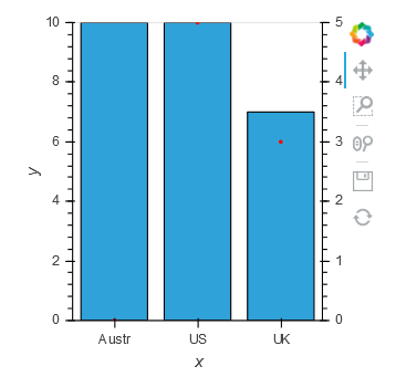
bars= hv.Bars([('Austr',10),('US',14),('UK',7)],name='Country')
log_plot = hv.Scatter((['Austr','US','UK'],(0,5,3))).opts(framewise=True,hooks=[plot_secondary],color='red')
(bars*log_plot)
It works well, in this case you have 2 y-axis, one for the bar plot and the second for the scatter plot.
Then you can replace the LinearAxis with LogAxis and change the Range1d values.
 import pandas as pd
import holoviews as hv
from bokeh.models import Range1d,LinearAxis,LogAxis

hv.extension('bokeh')

def plot_secondary(plot,element):
    p = plot.state
    if 'twiny' not in [t for t in p.extra_y_ranges]:
        p.y_range = Range1d(start=0,end=10)
        p.y_range.name = 'default'
        p.extra_y_ranges = {"twiny" : Range1d(start=0.1,end=10**8)}
        p.add_layout(LogAxis(y_range_name='twiny'),'right')

    glyph = p.renderers[-1]
    glyph.y_range_name ='twiny'

bars= hv.Bars([('Austr',10),('US',14),('UK',7)],name='Country')
bars2= hv.Bars([('Austr',10),('US',14),('UK',7)],name='Country2').opts(framewise=True,hooks=[plot_secondary])
log_plot = hv.Scatter((['Austr','US','UK'],(10**3,10**7,10**4))).opts(framewise=True,hooks=[plot_secondary],color='red')
bars*log_plot
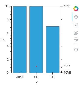
the second axis is now a log axis, but it’s quite bugged because there is a conflict between the properties LogTickFormatter and LogTicker of the y_axis and the property y_scale of the figure which is still linear.
Since the y_scale is linear you can try to change it using get_scale()
import pandas as pd
import holoviews as hv
from bokeh.models import Range1d,LinearAxis,LogAxis
from bokeh.plotting._plot import get_scale

hv.extension('bokeh')

def plot_secondary(plot,element):
    p = plot.state
    if 'twiny' not in [t for t in p.extra_y_ranges]:
        p.y_range = Range1d(start=0,end=10)
        p.y_range.name = 'default'
        p.extra_y_ranges = {"twiny" : Range1d(start=0.1,end=10**8)}
        p.add_layout(LogAxis(y_range_name='twiny'),'right')

    glyph = p.renderers[-1]
    glyph.y_range_name ='twiny'
    p.y_scale = get_scale(Range1d(start=0.1,end=10**7),'log')

bars= hv.Bars([('Austr',10),('US',14),('UK',7)],name='Country')
bars2= hv.Bars([('Austr',10),('US',14),('UK',7)],name='Country2').opts(framewise=True,hooks=[plot_secondary])
log_plot = hv.Scatter((['Austr','US','UK'],(10**3,10**7,10**4))).opts(framewise=True,hooks=[plot_secondary],color='red')
bars*log_plot
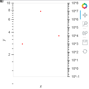
Thanks to get_scale() the logaxis is displayed correctly but the function has also changed the first axis. Since the bar plot isn’t rendered I think this type of plot isn’t compatible with logaxis.
It seems that there is only one attribute y_scale for all the y_axis. Maybe @philippjfr can confirm that ?
We need to wait for a new release where we would specify the y_scale for each axis.