Overlay 15+ line charts with 1.5 million data points each

Hi all! I am trying to plot several curves by overlaying them in a single chart. The data for these lines represent time series data but they are not all sharing the same x-axis, as each data point can vary when it was taken so I’m using hv.Curve instead of ds.line.


# data format - [[timestamps],[values],[category]],[[timestamps],[values],[category]]...
results = [
        [[1670266537.2231886,1670266537.2231887,1670266537.2231888...], [100, 101, 102], ["category_1", "category_1", "category_1"]]
        [[1670266537.2231885,1670266537.2231886,1670266537.2231888...], [200, 203, 150], ["category_2", "category_2", "category_2"]]

        ]

dists = { parameter: pd.DataFrame({ 'x': np.array(x), 'y': np.array(y), 'parameter': parameter }) for x, y, parameter in results }
df = pd.concat(dists, ignore_index=True)


dask_df = dd.from_pandas(df, npartitions=mp.cpu_count())
dask_df.persist()


from datashader.colors import Sets1to3
param_names = [param for _,_,param in results]

color_key = [(name,color) for name,color in zip(param_names, Sets1to3)]
print(color_key)

# method 1 use datashader colormapping but produces no legend
# is most performant, have no issues but default datashader colormapping is used
# ideally would like to be able to distinguish the different categories
shade(rasterize(hv.Curve(dask_df))).opts(**options, tools=["hover"])


# method 2 using overlay to create the colormapping and legend (incredibly slow)
color_points = hv.NdOverlay({n: hv.Curve((dask_df["x"], dask_df["y"]), vdims=["y"], label=str(n)).opts(color=c) for n,c in color_key})
datashader = color_points * shade(rasterize(hv.Curve(dask_df))).opts(**options, tools=["hover"])

I have several issues that I am trying to resolve:

  • When applying the colormapping on the front-end to produce a legend using Bokeh, the chart renders incredibly slow and is almost uninteractable.

  • I am using hv.Curve because the examples for timeseries charts have all the curves on the same x-axis. For the data I am using, this is not the case. Data points can be present for different bins of timestamps which may not all align.

1 Like

Hi @jon_tron

Welcome to the community. Its a good question.

Could you please provide a Minimal reproducible example? It will make it so much easier to try to help and help create a community knowledgebase.

Thanks.

Hi Marc,

Thanks for the response. I’ve uploaded the example to this notebook:

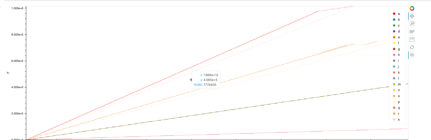
I found the answer to my own question. When dealing with millions of data points, you want to avoid letting the front-end doing the color mapping and instead allow datashader to perform this task.

What I struggled with, was getting each curve to plot with separate colors while also displaying a legend for each curve. You can use datashader’s categorical colormapping to handle applying individual colors to each curve. You first have to set the parameter column to type category and then use an aggregator to count by that category:

df["parameter"] = df["parameter"].astype("category")
dask_df = dd.from_pandas(df, npartitions=mp.cpu_count())
dask_df.persist()
datashader = datashade(hv.Curve(dask_df), aggregator=ds.count_cat("parameter")).opts(**options) #

The resulting chart will look something like this:

1 Like