Hi!
I am just taking my first steps with hvplots since I am working with polars which defers to it. I am creating two plots, which represent measured and ground truth data. Every plot is a set of lines for a group of devices:
scat1 = data.plot.scatter(x="x", y="measured", c="category", groupby="device", marker="x")
scat2 = data.plot.scatter(x="x", y="truth", c="category", groupby="device", marker="o")
comb = scat1*scat2
This is almost perfect, but I need the dots of the same color to also be joined by a line.
I have two issues here:
- I couldnt find a way to combine both lines and markers. Prior solutions seems to combine a scatter and lineplot, but I can’t use the
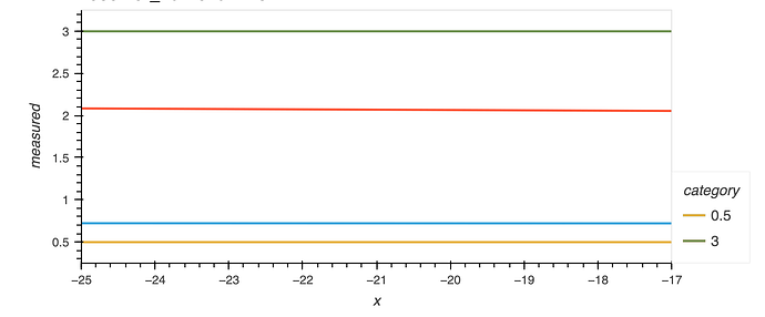
c="category"attribute on lineplots, so the resulting colors are very irritating - Using just the lineplot I cant even properly overlay them. The overlay has new colors assigned and the legend only shows those of one of the plots, see here:
Is there any way to overlay both plots as curves while still allowing to distinguish them (e.g. by different markers?). I tried going through the options but couldn’t find anything that would help.
