Hello, I’m trying to create an app where selecting a point (or a range of points) on a scatter plot will call a function with the selected values, and plot the result. The problem is that when I select multiple points at once, the curves that show up on the overlay have the same color, making it impossible to tell them apart.
Here’s a minimal example with sine waves:
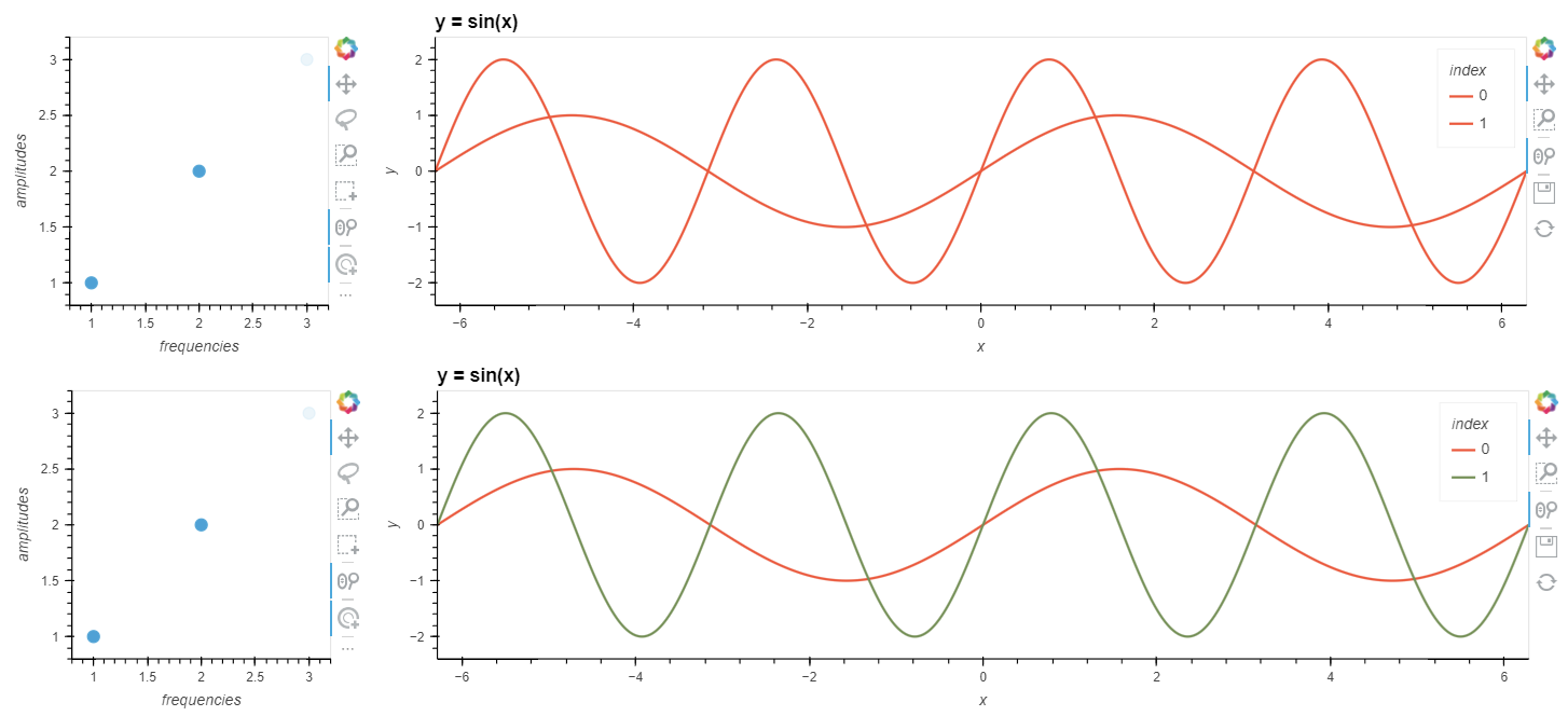
On the top, I selected two points by shift-clicking with the Tap tool, and on the bottom I selected them one after the other (not using shift-click), then re-selected them to display their sine curves together:
Here’s the code that generated it:
import numpy as np
import panel as pn
import holoviews as hv
from holoviews import opts, streams

hv.extension('bokeh')
pn.extension()

freqs = np.array([1, 2, 3])
amps = np.array([1, 2, 3])

# point plot with selection tools
pts = hv.Points((freqs, amps), ['frequency', 'amplitude']).opts(
    tools=['box_select','lasso_select','tap'], size=10)
selection = streams.Selection1D(source=pts)

def streaming_sines(index):
    # make an empty plot to show when there is no selection
    empty_plot = hv.Curve(np.random.rand(0, 2)).opts(
        height=300, width=1000, framewise=True)
    empty_dict = {'none': empty_plot}
    empty_overlay = hv.NdOverlay(empty_dict, kdims='index').opts(
        title="y = sin(x)")
    if not index:
        # show the empty plot in an NdOverlay, because DynamicMap
        # needs the function to consistently return one element type
        return empty_overlay
    else:
        # use the list of indices returned by Selection1D to look up freq and amp;
        # make a dict of sine curves using the data and plot in an NdOverlay
        curve_dict = {}
        for i in index:
            x = np.linspace(-2*np.pi, 2*np.pi, 1000)
            freq = freqs[i]
            amp = amps[i]
            sin = amp * np.sin(freq*x)
            curve = hv.Curve({'x': x, 'y': sin}, label=str(i), group='y = sin(x)').opts(
                height=300, width=1000, framewise=True)
            curve_dict[i] = curve
            sines_overlay = hv.NdOverlay(curve_dict, kdims='index').opts(
                title="y = sin(x)")
    return sines_overlay

# display the point plot alongside the sines
pn.Row(pts, hv.DynamicMap(streaming_sines, streams=[selection]))
Another minor issue is that the Overlay colormap starts at the second color (Red) instead of the first (Blue), but I think that’s a result of how I implemented a blank plot for the “no selection” case.