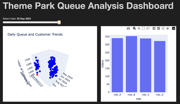
Hi, I was wondering if anyone had encountered an issue with Panel when updating multiple plots based on a user selected widget value. In my case, the user selects a date using a widget and this is used to update a Holoviews Scatter3D plot of aggregated (i.e., across a given day) data and an associated bar plot of daily data.
The code generates an error: “UnknownReferenceError: can’t resolve reference” which I believe is being triggered by Bokeh as Panel uses it. Note: despite being an error, it doesn’t crash the code but the output is verbose and interferes with the dashboard.
The Bokeh folks suggest suppressing it but I’m unable to achieve that in my code below. Also, I’m mindful that my fundamental approach to using Panel in this dynamic way might be bad/wrong.
I’ve included a toy code example which produces the error message when the user slides the date widget across the date range. Any help/suggestions would be greatly appreciated.
Environment:
- Python version: 3.10.13
- Panel version: 1.3.1
- HoloViews version: 1.19.1
- Bokeh version: 3.3.0
Theme Park Queue Analysis Dashboard
A complete example that demonstrates:
- Synthetic theme park data generation
- Interactive visualization with Panel and HoloViews
- Mixed backend usage (Plotly for 3D, Bokeh for 2D)
Requirements:
- pandas
- numpy
- holoviews
- panel
- plotly (for 3D plotting)
Tested with:
- Python version: 3.10.13
- Panel version: 1.3.1
- HoloViews version: 1.19.1
- Bokeh version: 3.3.0
Known Issue:
When running in Jupyter, this code produces UnknownReferenceError warnings like:
UnknownReferenceError: can’t resolve reference ‘xxx-xxx-xxx’
The dashboard functions correctly despite these warnings.
import pandas as pd
import holoviews as hv
import panel as pn
from holoviews import opts
from datetime import datetime, timedelta
import numpy as np
import logging


# Configure logging to ignore bokeh messages
logging.getLogger('bokeh').setLevel(logging.ERROR)
logging.getLogger('jupyter_bokeh').setLevel(logging.ERROR)


# Configure Panel to be less verbose
pn.config.console_output = 'disable'
pn.config.notifications = False

# Enable both backends
hv.extension('plotly', 'bokeh')
pn.extension()

"""
This code seeks to:

1. Create a dataframe with the following columns:
    - date
    - time
    - ride
    - queue_time
2. Aggregate the dataframe to create a daily dataframe
3. Create a 3D scatter plot of the daily dataframe and an interactive bar chart
"""

# Configuration
rides = ['ride_A', 'ride_B', 'ride_C', 'ride_D']
start_date = datetime(2024, 5, 1)
end_date = datetime(2024, 9, 30)
time_slots_per_day = 32  # 4 runs/hour * 8 hours
ride_capacity = 15  # People per run

# Define base queue time ranges based on ride popularity
queue_time_ranges = {
    'ride_A': (15, 30),  # Very popular
    'ride_B': (10, 20),  # Moderately popular
    'ride_C': (5, 15),   # Less popular
    'ride_D': (2, 10)    # Least popular
}

# Generate seasonality factor (higher demand in July and August)
def seasonal_factor(date):
    if date.month in [7, 8]:
        return 1.5  # Peak summer
    elif date.month in [5, 6]:
        return 1.0  # Early summer
    else:
        return 0.8  # Post-peak

# Generate time-of-day factor
def time_of_day_factor(hour):
    if 9 <= hour < 11:  # Early morning
        return 1.2
    elif 11 <= hour < 14:  # Midday
        return 1.5
    elif 14 <= hour < 16:  # Early afternoon
        return 1.3
    else:  # Late afternoon
        return 1.0

# Configuration for rider variability
ride_mean_capacity = 12  # Average number of riders per run
ride_capacity_stddev = 3  # Standard deviation for variability

# Modify dataset generation loop
data = []
current_date = start_date

while current_date <= end_date:
    for ride in rides:
        base_min, base_max = queue_time_ranges[ride]
        for run in range(time_slots_per_day):
            hour = 9 + (run // 4)  # Determine the hour of the run
            minute = (run % 4) * 15  # Calculate the exact minute

            season_factor = seasonal_factor(current_date)
            time_factor = time_of_day_factor(hour)

            # Generate queue time with added randomness
            base_time = np.random.uniform(base_min, base_max)
            queue_time = base_time * season_factor * time_factor
            queue_time = max(0, round(queue_time))  # Ensure non-negative integer

            # Simulate the number of riders for this run
            riders_this_run = max(0, min(ride_capacity, int(np.random.normal(ride_mean_capacity, ride_capacity_stddev))))

            # Create entries for all customers in this time slot
            for customer in range(riders_this_run):
                data.append({
                    'date': current_date,
                    'time': f"{hour:02d}:{minute:02d}",
                    'ride': ride,
                    'queue_time': queue_time
                })
    current_date += timedelta(days=1)

# Create a DataFrame
df_detailed = pd.DataFrame(data)

# Aggregate df_detailed to create daily_df
daily_df = (
    df_detailed
    .groupby('date')
    .agg(
        daily_avg_queue_time=('queue_time', 'mean'),  # Average queue time
        daily_customers=('queue_time', 'count')  # Total number of customers
    )
    .reset_index()
)

# Create daily ride volume dataframe
daily_ride_volume = (
    df_detailed
    .groupby(['date', 'ride'])
    .agg(
        avg_queue_time=('queue_time', 'mean'),
        riders=('queue_time', 'count')
    )
    .reset_index()
)

# Convert date columns to datetime
daily_df['date'] = pd.to_datetime(daily_df['date'])
daily_df['date_num'] = daily_df['date'].astype(np.int64) // 10**6
daily_ride_volume['date'] = pd.to_datetime(daily_ride_volume['date'])

# Create interactive dataframes
idf = daily_df.interactive()
idf_rides = daily_ride_volume.interactive()


# Function to create the 3D scatter plot
def create_scatter_plot(selected_date):
    selected_date = pd.Timestamp(selected_date)

    daily_df['color'] = daily_df['date'].apply(
        lambda x: 'red' if x.date() == selected_date.date() else 'blue'
    )

    # Format dates as strings for better display
    daily_df['date_str'] = daily_df['date'].dt.strftime('%Y-%m-%d')

    scatter_3d_plot = hv.Scatter3D(
        daily_df,
        kdims=['date_str', 'daily_avg_queue_time', 'daily_customers'],  # Use date_str instead of date_num
        vdims=['color']
    ).opts(
        width=500,
        height=400,
        color='color',
        title='Daily Queue and Customer Trends',
        xlabel='Date',
        ylabel='Average Queue Time (mins)',
        zlabel='Number of Customers',
        backend='plotly'
    )
    return scatter_3d_plot

# Function to create the bar chart
def create_bar_chart(selected_date):
    selected_date = pd.Timestamp(selected_date)

    # Filter data for selected date
    daily_data = daily_ride_volume[daily_ride_volume['date'].dt.date == selected_date.date()]

    # Create bar chart with Bokeh backend
    bars = hv.Bars(
        daily_data,
        kdims=['ride'],
        vdims=['riders', 'avg_queue_time']
    ).opts(
        width=500,
        height=400,
        title=f'Ride Volume for {selected_date.date()}',
        xlabel='Ride',
        ylabel='Number of Riders',
        xrotation=45,
        tools=['hover'],
        color=hv.Cycle(['#1f77b4', '#ff7f0e', '#2ca02c', '#d62728']),
        backend='bokeh'
    )
    return bars

# Create the dashboard layout
date_slider = pn.widgets.DateSlider(
    name='Select Date',
    start=daily_df['date'].min(),
    end=daily_df['date'].max(),
    value=daily_df['date'].min(),
    step=1
)

# Create panes for the plots
scatter_pane = pn.pane.HoloViews()
bar_pane = pn.pane.HoloViews()

# Initialize the plots
initial_scatter = create_scatter_plot(date_slider.value)
initial_bars = create_bar_chart(date_slider.value)
scatter_pane.object = initial_scatter
bar_pane.object = initial_bars

# Create update function
def update_plots(event):
    scatter_plot = create_scatter_plot(event.new)
    bar_plot = create_bar_chart(event.new)
    scatter_pane.object = scatter_plot
    bar_pane.object = bar_plot

# Watch the date_slider for changes
date_slider.param.watch(update_plots, 'value')

# Create the dashboard
dashboard = pn.Column(
    pn.pane.Markdown("# Theme Park Queue Analysis Dashboard", styles={'font-size': '24px'}),
    date_slider,
    pn.Row(
        scatter_pane,
        bar_pane
    ),
    min_width=1200,
    sizing_mode='stretch_width'
)

# Display the dashboard
dashboard.servable()
