This following code works for me. I think the main problem in your example is you are loading a lot of data which takes time and the plot cannot be shown before this is done. Therefore in my example I just removed that step and only import the already processed data in. This option is properly not available for you so you must find a way to speed up your data loading/processing, but this is definitely out of scope for this forum.
Another time you need help try to make a minimal, reproducible example (MRE). The excel file is 50 MB and took 5 min to download for me, the example could easily been done with fake data.
import matplotlib.colors as mcolors
import numpy as np
import pandas as pd
import seaborn as sns
from matplotlib.figure import Figure
import panel as pn
import param
pn.extension()
# run with panel serve $FILENAME.py
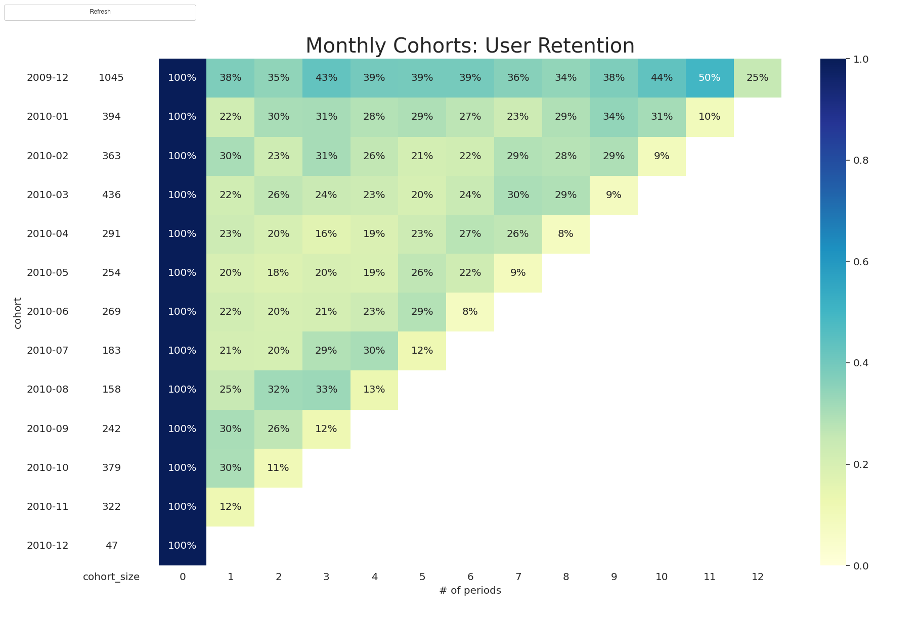
def retention_table_plot():
df_cohort = pd.read_csv(
"cohort.csv", index_col=0, parse_dates=["cohort", "order_month"]
)
cohort_pivot = df_cohort.pivot_table(
index="cohort", columns="period_number", values="n_customers"
)
cohort_size = cohort_pivot.iloc[:, 0]
retention_matrix = cohort_pivot.divide(cohort_size, axis=0)
# Just to show the plot is updating
retention_matrix.iloc[:, 1:] += np.random.rand() / 10
return retention_matrix, cohort_size
def plot_cohort_analysis(matrix):
"""
plot retention table.
"""
with sns.axes_style("white"):
fig = Figure(figsize=(13, 8))
ax = fig.subplots(1, 2, sharey=True, gridspec_kw={"width_ratios": [1, 11]})
# retention matrix
sns.heatmap(
matrix[0],
mask=matrix[0].isnull(),
annot=True,
fmt=".0%",
cmap="YlGnBu",
ax=ax[1],
vmin=0,
vmax=1,
)
ax[1].set_title("Monthly Cohorts: User Retention", fontsize=20)
ax[1].set(xlabel="# of periods", ylabel="")
# cohort size
cohort_size_df = pd.DataFrame(matrix[1]).rename(columns={0: "cohort_size"})
white_cmap = mcolors.ListedColormap(["white"])
sns.heatmap(
cohort_size_df, annot=True, cbar=False, fmt="g", cmap=white_cmap, ax=ax[0]
)
ax[0].set_yticklabels(
cohort_size_df.index.strftime("%Y-%m").to_list(), rotation=0
)
fig.tight_layout()
return fig
class refresh_dashboard(param.Parameterized):
action = param.Event(label="Refresh")
@param.depends("action")
def get_plot(self):
input_data = retention_table_plot()
return plot_cohort_analysis(input_data)
cohort_analysis_dashboard = refresh_dashboard()
dashboard = pn.Column(
pn.panel(
cohort_analysis_dashboard.param, show_labels=True, show_name=False, margin=0
),
cohort_analysis_dashboard.get_plot,
width=400,
).servable()
The cohort.csv
,cohort,order_month,n_customers,period_number
0,2009-12-01,2009-12-01,1045,0
1,2009-12-01,2010-01-01,392,1
2,2009-12-01,2010-02-01,358,2
3,2009-12-01,2010-03-01,447,3
4,2009-12-01,2010-04-01,410,4
5,2009-12-01,2010-05-01,408,5
6,2009-12-01,2010-06-01,408,6
7,2009-12-01,2010-07-01,374,7
8,2009-12-01,2010-08-01,355,8
9,2009-12-01,2010-09-01,392,9
10,2009-12-01,2010-10-01,452,10
11,2009-12-01,2010-11-01,518,11
12,2009-12-01,2010-12-01,260,12
13,2010-01-01,2010-01-01,394,0
14,2010-01-01,2010-02-01,86,1
15,2010-01-01,2010-03-01,119,2
16,2010-01-01,2010-04-01,120,3
17,2010-01-01,2010-05-01,110,4
18,2010-01-01,2010-06-01,115,5
19,2010-01-01,2010-07-01,105,6
20,2010-01-01,2010-08-01,91,7
21,2010-01-01,2010-09-01,114,8
22,2010-01-01,2010-10-01,134,9
23,2010-01-01,2010-11-01,122,10
24,2010-01-01,2010-12-01,37,11
25,2010-02-01,2010-02-01,363,0
26,2010-02-01,2010-03-01,109,1
27,2010-02-01,2010-04-01,82,2
28,2010-02-01,2010-05-01,110,3
29,2010-02-01,2010-06-01,93,4
30,2010-02-01,2010-07-01,76,5
31,2010-02-01,2010-08-01,79,6
32,2010-02-01,2010-09-01,103,7
33,2010-02-01,2010-10-01,100,8
34,2010-02-01,2010-11-01,106,9
35,2010-02-01,2010-12-01,32,10
36,2010-03-01,2010-03-01,436,0
37,2010-03-01,2010-04-01,95,1
38,2010-03-01,2010-05-01,113,2
39,2010-03-01,2010-06-01,103,3
40,2010-03-01,2010-07-01,100,4
41,2010-03-01,2010-08-01,87,5
42,2010-03-01,2010-09-01,105,6
43,2010-03-01,2010-10-01,130,7
44,2010-03-01,2010-11-01,126,8
45,2010-03-01,2010-12-01,36,9
46,2010-04-01,2010-04-01,291,0
47,2010-04-01,2010-05-01,67,1
48,2010-04-01,2010-06-01,58,2
49,2010-04-01,2010-07-01,47,3
50,2010-04-01,2010-08-01,54,4
51,2010-04-01,2010-09-01,67,5
52,2010-04-01,2010-10-01,79,6
53,2010-04-01,2010-11-01,76,7
54,2010-04-01,2010-12-01,22,8
55,2010-05-01,2010-05-01,254,0
56,2010-05-01,2010-06-01,49,1
57,2010-05-01,2010-07-01,45,2
58,2010-05-01,2010-08-01,49,3
59,2010-05-01,2010-09-01,48,4
60,2010-05-01,2010-10-01,66,5
61,2010-05-01,2010-11-01,56,6
62,2010-05-01,2010-12-01,22,7
63,2010-06-01,2010-06-01,269,0
64,2010-06-01,2010-07-01,58,1
65,2010-06-01,2010-08-01,53,2
66,2010-06-01,2010-09-01,55,3
67,2010-06-01,2010-10-01,62,4
68,2010-06-01,2010-11-01,76,5
69,2010-06-01,2010-12-01,20,6
70,2010-07-01,2010-07-01,183,0
71,2010-07-01,2010-08-01,38,1
72,2010-07-01,2010-09-01,37,2
73,2010-07-01,2010-10-01,52,3
74,2010-07-01,2010-11-01,55,4
75,2010-07-01,2010-12-01,21,5
76,2010-08-01,2010-08-01,158,0
77,2010-08-01,2010-09-01,39,1
78,2010-08-01,2010-10-01,50,2
79,2010-08-01,2010-11-01,51,3
80,2010-08-01,2010-12-01,20,4
81,2010-09-01,2010-09-01,242,0
82,2010-09-01,2010-10-01,73,1
83,2010-09-01,2010-11-01,63,2
84,2010-09-01,2010-12-01,28,3
85,2010-10-01,2010-10-01,379,0
86,2010-10-01,2010-11-01,112,1
87,2010-10-01,2010-12-01,39,2
88,2010-11-01,2010-11-01,322,0
89,2010-11-01,2010-12-01,38,1
90,2010-12-01,2010-12-01,47,0