dear all
can we make the log and linear plot in same y-axis but different scale x-axis , which linear plot plot in the left while log plot in the right
my code:
import holoviews as hv
import panel as pn
import numpy as np
from bokeh.models import Range1d, LogAxis, LinearAxis
hv.extension('bokeh')

# 1. Generate some sample data
x = np.linspace(1, 10, 10)
x1= np.linspace(50, 100, 100)
linear_data = x1 * 2
log_data = 10**x

# Create the primary (linear) curve
# This curve uses the default y-axis ('y')
curve_linear = hv.Curve((x1, linear_data), vdims=['y'], label='Linear Curve')
curve_linear = curve_linear.opts(ylabel='Linear Scale (left)')

# 2. Define a plot hook to add a secondary (logarithmic) axis
def plot_secondary_log_axis(plot, element):
    # Get the Bokeh plot object
    p = plot.state
    # Check if the secondary axis (named 'log_axis') is already present
    if 'log_axis' not in p.extra_y_ranges:
        # Define the range for the log axis (must be > 0)
        p.extra_y_ranges = {"log_axis": Range1d(start=log_data.min(), end=log_data.max())}
        # Add the LogAxis to the right side of the plot
        p.add_layout(LogAxis(y_range_name='log_axis', axis_label='Logarithmic Scale (right)'), 'right')

    # Iterate over renderers to assign the correct y-range to the second curve
    for renderer in p.renderers:
        if renderer.glyph.name == 'log_curve':
            renderer.y_range_name = 'log_axis'

# 3. Create the second (logarithmic) curve
# Assign a unique name so the hook can identify it
curve_log = hv.Curve((x, log_data), vdims=['y'], name='log_curve')
# Apply the hook to the log curve
curve_log = curve_log.opts(hooks=[plot_secondary_log_axis], color='red')

# 4. Overlay the plots
# The hook will execute when the plots are rendered
overlay = (curve_linear * curve_log)

# 5. Customize the overlay appearance
overlay = overlay.opts(
    # Set the main ylabel (it will be for the linear axis)
    # The log axis label is set in the hook
    height=400,
    width=600,
    legend_position='top_left'
)
a=pn.Row(overlay)
# Display the plot (in a Jupyter notebook environment)
a.servable()
it still give this plot:
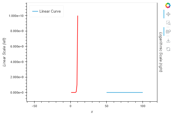
I want red log curve plot in the right one and linear in the left
Kindly please advise