Hello fellow visualizers!
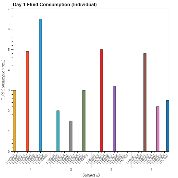
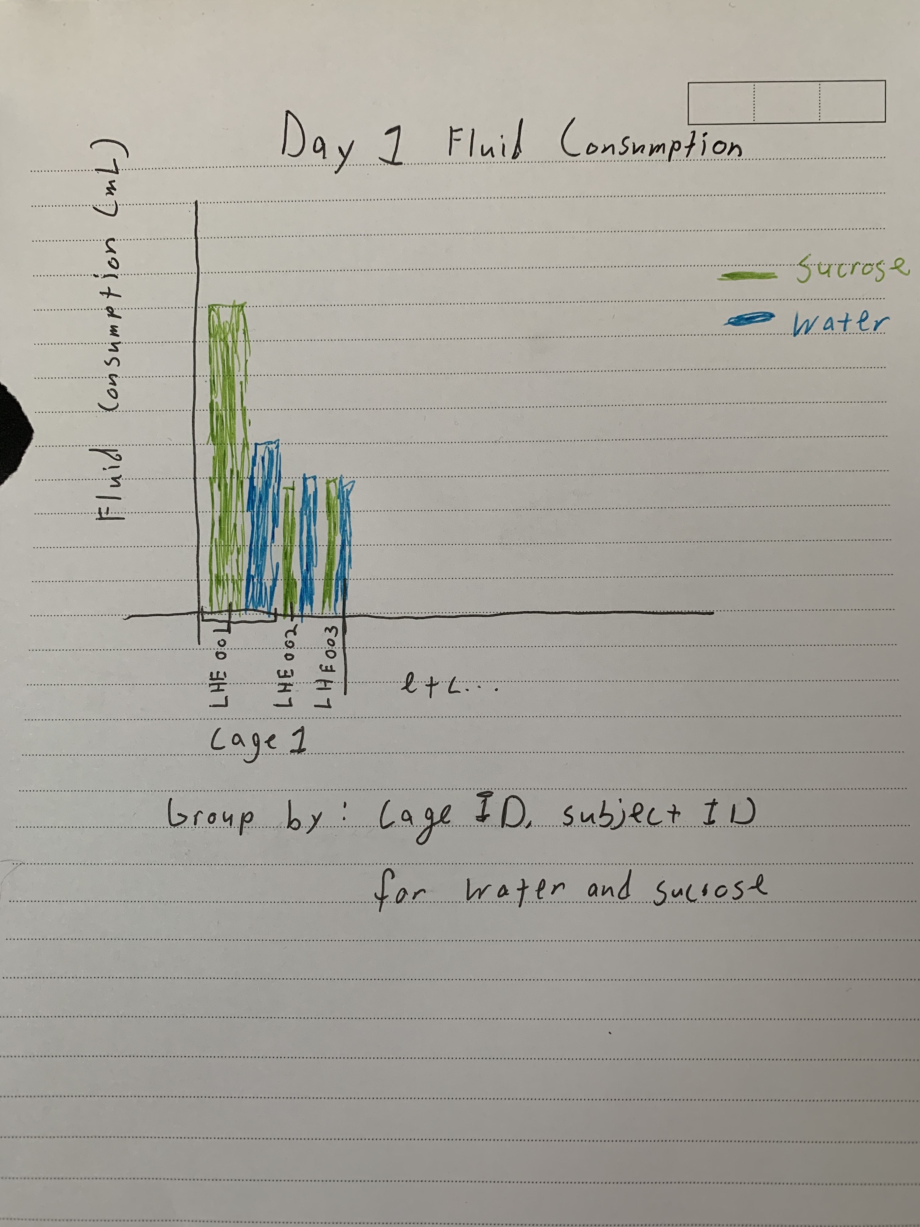
I’m having some trouble plotting some data into a bar chart. I’m hoping to have multiple vdims map to one kdim on the same plot and have the bars plotted next to each other. I’m also trying to get the plot to group according to an id number. So far I’m getting some wacky looking plots or not what I’m looking for and I was hoping I could get some assistance. Here’s what I have so far:
# Pandas for data wrangling
import pandas as pd
# numpy
import numpy as np
# holoviews
import holoviews as hv
from holoviews import dim, opts

# Define bokeh as backend
hv.extension('bokeh')

# Upload data from .csv ... #
# filter data I want... #

day1_both = hv.Bars(
    data=day1consumption_df,
    kdims=['cage_id','subject_id'],
    vdims=['sucrose_consumption', 'water_consumption'],
).opts(
    height=600, width=600, xlabel="Subject ID", ylabel="Fluid Consumption (mL)", title="Day 1 Fluid Consumption (Individual)",
    xrotation=45, tools=['hover']
)
day1_both
I’m only seeing one bar graph for sucrose consumption appear when I’m hoping to get, for the same ID, sucrose and water consumption side by side. Then I’m also trying to get only the members of each cage in the group, not the ones from other groups plotted. I’ve been pretty stuck for the past few hours so I figured I would reach out to the community. I’m new to holoviews and have done some basic stuff, but I’ve gotten stuck here so far. Any advice would be greatly appreciated! Thank you!
I would attach the data, but as a new user to this site I’m not allowed to!
One immediate thing I’m thinking of is maybe I can make a dictionary that maps the appropriate cage/subject id’s, but that’s already a part of the dataframe! So I’m not sure why holoviews plots together individuals that are not members of the group… I just don’t understand hv well enough yet.
I’ve looked a little bit into hvPlot as the interface, but still run into the same trouble. I’ll be trying some more this evening with all this and update the thread if I succeed.
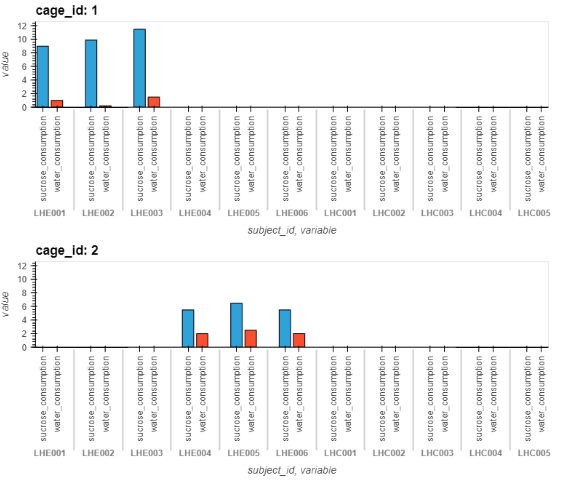
It could help if you could also make the data available, or at least some test data with the exact same structure to let others experiment and try to debug it.
Hehh, I know the pain, I was struggling with that too. I think you will get a bit more options after a few posts, comments and likes. But meanwhile, assuming it’s a CSV file, you could upload it to google drive, share that to “anyone with the link” and post a link here, or something similar.
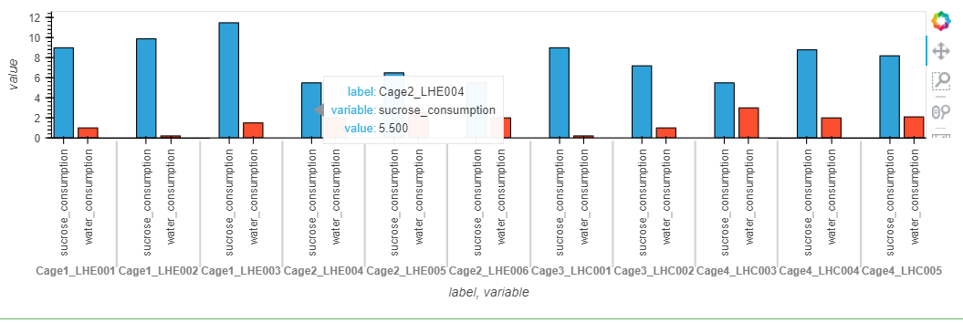
My goodness you’re a wizard! Thank you so much for taking the time to do this! I have been trying to use melt properly for a few days and haven’t understood properly how to use it. This helps me so much! It’s also good to know that holoviews doesn’t yet support 3 levels. Two levels will definitely work. Thanks again!