I have a piece of code that produces a different plot in a jupyter notebook and a holoviz panel app.
First let us create some data:
    import pandas as pd
    import numpy as np
    from plotly_calplot import calplot
    import panel as pn

    allDays = pd.date_range('1/1/2022', periods=730, freq='D')
    selectedDays = np.random.choice(allDays, 1000)
    events = pd.Series(np.random.randn(len(selectedDays)), index=selectedDays)
    df = pd.DataFrame(events, columns=["value"])
    df["date"] = df.index
Then I create the following figure:
    fig = calplot(
        df,
        x="date",
        y="value",
        years_title=True,
        colorscale="YlGnBu",
    ).update_layout(
        font_color="black",
        plot_bgcolor="white",
    ).update_traces(
        showscale = True,
        selector=dict(type='heatmap'),
    )
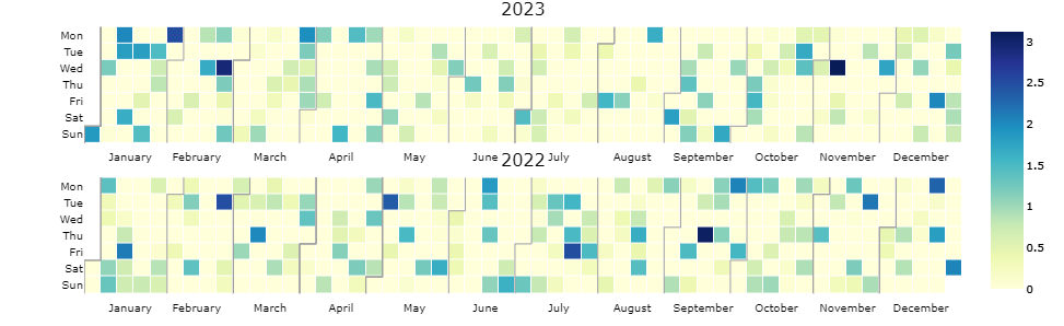
If I now type fig in a jupyter notebook, the image looks like this:
However, if I type pn.serve(fig), the image looks like this:
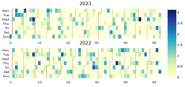
That is, the months are not shown and week numbers are shown instead. How can I get the months? Also, is this a bug or a feature?