Plotting Many Time Series with Datashader

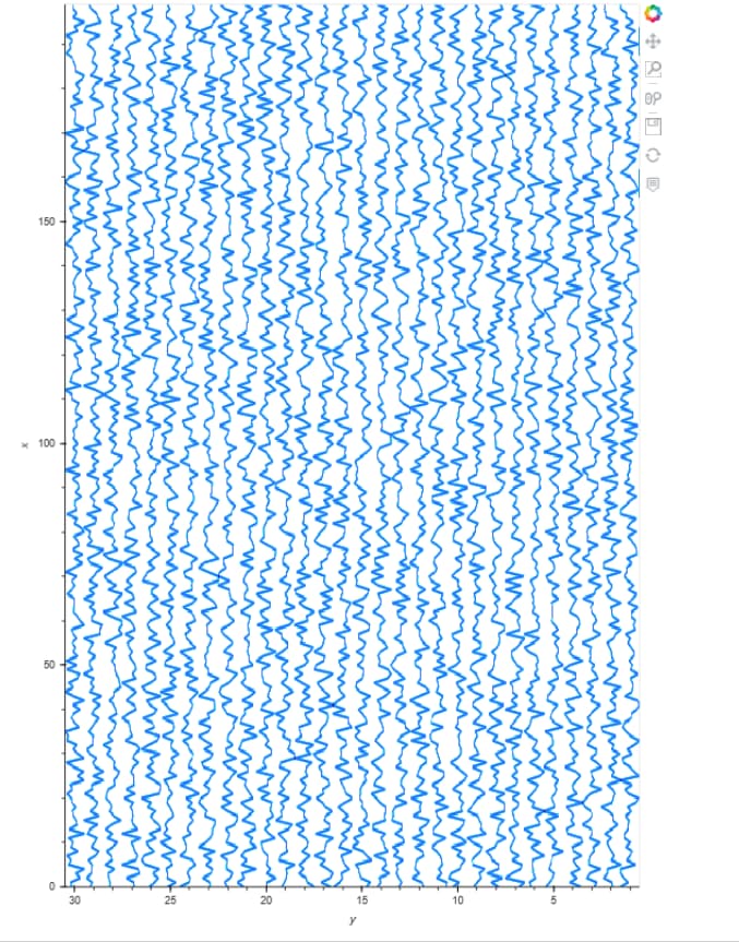
I’m trying to display a panel of seismic data (a.k.a. time series or wiggles). Essentially, this is the same issue as Plotting large numbers of sequences/time series together: dealing with fixed length numpy arrays. However, I have a few added requirements and constraints.

  1. The time series should be distinct and not overlapping, i.e., adjacent to one another along the x-axis for comparison.
  2. The image size must be kept to a minimum due to network limitations. This is a small example for clarity but could be up to n=3000,points=2000.
  3. Minimally interactive: zoom-able to some degree.
  4. Solid color lines, if possible. No shading or color by series needed.

I believe I have found the best balance using the method below. I still need help putting the datashade image into a usable, interactive format (some Holoviews container?) and to apply invert_axes=True & invert_yaxis=True.

import pandas as pd
import numpy as np
import datashader as ds
from datashader import transfer_functions as tf
from sklearn.preprocessing import minmax_scale
import panel as pn

pn.extension()
import holoviews as hv

hv.extension('bokeh')

n = 30
points = 150
np.random.seed(0)
data = np.random.normal(0, 100, size=(n, points))
data = minmax_scale(data, feature_range=(-.5, 0.5), axis=0, copy=True)


def dataframe_from_multiple_sequences(x_values, y_values):
    """
   Converts a set of multiple sequences (eg: time series), stored as a 2 dimensional
   numpy array into a pandas dataframe that can be plotted by datashader.
   The pandas dataframe eventually contains two columns ('x' and 'y') with the data.
   Each time series is separated by a row of NaNs.
   Discussion at: https://github.com/bokeh/datashader/issues/286#issuecomment-334619499
   x_values: 1D numpy array with the values to be plotted on the x axis (eg: time)
   y_values: 2D numpy array with the sequences to be plotted of shape (num sequences X length of each sequence)
   """

    # Space each sequence equally along y-axis (assumes dy=1) 
    y_values = y_values + np.ones(y_values.shape) + np.arange(
        len(y_values)).reshape(len(y_values), 1)

    # Add a NaN at the end of the array of x values
    x = np.zeros(x_values.shape[0] + 1)
    x[-1] = np.nan
    x[:-1] = x_values

    # Tile this array of x values: number of repeats = number of sequences/time series in the data
    x = np.tile(x, y_values.shape[0])

    # Add a NaN at the end of every sequence in y_values
    y = np.zeros((y_values.shape[0], y_values.shape[1] + 1))
    y[:, -1] = np.nan
    y[:, :-1] = y_values

    # Return a dataframe with this new set of x and y values
    return pd.DataFrame({'x': x, 'y': y.flatten()})


# df = ds.utils.dataframe_from_multiple_sequences(np.arange(points), data)
df = dataframe_from_multiple_sequences(np.arange(points), data)

canvas = ds.Canvas(
    x_range=(np.min(df['x']), np.max(df['x'])),
    y_range=(df['y'].min() - 10, df['y'].max() + 10),
    plot_height=400,
    plot_width=1000,
)

agg = canvas.line(df, 'x', 'y', ds.count())
img = tf.shade(agg, how='eq_hist')
pn.Row(img).servable()
# pn.Row(hv.Image(img).opts(invert_axes=True, invert_xaxis=True)).servable()  # ??? not very pretty

I’ve hacked the dataframe_from_multiple_sequences function to include the spacing requirement. I’m also scaling each time series to [-.5,.5] so the series are distinct within the spacing.

Thanks for any advice. Alternative suggestions also appreciated.

Hi @skytaker,

There’s parts in the code that I don’t understand what is going on so may not be the best for a response here but I guess my main question is does it need to go down the route of producing an image first? Or could you make use of rasterize / datashade inside of hvplot like the following which produces an interactive image is my understanding:

import pandas as pd
import numpy as np
import datashader as ds
from datashader import transfer_functions as tf
from sklearn.preprocessing import minmax_scale
import panel as pn

pn.extension()
import holoviews as hv
import hvplot.pandas ##new import

hv.extension('bokeh')

n = 30
points = 200
np.random.seed(0)
data = np.random.normal(0, 100, size=(n, points))
data = minmax_scale(data, feature_range=(-.5, 0.5), axis=0, copy=True)


def dataframe_from_multiple_sequences(x_values, y_values):
    """
   Converts a set of multiple sequences (eg: time series), stored as a 2 dimensional
   numpy array into a pandas dataframe that can be plotted by datashader.
   The pandas dataframe eventually contains two columns ('x' and 'y') with the data.
   Each time series is separated by a row of NaNs.
   Discussion at: https://github.com/bokeh/datashader/issues/286#issuecomment-334619499
   x_values: 1D numpy array with the values to be plotted on the x axis (eg: time)
   y_values: 2D numpy array with the sequences to be plotted of shape (num sequences X length of each sequence)
   """

    # Space each sequence equally along y-axis (assumes dy=1) 
    y_values = y_values + np.ones(y_values.shape) + np.arange(
        len(y_values)).reshape(len(y_values), 1)

    # Add a NaN at the end of the array of x values
    x = np.zeros(x_values.shape[0] + 1)
    x[-1] = np.nan
    x[:-1] = x_values

    # Tile this array of x values: number of repeats = number of sequences/time series in the data
    x = np.tile(x, y_values.shape[0])

    # Add a NaN at the end of every sequence in y_values
    y = np.zeros((y_values.shape[0], y_values.shape[1] + 1))
    y[:, -1] = np.nan
    y[:, :-1] = y_values

    # Return a dataframe with this new set of x and y values
    return pd.DataFrame({'x': x, 'y': y.flatten()})


# df = ds.utils.dataframe_from_multiple_sequences(np.arange(points), data)
df = dataframe_from_multiple_sequences(np.arange(points), data)

### interctive plot using hvplot

df.hvplot.line(
    x='x',
    y='y',
    rasterize=True,
    #datashade=True,
    #aggregator=ds.count(),
    height=1000).opts(invert_axes=True,
                      invert_xaxis=True,
                      colorbar=False) #note though axis are inverted invert xy axis still works like y on the left and x on the bottom therefor used invert xaxis to flip the y!!

### original code from discourse

#canvas = ds.Canvas(
#    x_range=(np.min(df['x']), np.max(df['x'])),
#    y_range=(df['y'].min() - 10, df['y'].max() + 10),
#    plot_height=400,
#    plot_width=1000,
#)

#agg = canvas.line(df, 'x', 'y', ds.count())
#img = tf.shade(agg, how='eq_hist')
#pn.Row(img).servable()
#pn.Row(hv.Image(img).opts(invert_axes=True, invert_xaxis=True)).servable()  # ??? not very pretty

1 Like

Thanks, @carl.
First, it is likely confusing because of my arrangement of the data. That is due to originally trying to fit the data into an hv.Path format then adapting to this unusual datshader input. Using hvplot, I can swap the x-y data and would not have to flip axes.

I guess I want to have my cake and eat it, too. I would like a small initial data transfer size but also some detail when zoomed without another network data transfer.
There seem to be 2 options here:

  1. hvplot without rasterizing: larger initial transfer which allows zoomed detail
  2. hvplot + rasterize or datashade: smaller initial transfer but additional transfer on each zoom

Either way, I think I can make this work. Thanks for the suggestions.