My goal is ultimately to get a good visual representation of helicopter rotor data (radius vs psi) as a disk plot. So far every option I’ve found has been lacking. I’ll describe what I’ve tried and the shortcomings I’ve found. I’d love any suggestions on other approaches I could try, and also on where the best place to file feature requests would be (e.g. with HoloViews, Bokeh, Matplotlib, etc.).
Radial HeatMap Gaps
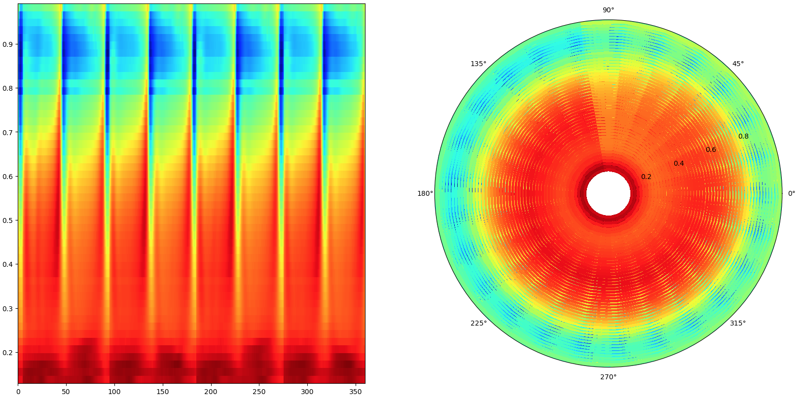
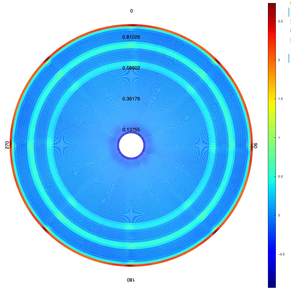
Looking through the HoloViews Gallery the only thing I could find that was close to the type of plot I needed was the Radial HeatMap.
I found that the HeatMap tends to have a gap between elements that causes aliasing effects when the data resolution is large. For rectangular HeatMaps there is a dilate option that does a pretty good job of removing the gaps in my case, but the dilate option does not work with the radial=True option.
The aliasing is perhaps easier to see in this image:
When I try to add dilate=True and radial=True I get this error:
unexpected attribute ‘dilate’ to AnnularWedge, possible attributes are direction, end_angle, end_angle_units, fill_alpha, fill_color, hatch_alpha, hatch_color, hatch_extra, hatch_pattern, hatch_scale, hatch_weight, inner_radius, inner_radius_units, js_event_callbacks, js_property_callbacks, line_alpha, line_cap, line_color, line_dash, line_dash_offset, line_join, line_width, name, outer_radius, outer_radius_units, start_angle, start_angle_units, subscribed_events, syncable, tags, x or y
It’s unclear if AnnularWedge is a HoloViews object or a Bokeh object, so I’m not sure where to request that the dilate option be added.
In any case as mentioned in this Bokeh issue, perhaps a HeatMap is not the best option for my “image-scale” data anyway. I would love to be able to use an hv.Image with radial=True but I can’t tell if this is just a HoloViews API request, or if Bokeh would even support it.
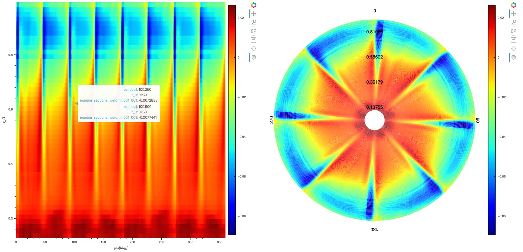
Radial HeatMap Labels
The other obstacle with the Radial HeatMap is that to get the orientation in standard form for a rotorcraft plot I needed to set invert_xaxis=True and start_angle=math.pi
hv.HeatMap(data[var].sel(**opts), kdims=['psi[deg]', 'r_R']).opts(
    invert_xaxis=True, start_angle=math.pi,
    radial=True, width=900, height=900, cmap='jet', title=f'Run {run}', colorbar=True, tools=['hover']
)
This makes the 0 and 180 degree labels move to the inside of the plot for some reason:
I’d also like to make all of the x-tick labels be oriented upwards.
Filled Contour Plots
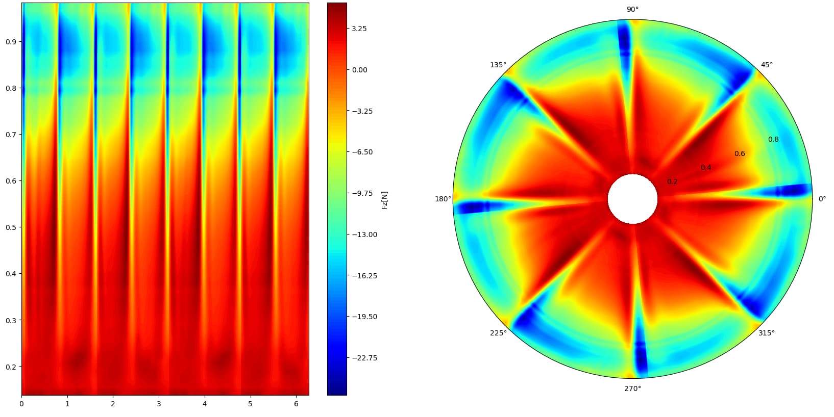
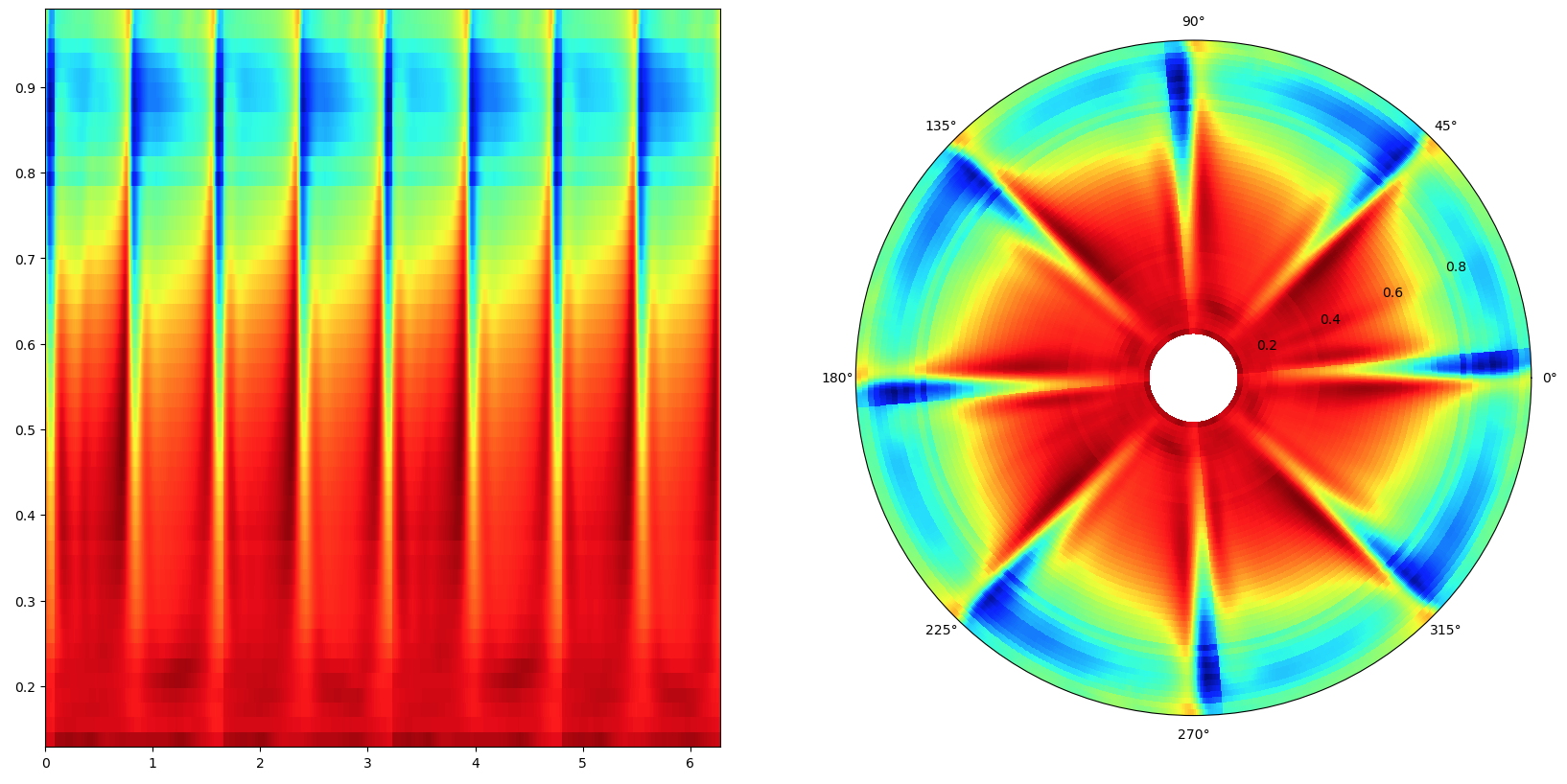
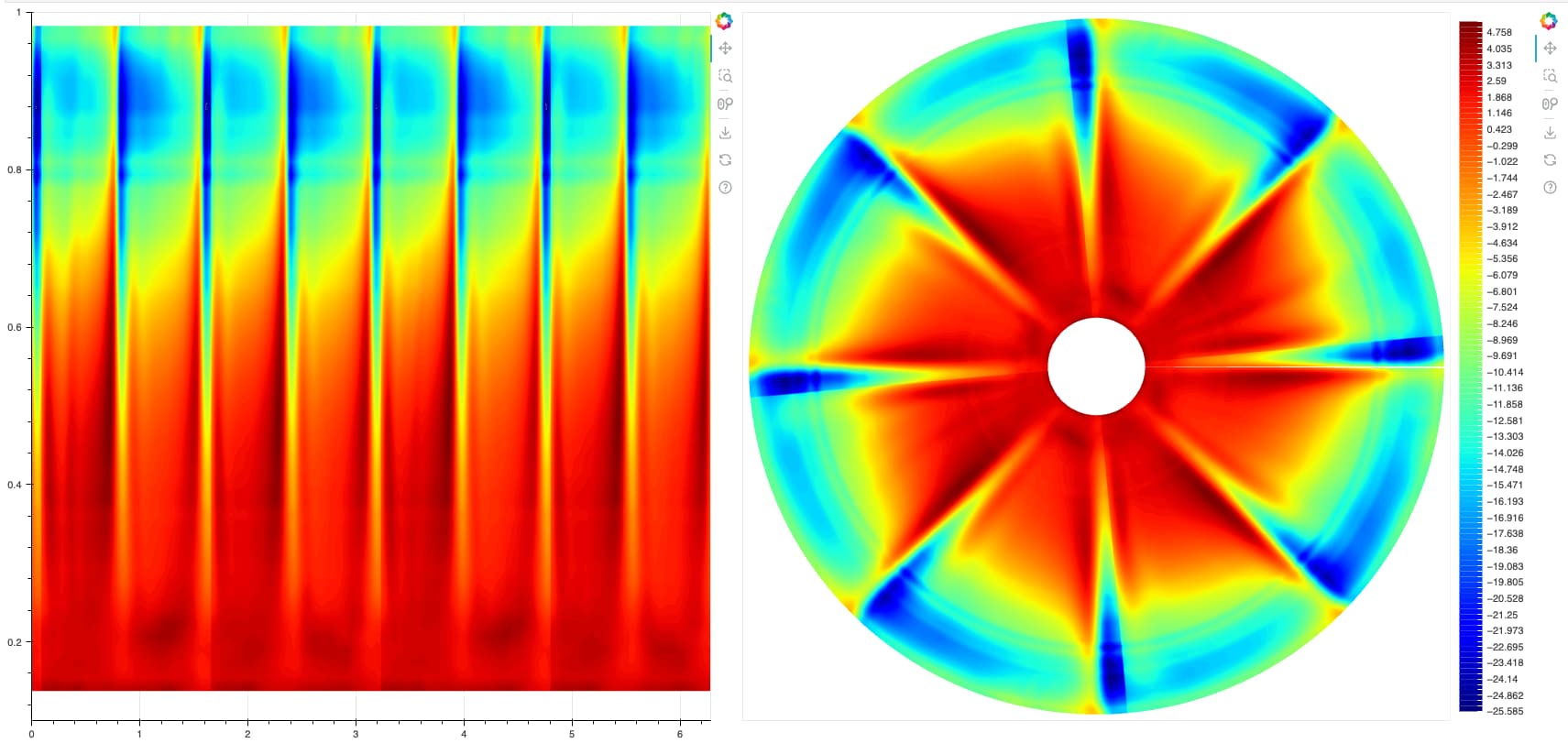
I haven’t been able to find support for any filled contour plots in HoloViews. It seems like Matplotlib and Plotly both support them, but I don’t think Bokeh does. Matplotlib seems to be the only library that “supports” polar coordinates for a filled contour plot, however, while it will generate a polar plot, the contouring algorithm seems to not support polar coordinates well. (I realize this is an issue with Matplotlib or perhaps ContourPy, but I’ll list it here for reference/completeness).
In both these examples the rectangular coordinates represent the data well, but the data are very obscured when plotted in polar coordinates:
fig = plt.figure(figsize=(20, 10))
gs = fig.add_gridspec(1, 2)
ax1 = fig.add_subplot(gs[0, 0])
ax2 = fig.add_subplot(gs[0, 1], projection='polar')
ax2.set_ylim(0, dX['r_R'][-1])
levels = 128
orig_map=cm.get_cmap('RdYlBu')
BuYlRd = orig_map.reversed()
plt.grid(False)
ax2.subplot_kw=dict(projection='polar')
f1 = ax1.contourf(dX['psi[deg]'], dX['r_R'], dX.values.T, levels, cmap='jet', origin='image')
f2 = ax2.contourf(dX['psi[deg]'], dX['r_R'], dX.values.T, levels, cmap='jet', origin='image')
c1 = fig.colorbar(f1)
c1.set_label(str(var))
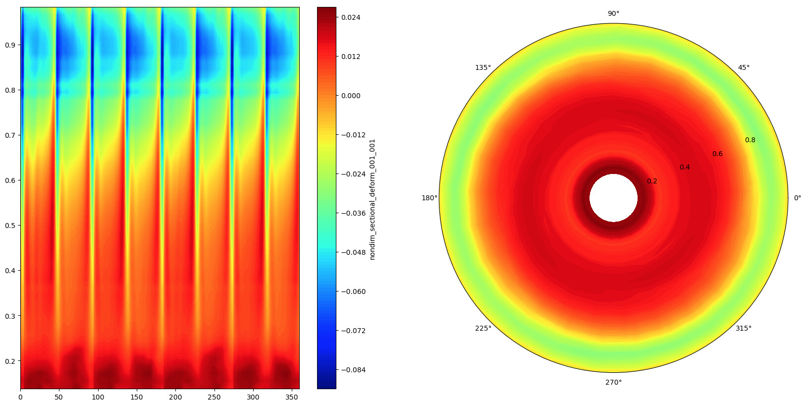
fig = plt.figure(figsize=(20, 10))
gs = fig.add_gridspec(1, 2)
ax1 = fig.add_subplot(gs[0, 0])
ax2 = fig.add_subplot(gs[0, 1], projection='polar')
plt.grid(False)
ax1.pcolormesh(plot_data['psi[deg]'], plot_data['r_R'], plot_data.values.T, cmap="jet", shading='auto')
ax2.pcolormesh(plot_data['psi[deg]'], plot_data['r_R'], plot_data.values.T, cmap="jet", shading='auto')
plt.show()