Hello !!
A week ago I saw this issue in bokeh about react grid layout https://github.com/bokeh/bokeh/issues/10276 . React grid layout (https://github.com/STRML/react-grid-layout)
is a grid layout system for React. It is responsive and supports breakpoints.
After a while I could adapt to work in panel while serving static-dirs (panel serve --show pnrct.py --static-dirs assets=./assets).
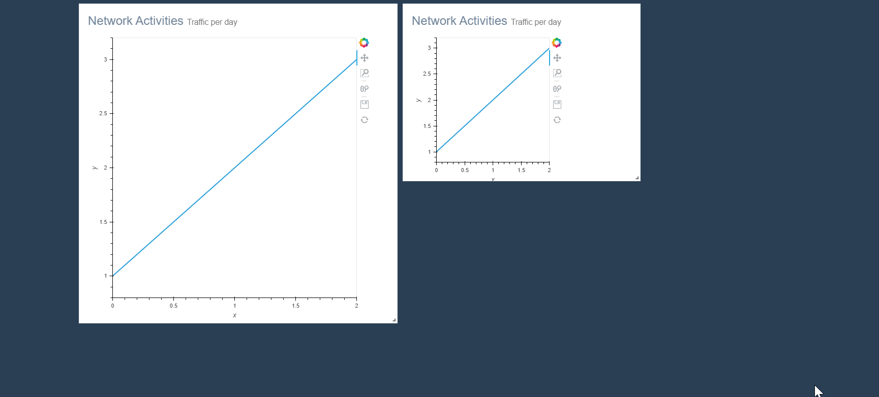
Here is the repository where the code can be seen. https://github.com/nghenzi/panel-react . A snapshot of the react grid layout working is here
I use the templates of panel
import panel as pn
import holoviews as hv
from holoviews import dim, opts
from jinja2 import Environment, FileSystemLoader

hv.extension('bokeh')

env = Environment(loader=FileSystemLoader('.'))
jinja_template = env.get_template('./index.html')

tmpl = pn.Template(jinja_template)

tmpl.add_panel('A', pn.Row(hv.Curve([1, 2, 3]).opts(responsive=True),
                            sizing_mode='scale_both',
                            margin=(0,0,50,0)
                            )
                )
tmpl.add_panel('B', hv.Curve([1, 2, 3]))
tmpl.add_variable('title', 'Custom Template')

tmpl.servable('title')
and the template is
{% extends base %}
{% block preamble %}

  <!-- Bootstrap -->
  <link rel="stylesheet" href="https://maxcdn.bootstrapcdn.com/bootstrap/3.3.7/css/bootstrap.min.css">
  <!-- Font Awesome -->
  <link rel="stylesheet" href="https://maxcdn.bootstrapcdn.com/font-awesome/4.7.0/css/font-awesome.min.css">
  <!-- react-grid-layout css-->
  <link rel="stylesheet" href="assets/css/react-grid-layout.css">
  <!-- react-resizable css-->
  <link rel="stylesheet" href="assets/css/react-resizable.css">
  <!-- React development assets -->
  <link href="assets/css/custom.min.css" rel="stylesheet">
  <script src="https://unpkg.com/react@16/umd/react.development.js" crossorigin></script>
  <script src="https://unpkg.com/react-dom@16/umd/react-dom.development.js" crossorigin></script>
  <script src="https://unpkg.com/babel-standalone@latest/babel.min.js" crossorigin></script>
  <!-- React-grid-layout script -->
  <script src="assets/js/react-grid-layout.min.js"></script>
{% endblock %}

{% block contents %}
<!-- <div id="topbarra"> Hello World</div> -->

<div class="container body">
  <div class="main_container">
     <!-- page content -->

    <div id="mydiv"></div>

  </div>
</div>
<!-- /page content -->

<!-- Load our React component. -->
<script type="text/babel">

  //react component class
  class MyFirstGrid extends React.Component {

    constructor(props) {
      super(props);
      this.A = '{{ embed(roots.A) }}';
      this.B = '{{ embed(roots.B) }}';
    }

  get_data_root_id(tag_str){
      return tag_str.split('data-root-id=')[1].split('"')[1]
  }

  resize_layout(obj, old_, new_, p, e, element) {
    window.Bokeh.index[new_['i']].resize_layout();
  }

  render() {
    // layout is an array of objects, see the demo for more complete usage
    const layout = [
           {i: this.get_data_root_id(this.A), x: 1, y: 6, w: 10, h: 6},
           {i: this.get_data_root_id(this.B), x: 1, y: 6, w: 10, h: 6}
    ];

    console.log(this.parent)
    return <ReactGridLayout  className="layout"   layout={layout}             cols={12}
              rowHeight={30}    width={window.screen.width}         onResize={this.resize_layout}
              margin={[10,10]}   draggableCancel='.bk-root'>

            <div key={this.get_data_root_id(this.A)} className="x_panel tile">
              <h3>Network Activities <small>Traffic per day</small></h3>
              <div className="clearfix"></div>
              {{ embed(roots.A) }}
            </div>

            <div key={this.get_data_root_id(this.B)} className="x_panel tile">
              <h3>Network Activities <small>Traffic per day</small></h3>
              <div className="clearfix"></div>
              {{ embed(roots.B) }}
            </div>


      </ReactGridLayout>
  }
}

ReactDOM.render(<MyFirstGrid />, document.getElementById('mydiv'))
</script>

{% endblock %}
Now I’m trying to use the Responsive grid layout (import { Responsive as ResponsiveGridLayout } from ‘react-grid-layout’;), but I need the import and they don’t work on the client. Can you imagine how to use it? I need to do something else? I tried to import Requirejs because in the console appears the errors (Uncaught ReferenceError: require is not defined) but it doesn’t work. Do I need to build a custom panel extension ? some guideline or clue will be very grateful.