Rename Legend names and formatting box

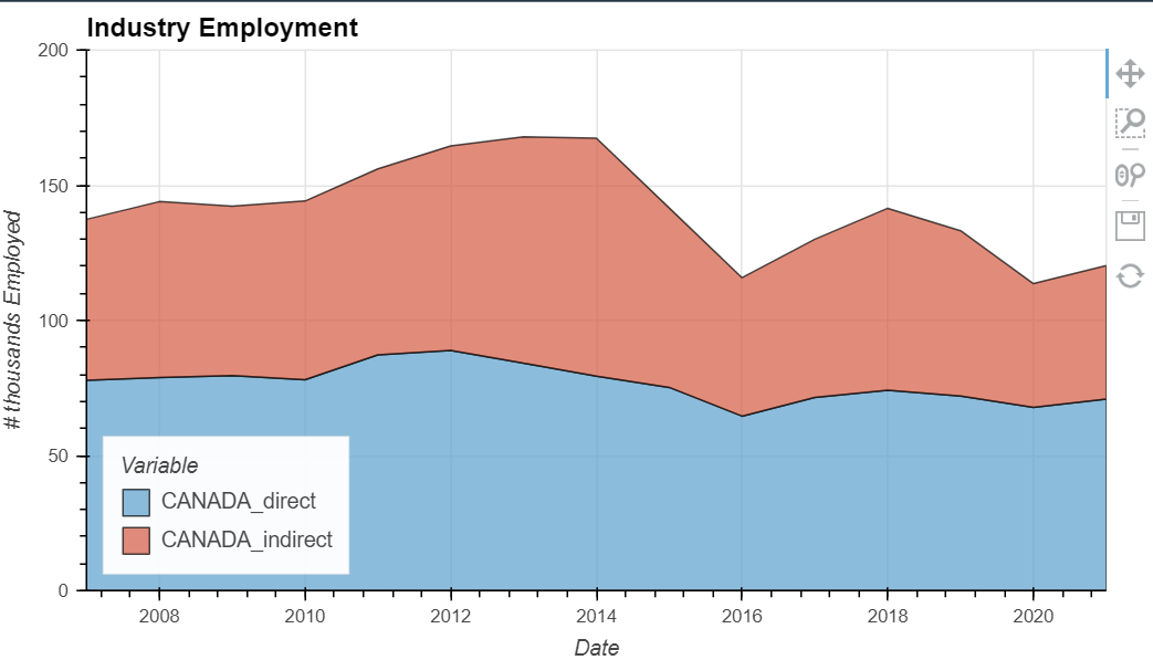
I have a few examples where I’m using hvplot to make life a bit quicker, but I get stuck especially when the variable name is really large or ugly… for instance in the example below the legend will show ‘CANADA_direct’ and I would just like to relabel the legend name to ‘direct’ so it takes less space.

labo_curves = labo_summary2.hvplot.area(x='Date', 
                                       y=['CANADA_direct', 'CANADA_indirect'], 
                                       value_label='# thousands Employed',
                                       xlim=[2007,2021],
                                       ylim=[0,200],
                     height=400,
                     width=700,
                     stacked=True,
                     hover=False,
                     grid=True,
                     alpha=0.7,
                     title='Industry Employment').opts(legend_position='bottom_left')
labo_curves.opts(hooks=[remove_bokeh_logo], width=700, height=400, shared_axes=False)

My second question is for area charts, the bug that shows ??? still happens so I turn off hover info. What do you guys do to work around this issue ?

I think the easiest way to do it is to rename the column name beforehand.

the bug that shows ??? still happens

Yes. This is a bug. See here. I would do the same thing as you and disable it until it has been fixed.

darn , makes sense . Shouldve just done that , figured there was an option i could pass there.

I was wondering if I overlay a stacked line chart on top with the same data , what is the ideal way so that the colors match up , is there a standard dictionary they cycle through in a certain order . And maybe how do i change that for all the plots in 1 single notebook at the beginning

Sorry last question, Ive noticed that when i launch a Panel app with the same plot the legend background goes from a milky white to almost transparent . Is that some interplay between bokeh taking over from holoviews ?