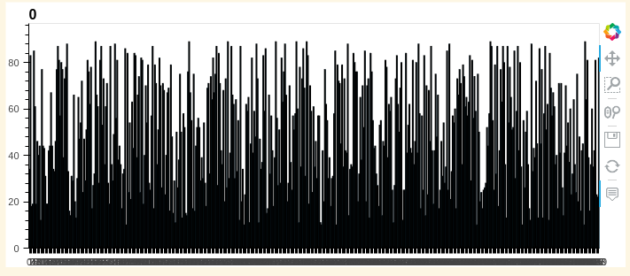
which is not that useful due to the number of bars displayed. A user can manually zoom in to get something like this:
(since I’m a new user, I’m not allowed to put more than one image - I’ll add the image that should have been here as a comment)
but in cases where the number of bars is expected to be high it’s not a good user experience to have them always zoom in.
Is there a way to set the starting position and zoom level (preferably in the number of bars displayed in the case of a bar chart)? So e.g. display first 50 bars or last 50 bars or something of sorts (while still allowing the user to zoom out and see some other part of the chart)?
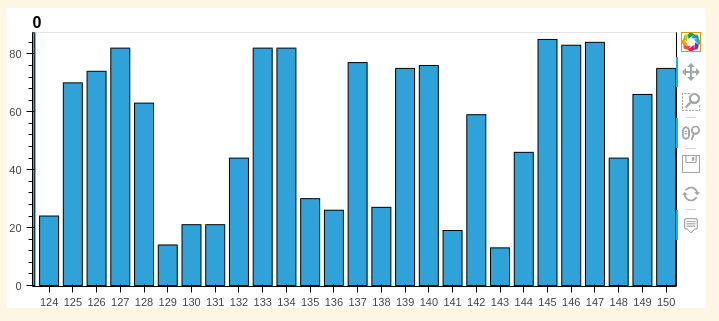
I’m not aware if you have some kind of control over the zoom tool as such but if you know your data size then you can simply manually set the x axis range for example something like this: (not tried but think it’ll work)
s.hvplot.bar(xlim=(124,150))
If the x is going to vary between data sets you could add in some method to get the length and subtract an amount to get the tail or plus an amount from zero or find the middle plus minus and set the xlim appropriately. Something to this effect, but I’d maybe have a graph on the side showing the full picture or ensure user is aware there is more to be seen
#To find the last fifty bars
import hvplot
import pandas as pd
import numpy as np

s = pd.Series(np.random.randint(10, 90, 500))

x_max = len(s)
x_min = x_max - 50 # random number probably better with a percentage of max length

s.hvplot.bar(xlim=(x_min,x_max))
interestingly if you reset the graph not sure if it’ll reset to your new defined x or take the max x resulting in initial picture.
Out of curiosity, what kind of data is that? I’m asking as indeed HoloViews, on which hvPlot is based, expects Bar plots to take care of categorical data only.
Hm… That’s interesting. I guess the docs are clear there:
The Bars Element uses bars to show discrete, numerical comparisons across categories. One axis of the chart shows the specific categories being compared and the other axis represents a continuous value.
Given that, what would be the correct element to use here - Rectangles perhaps?
Histogram doesn’t look like a correct element for time series, no?