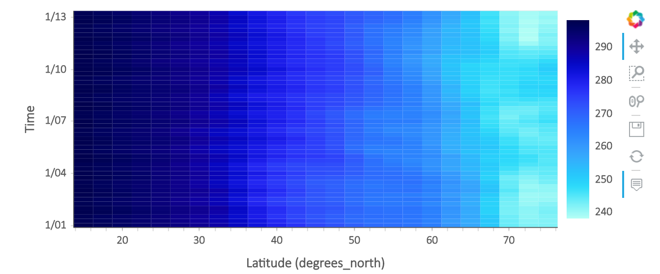
After updating to the latest holoviews, the heatmaps now hide some tick labels. In most cases, this is desirable, but is there a way to revert to the old behavior of showing every label?
import xarray as xr
import hvplot.xarray
ds = xr.tutorial.open_dataset('air_temperature').isel(time=slice(0, 50))
ds.mean('lon').hvplot.heatmap('lat', 'time', 'air')
I tried providing yticks, but it shows None:
import xarray as xr
import hvplot.xarray
ds = xr.tutorial.open_dataset('air_temperature').isel(time=slice(0, 50))
ds.mean('lon').hvplot.heatmap('lat', 'time', 'air').opts(yticks=ds['time'].values.tolist())
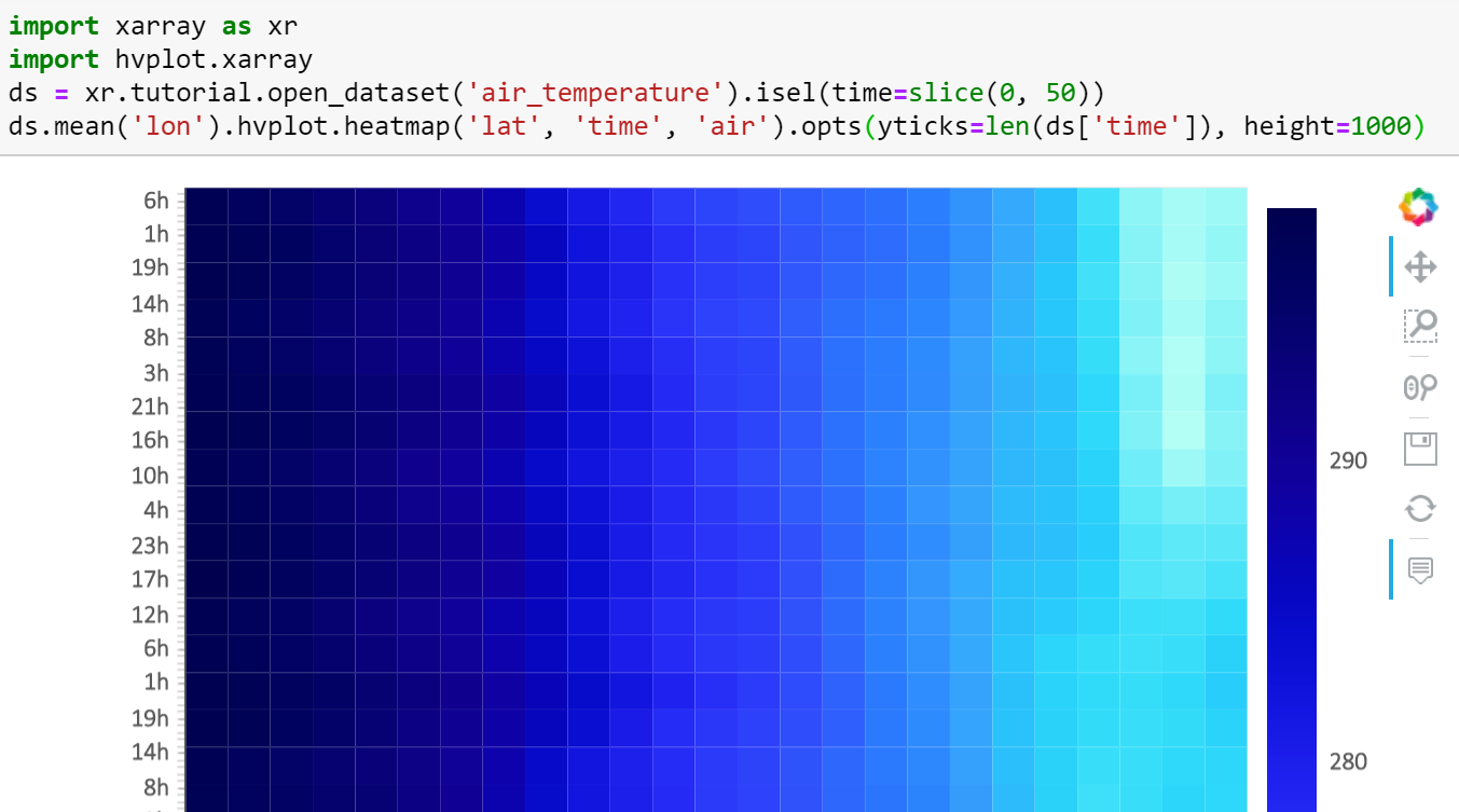
I also tried providing number of yticks, but it abbrieviates it awkwardly
import xarray as xr
import hvplot.xarray
ds = xr.tutorial.open_dataset('air_temperature').isel(time=slice(0, 50))
ds.mean('lon').hvplot.heatmap('lat', 'time', 'air').opts(yticks=len(ds['time']), height=1000)
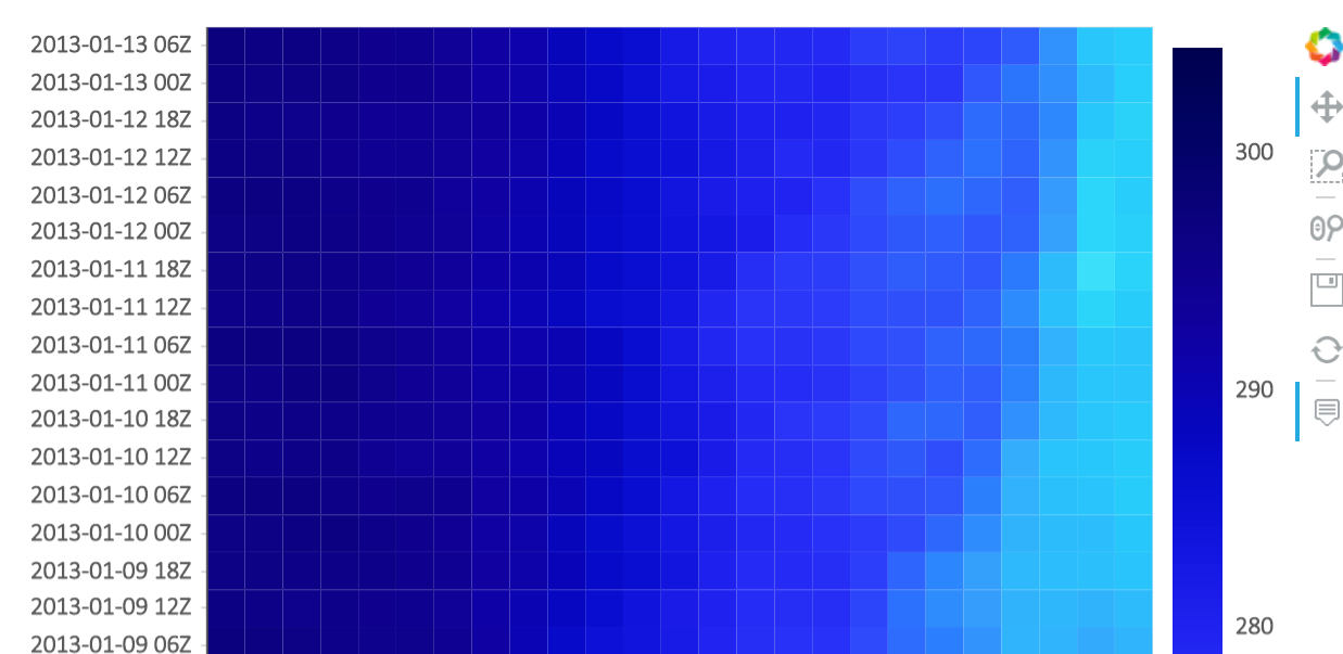
Ah, just had to pre-format the datetime
import xarray as xr
import hvplot.xarray
ds = xr.tutorial.open_dataset('air_temperature').isel(time=slice(0, 50))
ds['time'] = ds['time'].dt.strftime('%Y-%m-%d %HZ')
ds.hvplot.heatmap('lat', 'time', 'air').opts(height=1000)