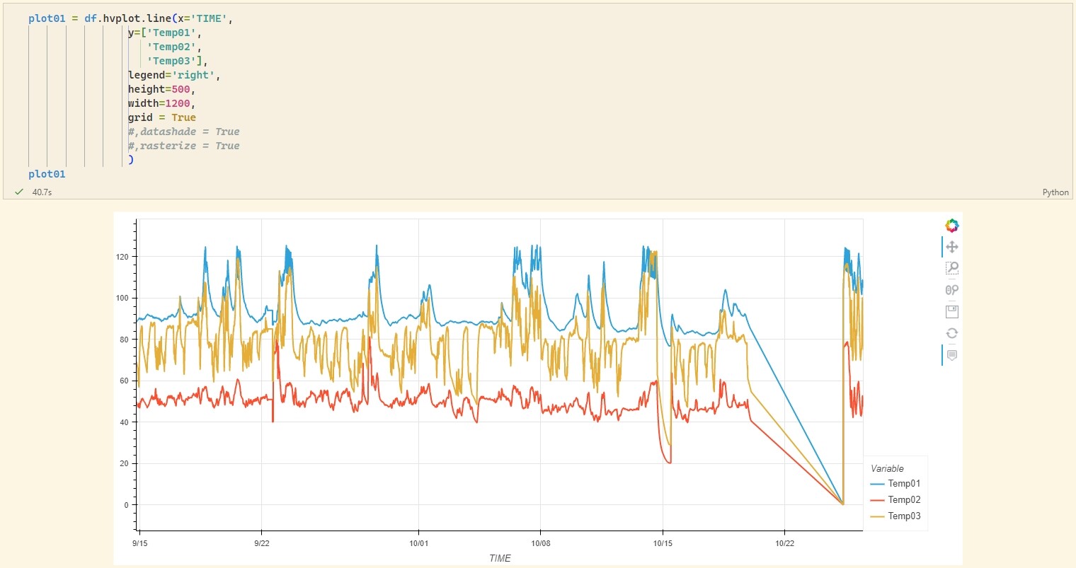
Hi all, I just started using hvPlot and I’m not very proficient at it. I usually plot timseries with large datasets (>5 Million points). Plotting all the dataset at once with hVplot is very slow and the output interactivity freezes/hangs all the time (output is usually > 500MB).
I was wondering if, using Jupyter notebooks, there is an option in hvPlot to plot the graph as a static image to take a first glance of the data so I can afterwards select a smaller subset of the dataframe.
I do know I could save the image as a static image or use another library, but this is not the point since I would like to do everything at once in a Jupyter noptebook output with hvPlot directly if possible.
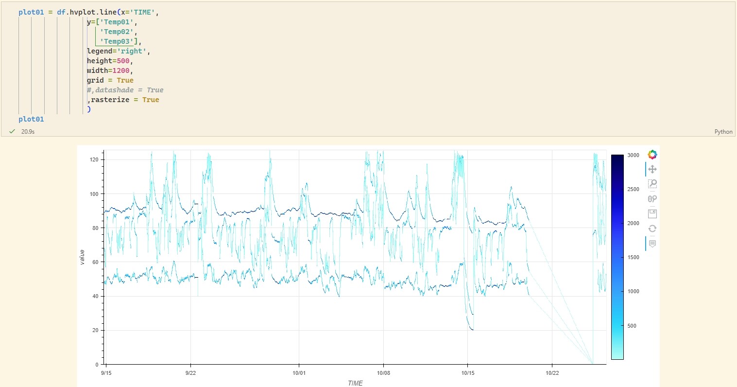
It seems like what you are asking for is exactly what Datashader is for. Try installing Datashader (also part of the holoviz ecosystem) and changing your code to something like this df.hvplot(..., datashade=True).
Yes, though I’d recommend rasterize=True for a better experience in most cases. Both datashade and rasterize call Datashader to get a static image, but rasterize gets the raw data as an array that Bokeh can then display, so it supports more features like hovering and colorbars, while datashade returns the output fully rendered down into an RGB image that Bokeh can only display and not report any information about.
Thanks for your replies. I’ve tried both options and the gains in time to get the output are outstanding.
I have a problem though, using those opts (datashade=True or rasterize=True) plots all the variables in a similar color and I don’t know what is what. You can see the original variables and the plot with datashade and rasterize in the attached images.
Is there any way to have different colors for each one of the variables when using datashade/rasterize?
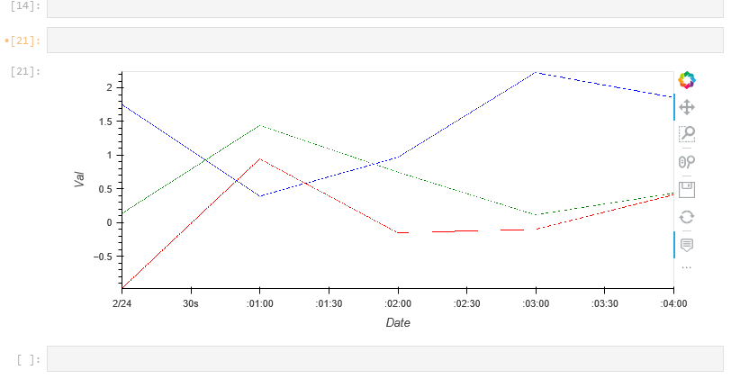
you could maybe do something like this but I’m sure there’s a nicer way to loop the cmap through the lines… instead of 3 plots however addapting the below will maybe work for you
import pandas as pd
import numpy as np
import hvplot
import hvplot.pandas
np.random.seed(0)
# create an array of 5 dates starting at '2015-02-24', one per minute
rng = pd.date_range('2015-02-24', periods=5, freq='T')
df = pd.DataFrame({ 'Date': rng, 'Val': np.random.randn(len(rng)),'Val2': np.random.randn(len(rng)),'Val3': np.random.randn(len(rng)) })
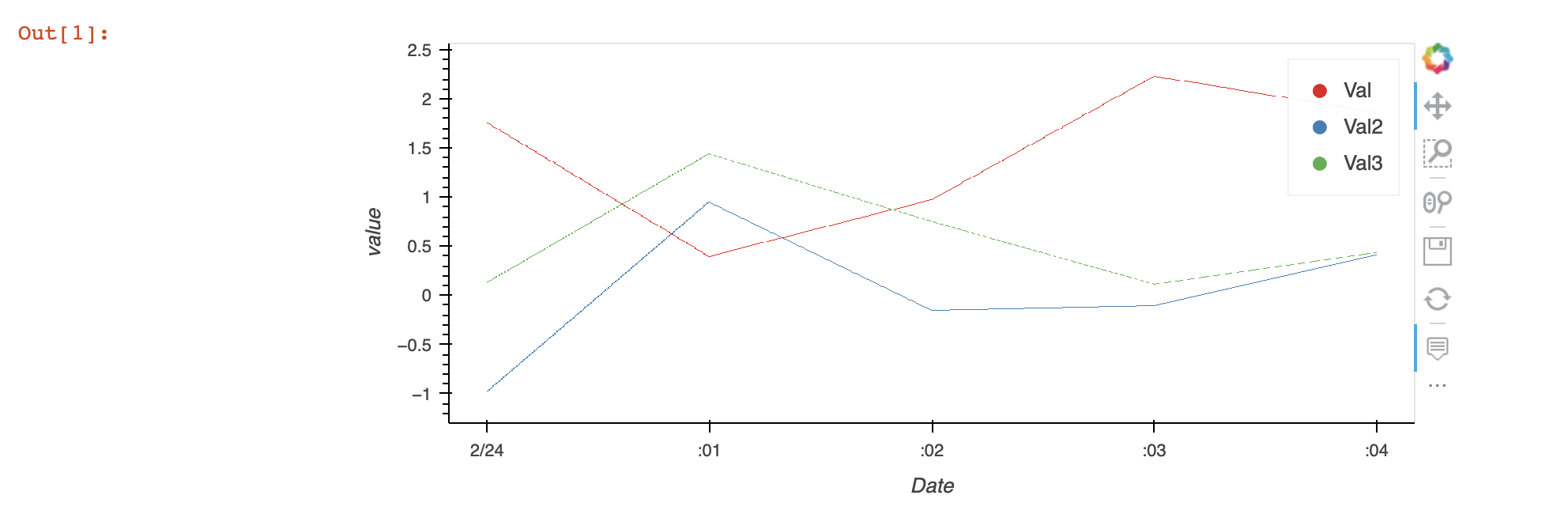
plot1 = df.hvplot.line(x='Date',y=['Val'], rasterize=True,cmap=['blue'])
plot2 = df.hvplot.line(x='Date',y=['Val2'], rasterize=True,cmap=['red'])
plot3 = df.hvplot.line(x='Date',y=['Val3'], rasterize=True,cmap=['green'])
plots = plot1*plot2*plot3
plots
For myself this goes down a rabit hole, it doesn’t feel like the right direction to me that I’m suggesting but a couple of possibles from what I’ve red you could simply:
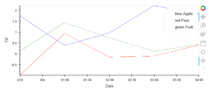
The legend doesn’t end up with any color so that’s why the text, don’t click it either as that part doesn’t function well for me but that said it will get a label on the screen so you can identify the traces.
I’ve read here you can build a legend if you like (look for multi dimensional plots just over half way down the page https://holoviews.org/user_guide/Large_Data.html), I use this but haven’t tried to use it in conjuction with hvplot and wasn’t able to quickly join the holoviews and hvplot together though I’m certain it’s possible I just can’t help but think none of this is the right way. For me if you redid your graphs in holoviews you would be able to add this colorful legned or someone might know how to join the hvplot and holoviews component together that or have a better solution for you here.
import holoviews as hv
from datashader.colors import Sets1to3 # default datashade() and shade() color cycle
color_key = [('val','red'), ('val2', 'blue'), ('val3', 'green')]
color_points = hv.NdOverlay({k: hv.Points([0,0], label=str(k)).opts(color=v, size=0) for k, v in color_key})

(color_points).opts(width=600).relabel(" ") #relabel to get rid of auto title
And this would create you something like but you would need to find a way to fit hvplot and holoviews together or change the hvpart to holoviews so you can easily overlay the plots with a legend.
As of now, “faking” a legend as in the Large Data notebook is your best bet. But we’ll soon be working into making that more seamless, as we add a lot more support for using Datashader with timeseries data. We expect improvements in Bokeh, Datashader, HoloViews, and hvPlot, all helping to making working with this sort of data easier. Work starts Monday, but not sure when it will all appear!
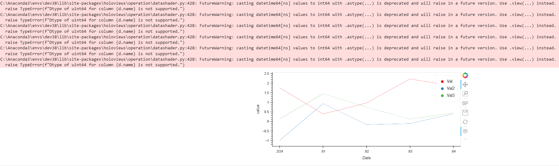
@hyamanieu , thanks for the code example! After fixing up the imports it works fine for me with no warnings with holoviews=1.14.7, hvplot=0.7.3, and datashader=0.13.0:
import pandas as pd, numpy as np, hvplot.pandas, holoviews as hv
from datashader.colors import Sets1to3

np.random.seed(0)
# create an array of 5 dates starting at '2015-02-24', one per minute
rng = pd.date_range('2015-02-24', periods=5, freq='T')
df = pd.DataFrame({'Date': rng,
                   'Val':  np.random.randn(len(rng)),
                   'Val2': np.random.randn(len(rng)),
                   'Val3': np.random.randn(len(rng)) }).set_index('Date')

cols = df.columns.tolist()
color_keys = list(zip(cols,Sets1to3[0:len(cols)]))

list_of_plots = list(df.hvplot.line(y=k, rasterize=True, cmap=[v],label=k) for k, v in color_keys)
interesting_plot = hv.Overlay(list_of_plots)

color_points = hv.NdOverlay({k: hv.Points(data = {'Date': [rng[0].to_datetime64()],'value':[0]},
                                          kdims=['Date','value'],label=str(k)).opts(color=v,size=0)
                             for k, v in color_keys})

color_points*interesting_plot.collate()
Well you’re right, I’m using holoviews ‘1.14.8’ and there is no warning today, even with my code
(yes, importing hvplot alone was not useful).
The issue with datetime is always the same: it’s a bit hard to get it to work as intended. Since the beginning with Bokeh I had issue with that. The trick was do use the .to_datetime64() method. I’ll try to find some time to address it, at least in the documentation.