As I write in the PR I basically see 3 types of stats card primitives
StatsTextCard: Value and Text
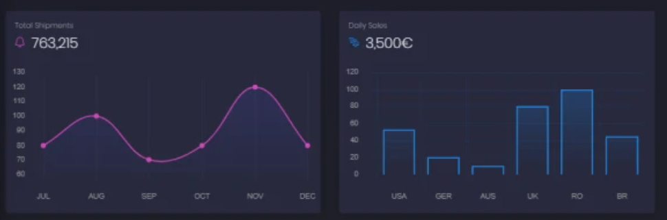
StatsPlotCard: Value and Plot (like above)
StatsProgressCard: Value and Progress indicator
They can then be arranged as a column or row
I have not fully figured out yet if this is really true and also how they should look so feel free to throw in some pictures or description of stats cards that would be nice to have in Panel.
I am also thinking wether the StatsCards are what is needed or if its more easy to use primitives for streaming like the stackline plots in the example above.
@nghenzi and @ea42gh are also working on streaming or indicators so check out their posts as well
What do you mean by “if this is true”?
I’m not really an ace at front end designing, but I can see a usage for the one shown above. It’s only lacking units on the plot, but I can see the difficulty is to show enough information without cluttering.
Units could be indicated outside of the Card if several cards are there (e.g. indicating that each bar represents an hour), like a legend. Or the purpose is to show a trend, but there is always the question “where is the zero?” (something journalists use a lot to make sensational minimal changes).
I like the Echarts, however I failed at using them last time (I believe I posted or commented an issue).