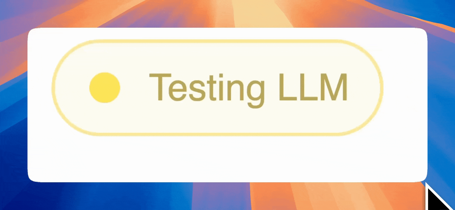
Pretty cool; just had to inherit Button and add stylesheets
class StatusBadge(Button):
    """
    A customizable badge component that can show different statuses with visual effects.
    """

    status = param.Selector(
        default="pending", objects=["pending", "running", "success", "failed"]
    )

    _base_stylesheet = """
    :host {
        position: relative;
    }

    /* Base badge styles */
    .bk-btn {
        border-radius: 16px !important;
        padding: 6px 10px !important;
        transition: all 0.3s ease;
        cursor: not-allowed;
        pointer-events: none !important;
    }

    .bk-btn .bk-TablerIcon {
        display: inline-flex;
        border-radius: 50%;
        margin-right: 5px;
        margin-bottom: 2px;
    }

    .bk-btn .bk-TablerIcon path {
        stroke: inherit;
        fill: inherit;
    }
    """

    # Status-specific stylesheets
    _status_stylesheets = {
        "pending": """
            /* Badge pending state */
            .bk-btn {
                background-color: #f0f0f0 !important;
                border-color: #d0d0d0 !important;
                color: #606060 !important;
            }

            .bk-btn .bk-TablerIcon {
                color: #808080 !important;
            }

            .bk-btn .bk-TablerIcon path {
                stroke: #808080;
                fill: #808080;
            }
        """,
        "running": """
            /* Badge running state */
            .bk-btn {
                background-color: #fffceb !important;
                border-color: #ffe066 !important;
                color: #997a00 !important;
            }

            .bk-btn .bk-TablerIcon {
                color: #FFD700 !important;
                animation: pulse-gold 2.5s infinite;
            }

            .bk-btn .bk-TablerIcon path {
                stroke: #FFD700;
                fill: #FFD700;
            }

            @keyframes pulse-gold {
                0% {
                    box-shadow: 0 0 0 0 rgba(255, 215, 0, 0.7);
                }
                70% {
                    box-shadow: 0 0 0 7px rgba(255, 215, 0, 0);
                }
                100% {
                    box-shadow: 0 0 0 0 rgba(255, 215, 0, 0);
                }
            }
        """,
        "success": """
            /* Badge success state */
            .bk-btn {
                background-color: #e8f5e9 !important;
                border-color: #a5d6a7 !important;
                color: #2e7d32 !important;
            }

            .bk-btn .bk-TablerIcon {
                color: #4CAF50 !important;
            }

            .bk-btn .bk-TablerIcon path {
                stroke: #4CAF50;
                fill: #4CAF50;
            }
        """,
        "failed": """
            /* Badge failed state */
            .bk-btn {
                background-color: #ffebee !important;
                border-color: #ef9a9a !important;
                color: #c62828 !important;
            }

            .bk-btn .bk-TablerIcon {
                color: #f44336 !important;
            }

            .bk-btn .bk-TablerIcon path {
                stroke: #f44336;
                fill: #f44336;
            }
        """,
    }

    # Status mapping for other properties
    _status_mapping = {
        "pending": {
            "icon": "circle",
        },
        "running": {
            "icon": "circle-filled",
        },
        "success": {
            "icon": "circle-check",
        },
        "failed": {
            "icon": "circle-x",
        },
    }

    _rename = {
        "status": None,
        **Button._rename,
    }

    def __init__(self, **params):
        super().__init__(**params)
        self.param.update(
            icon=self.param.status.rx().rx.pipe(
                lambda status: self._status_mapping[status]["icon"]
            ),
            stylesheets=self.param.status.rx().rx.pipe(
                lambda status: [self._base_stylesheet, self._status_stylesheets[status]]
            ),
        )