I’m basically plotting a DataFrame with a bunch of sinewaves with code like
def _timeplot(data, cols=[]):
    traces = {k: hv.Curve((data.index, data[k]), 'time', 'amplitude') for k in cols}
    if not traces:
        traces = {"dummy": hv.Curve([])}
    return hv.NdOverlay(traces, kdims='k')

def timeplot(streams):
    curve_dmap = hv.DynamicMap(_timeplot, streams=streams)
    return dynspread(datashade(curve_dmap, aggregator=ds.count_cat('k')))
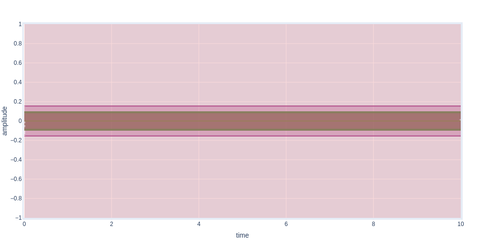
When fully zoomed out, the sine wave fills the entire view and becomes transparent. Understandable, because the lowest density is basically the plot, rather than the background.
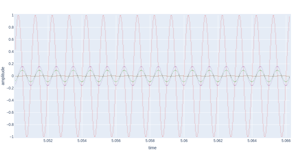
At some zoom levels aliasing occurs leading to a low-frequecy sine being visible. I guess it’s to be expected, but it’s a bit ugly.

At some zoom levels the plot is really pixelated.
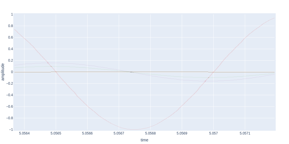
And at others extremely thin
If there is any way to make the result more consistent I’d love to hear it.
Note that these are some particularly weird edge cases, on most data and zoom levels the result is already pretty awesome.