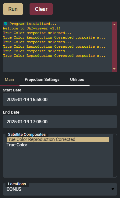
I am struggling to figure out how to stylize the select widget components with CSS. When I do not have active focus on the widget, the intended design exists (gold background, dark font for the selected option):
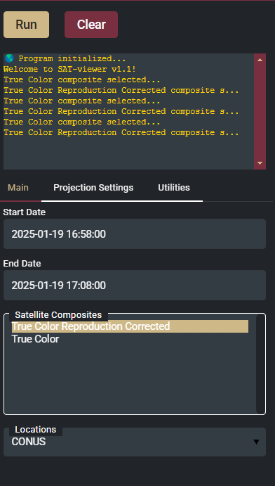
However, when I actively select/focus the widget, it turns the active option font color back to white:
Here is my CSS styling (that changes the gradient background color thanks to @Marc but doesn’t appear to change the font color)
select option:focus,
select option:active,
select option:checked
{{
    background: linear-gradient({theme_settings['secondary_color']},{theme_settings['secondary_color']});
    background-color: {theme_settings['secondary_color']} !important;
    color: {theme_settings['dark_font']} !important;
    text-shadow: none !important;
}}
My second styling question is regarding the dropdown arrow for the select widget.

This seems to be an svg that is set to the color black. Is there any way to change the dropdown arrow/svg color in CSS as well?
select:not([multiple]).bk-input, select:not([size]).bk-input {
    background-image: url(data:image/svg+xml;utf8,<svg version="1.1" viewBox="0 0 25 20" xmlns="http://www.w3.org/2000/svg"><path d="M 0,0 25,0 12.5,20 Z" fill="black" /></svg>);
    min-height: 1.4375em;
    padding: 8px 10px;
}