Hi all,
Is that any functionality to have symmetry shading as we have in power bi scatter plot?
thanks
Hi all,
Is that any functionality to have symmetry shading as we have in power bi scatter plot?
thanks
Never used Power BI, but sounds like symmetric=True does what you want. Customization — hvPlot 0.9.0 documentation
Hi @ahuang11 thanks for your suggestion however I couldn’t get anything. I just put symentric = True and there is no shading plot at all, actually what I want is I have a plot of point forecast something then I have 1:1 diagonal line or upper and lower bound as specify then all points forecast below of the area means our forecast is too optimistic and above means our previous forecast is pesimistic because in actual we get higher that forecast.
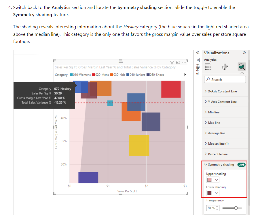
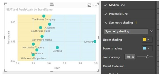
I am copy the explanation form microsoft power bi regarding symmetry shadding
Symmetry shading is a new analytics feature that allows you to easily see which points have a higher value of the x-axis measure compared to the y-axis measure and vice versa. When you turn symmetry shading on in the Analytics pane, we’ll shade the background of your scatter chart symmetrically based on your current axis bounds. This is a very quick way to identify which measure a data point favors, especially when you have a different axis range for your x- and y-axis
Hi @ahuang11 , I just found probably we can use patching in matplot or multipolygon in bokeh plot. however how we can combine multipolygon in hv scatter plot. can we?
using bokeh for example:
# import modules
import panel as pn
pn.extension()
from bokeh.io import output_file, show
from bokeh.layouts import row
from bokeh.plotting import figure
from bokeh.io import output_notebook
import numpy as np
import random
output_notebook()
# create a new plot
# instantiating the figure object
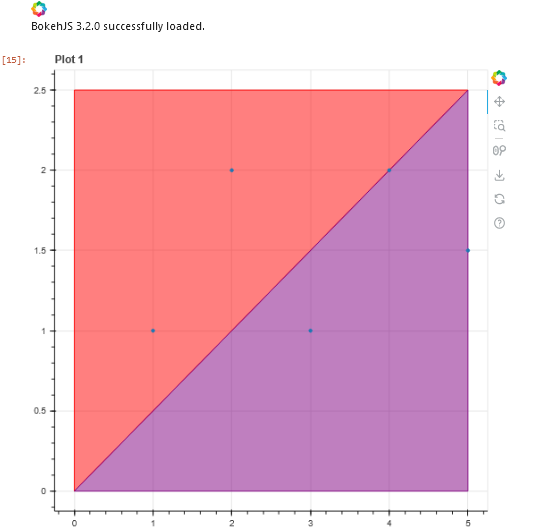
fig1 = figure(title="Plot 1")
# coordinates
x = [[[[0, 5, 0, 0]]],
[[[5, 0, 5]]]]
y = [[[[2.5, 2.5, 0, 2.5]]],
[[[2.5, 0, 0]]]]
# color values of the polygons
color = ["red", "purple"]
# fill alpha values of the polygons
fill_alpha = 0.5
# plotting the graph
fig1.multi_polygons(x, y,
color=color,
fill_alpha=fill_alpha)
# the points to be plotted
x = [1, 2, 3, 4, 5]
y = [1, 2, 1, 2, 1.5]
# plotting the graph
fig1.scatter(x, y)
# depict visualization
bokeh_pane = pn.pane.Bokeh(fig1, theme="dark_minimal")
bokeh_pane
Hi sorry I don’t quite understand your question, can you try rephrasing? Maybe this?
https://holoviews.org/reference/elements/matplotlib/Polygons.html
Hi @ahuang11 , sorry to make confuse.
thanks for your link. will try to use it.