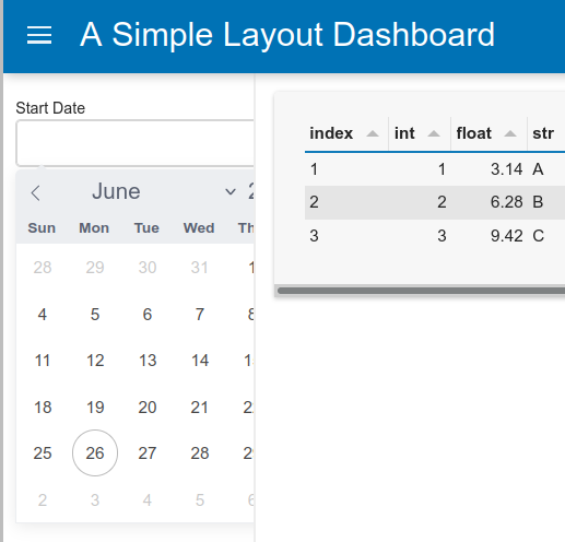
I would like to put the Datepicker widget inside the sidebar in FastListTemplate. However I dislike the size of the sidebar and decide to reduce it to 200px. But then I found out that doing so will make the Datepicker input area got covered by the main area as it is longer than the sidebar, moreover when the widget is clicked, some part of the calendar also got covered by the calendar.

I think it would be nice if the Datepicker input area size can be updated (whether manually or automatically) to fit inside the sidebar. Also it would be great if the calendar is positioned above the main area so that it will not be covered even when the sidebar is smaller than the calendar.
Some snippets of the code that I am using here:
start_date = pn.widgets.DatePicker(name='Start Date')
end_date = pn.widgets.DatePicker(name='End Date')

template = pn.template.FastListTemplate(
    title="A Simple Layout Dashboard",
    sidebar=[start_date, end_date],
    sidebar_width=200,
)
