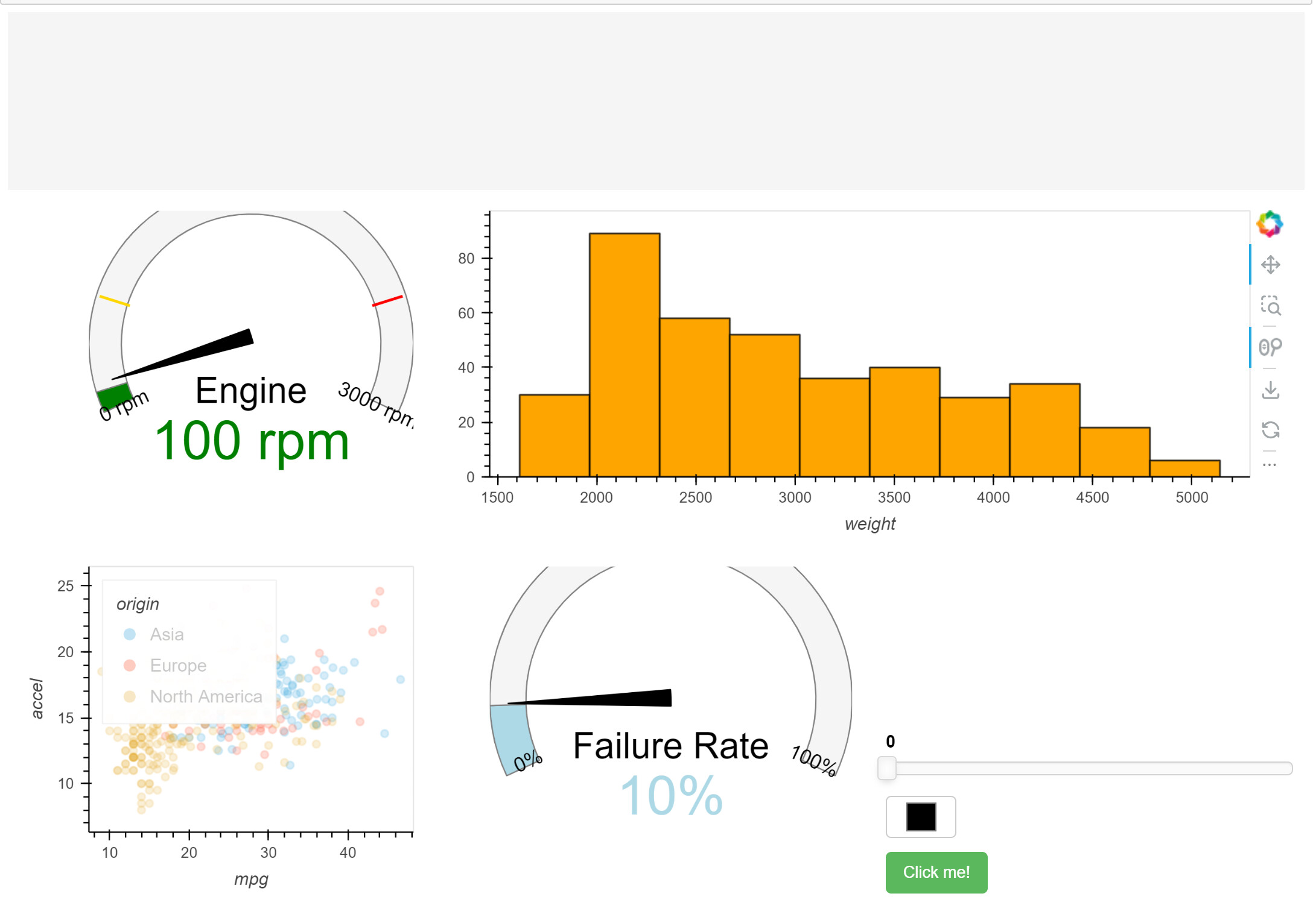
I am using the following code to have a simple layout, but the indicators do not fit into the layout and I cannot resolve it. Please help me to get control of the indicators to a desired size and to be fitted into the layout.
import panel as pn
pn.extension()
import pandas as pd
import hvplot.pandas
df = pd.read_csv(“data/autompg.csv”)
gspec = pn.GridSpec(sizing_mode=‘stretch_both’, max_height = 800)
gspec[0, :3] = pn.Spacer(styles=dict(background=‘whitesmoke’))
gspec[1:3, 0] = pn.indicators.Dial(name=‘Engine’, value = 100, bounds=(0, 3000), format = ‘{value} rpm’,
colors=[(0.2, ‘green’), (0.8, ‘gold’), (1, ‘red’)])
gspec[1:3, 1:3] = df.hvplot.hist(“weight”, bins = 10, color = ‘orange’)
gspec[3:5, 0] = df.hvplot.scatter(x = ‘mpg’, y = ‘accel’, by = ‘origin’)
.opts(legend_position=‘top_left’, legend_offset = (0, 10), legend_muted = True, toolbar = None)
gspec[3:5, 1] = pn.indicators.Dial(name=‘Failure Rate’, value=10, bounds=(0, 100))
gspec[4:5, 2] = pn.Column(
pn.widgets.FloatSlider(),
pn.widgets.ColorPicker(),
pn.widgets.Button(name=‘Click me!’, button_type = ‘success’))
gspec
The output is that it is not a well-placed dashboard: