Unlinking magically connected bar charts

Hi, I have two seperate bar charts, derived from the same Pandas data frame.
They are rendered using seperate functions, and displayed using Panel. These bar charts use seperate aggregation functions.
If I have one commented out, then the other bar chart only shows nonzero values, which is what I want. Eg it shows 3 bars, and doesn’t render the other 10 zero values.
This works for the other bar chart if the first is commented out.

The strange behaviour is when both bar charts are displayed. In this case both of the bar charts display the full x axis of 13 values, including all of the zero entries.

There must be some magic happening behind the scenes, but I cannot figure out where to look to disconnect them.
Any help would be appreciated.
Thanks!

1 Like

Hi @sk2

Welcome to the community. Would it be possible to provide a minimum reproducible example with some screenshots explaining the issue? That would make it so much easier to try to help.

1 Like

Hi, Thanks, I’ve created an MWE based on the auto mpg dataset.

import hvplot.pandas
import param
import panel as pn
import numpy as np
import holoviews as hv
from shapely.geometry import Polygon, LineString, Point
from bokeh.sampledata.autompg import autompg

import panel as pn
pn.extension()

class TestExample(param.Parameterized):
    cylinders = list(autompg["cyl"].unique())
    cylinders.insert(0, None)
    selected_cylinders = param.ObjectSelector(objects=cylinders)
    
    @param.depends("selected_cylinders")
    def filtered_full_df(self):
        data = autompg
        if self.selected_cylinders:
            data = data.query("cyl == @self.selected_cylinders")
        else:
            data = data
        return data
       
    @param.depends("selected_cylinders")
    def bar_chart(self):
        data = self.filtered_full_df()
        bars = hv.Bars(data, "yr", 'mpg',
         title="Year",
         responsive=True,
         min_height=300
         ).aggregate(function=np.count_nonzero)
        return bars
    
    @param.depends("selected_cylinders")
    def chart2(self):
        data = self.filtered_full_df()
        bars2 = hv.Bars(data, "yr", 'accel',
            title = "Mean accel",
            responsive=True,
            min_height=300
            ).aggregate(function="mean")
        return bars2
  
explorer = TestExample()
app = pn.Row(
    pn.Column(explorer.param, 
          pn.Row(explorer.bar_chart),
          pn.Row(explorer.chart2),
         ),
)

app.servable()

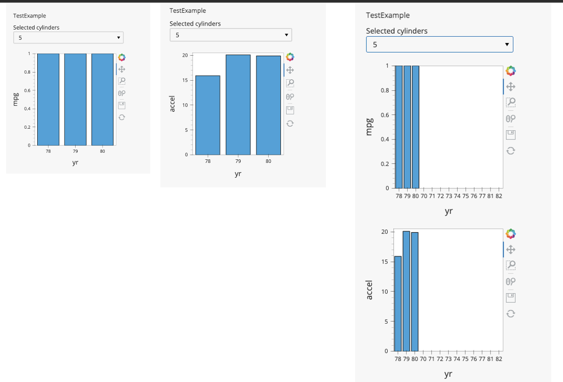
The behaviour is shown in the screenshots, when the filter is set to filter the data to just 5 cylinders.

For only showing the mpg plot (left in pictures), we just get the years mpg is present for, 78, 79, 80 in the bars:

app = pn.Row(
    pn.Column(explorer.param, 
          pn.Row(explorer.bar_chart),
          #pn.Row(explorer.chart2),
         ),
)

if we only show the accel plot (middle in pictures) we also just see the years 78 79 80:

app = pn.Row(
    pn.Column(explorer.param, 
         # pn.Row(explorer.bar_chart),
          pn.Row(explorer.chart2),
         ),
)

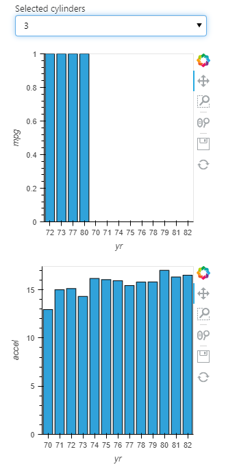
but if we uncomment and show both (right in pictures), somehow it shows all years from 78 79 80 but also the entries 70, 71, 72, 73, 74, 75, 76, 77, 81, 82:

app = pn.Row(
    pn.Column(explorer.param, 
          pn.Row(explorer.bar_chart),
          pn.Row(explorer.chart2),
         ),
)

What’s confusing is that individually they render correctly, but somehow having both present activates this behaviour.

I am also relatively new to Panel and Holoviz, so please let me know if I’m doing anything idiomatically incorrect.

Personnally I’ll do this:

app = pn.Row(
    pn.Column(
        explorer.param, 
          pn.pane.HoloViews(hv.DynamicMap(explorer.bar_chart)),
          pn.pane.HoloViews(hv.DynamicMap(explorer.chart2)),
         ),
)
1 Like

Perfect! Can you give me a one sentence summary of what that is doing? Or a pointer to the docs on it? I tried to figure out what the dynamic maps do, but haven’t been able to quite understand it.
Thanks

I’ll try to explain my understanding but @philippjfr might correct me.
bar_chart and chart2 are ParamMethod and panel automatically infer the best Pane to use to display the object returned by these function.
In your case both functions return an hv.Bar object, so panel use an Holoviews Pane to display the object. However each time you change the selected_cylinders the function is re-run a new hv.Bar is created, new pn.pane.Holoviews is created serialized to be sent to javascript and displayed.
By default Holoviews Pane try to link axes with same Dimensions across all your dashboard.
However when selected_cylinders change both functions are not triggered exactly at the same time and the first function return an Holoviews Pane and try to find if there is already a “yr” axis in the dashboard. It founds the “yr” axis of the previous plot not yet updated and use it to adjust its factors.
(for example if I stop the app rendering to a transition state (first plot update but not the second one) I can see this:


)
In panel documentation for the Holoviews Pane you can found this:
image

hv.DynamicMap is just an optimisation to not recreate a full new plot but to use the current one (on the javascript side) and just change the data (the bokeh ColumnDataSource, I don’t know what’s happening with other backends)
So by using it in your case the range of your plots are created only at the first display and always stay sync between your both plots since yr is always shared between them.

The other solution would be to return directly Holoviews Panes with linked_axes=False but in these case zooming on one plot would be not reflected on the other one

2 Likes

I would like to understand why pn.pane.HoloViews does not automatically wrap any holoviews object into a DynamicMap. To me it seems like it should always be done?

I don’t understand why an holoviews pane should wrap an holoviews object in dynamicmap?

A dynamicmap is an holoviews object but not all holoviews objects are dynamicmaps

May be an holoviews pane could automatically wrap a function into a dynamic map instead of doing pn.pane.Holoviews(hv.DynamicMap(fun)) it could be just pn.pane.Holoviews(fun)
Hower in a real dash board pn.Row(..., hv.DynamicMap(fun), ...) already works as expected

1 Like

Thank you!

1 Like