Hello,
I’m working on a dashboard to showcase radar data with some controls on the sidebar. Current dashboard look like this:
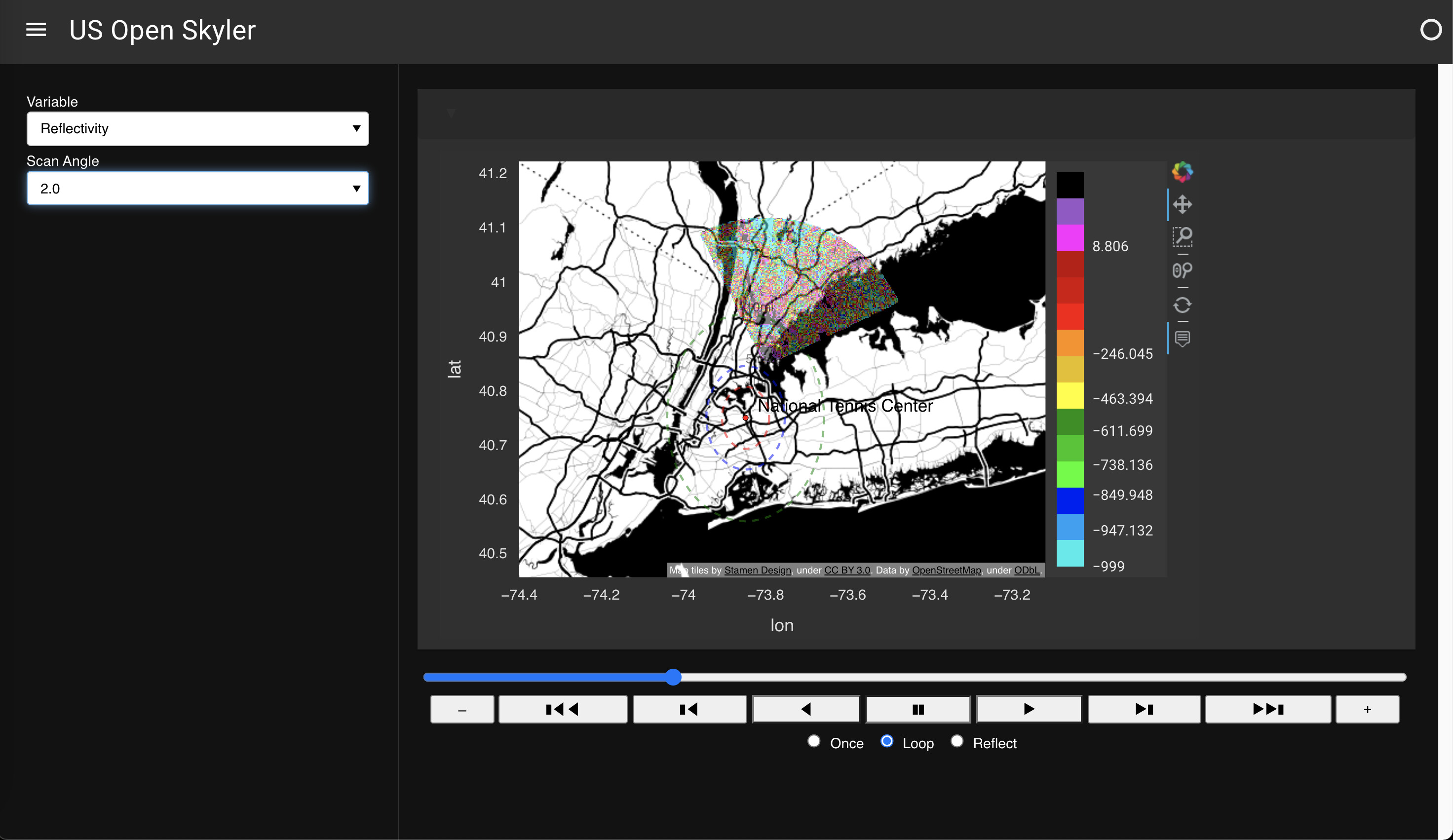
This map is currently plot using this function:
@pn.depends(var_select.param.value, angle_select.param.value, player.param.value)
def graph(selected_var, angle, timestep):
    # get timestamp
    print(ds)
    timestamp = ds['time'][timestep].astype(int)
    ns = 1e-9
    dt = datetime.utcfromtimestamp(timestamp * ns)
    ts = dt.strftime("%Y/%m/%d %H:%M:%S")

    data = ds[selected_var].sel(scan_angle=angle).isel(time=timestep).load()

    if selected_var in ['Reflectivity', 'CorrectedReflectivity','DifferentialReflectivity', 'CorrectedDifferentialReflectivity']:
        color_map = NWSReflectivity
    elif selected_var in ['Velocity']:
        color_map = NWSVelocity
    else:
        color_map = 'gist_ncar'
    data = hv.Dataset(data, vdims=selected_var)
    graph = data.to(gv.Image, ["lon", "lat"], dynamic=True)
    tiles = gv.tile_sources.StamenTonerBackground().apply.opts()
    # site
    ntc = gv.Text(-73.82, 40.7, 'National Tennis Center').opts(text_font_style='bold')
    site = gv.Points([(-73.8492017,40.7498823)]).opts(color='red', line_color='black', line_width=0.5, size=5)
    site_shapely = Point(-73.8492017,40.7498823)
    first_circle = gv.Shape(site_shapely.buffer(0.0573)).opts(line_color='red', line_dash='dashed', fill_alpha=0,line_width=2, alpha=0.5) #3mi
    second_circle = gv.Shape(site_shapely.buffer(0.0955)).opts(line_color='blue', line_dash='dashed',  fill_alpha=0, line_width=2, alpha=0.5) #5mi
    third_circle = gv.Shape(site_shapely.buffer(0.191)).opts(line_color='green', line_dash='dashed',  fill_alpha=0, line_width=2, alpha=0.5) #10mi
    cirle_anno1 = gv.Text(-73.8492017, 40.807, '3mi').opts(text_alpha=0.6, text_font_size='12px')
    cirle_anno2 = gv.Text(-73.8492017, 40.846, '5mi').opts(text_alpha=0.6, text_font_size='12px')
    cirle_anno3 = gv.Text(-73.8492017, 40.941, '10mi').opts(text_alpha=0.6, text_font_size='12px')
    graph = (
        rasterize(graph).opts(title=ts, height=550, width=800, colorbar=True, cnorm='eq_hist', cmap=color_map, alpha=0.5, tools=['hover'])
    ) * tiles * site * ntc * first_circle * second_circle * third_circle * cirle_anno1 * cirle_anno2 * cirle_anno3
    return graph
And to serve in the dashboard:
dark_material = pn.template.MaterialTemplate(title='US Open Skyler', theme='dark')
dark_material.sidebar.append(var_select)
dark_material.sidebar.append(angle_select)
dark_material.sidebar.append(refresh)

dark_material.main.append(
    pn.Row(
        pn.Card(graph)
    )
)
dark_material.main.append(
    pn.Row(player)
)
dark_material.servable()
The issue I have is, in this current approach, every parameter change, the graph function got called once, and the ds.sel got called once, and generate a new map. I saw in the Xarray quadmesh — GeoViews 1.9.1+g33876c8-dirty documentation example, this build-in slider when converting a xarray.Dataset to a geoviews.Dataset, and the transition between timestamp is much smoother without recreating the map.
Questions,
- How to use and customize the built-in controls if a Dataset is 3D or 4D, and served them in
sidebar? - If not, how to frame the
graphfunction to only update the data, without recreating a new map whenever called?
Thank you very much!