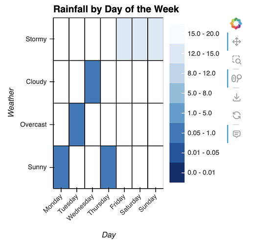
I’m wondering if its possible to force the colorbar in a holoviews heatmap plot to use a linear scale, despite having had to transform the data (let’s say because it spans a massive range and the default plot leave most of the data variance uniform in terms of the heatmap color) which is being displayed using a log function?
Is it possible to create a custom colorbar associated with the data before the log transformation and use that?
Below is some dummy code:
import holoviews as hv
import numpy as np

hv.extension('bokeh')

# Create a dummy DataFrame with rainfall data spanning a wide range of values
data = {
    'Day': ['Monday', 'Tuesday', 'Wednesday', 'Thursday', 'Friday', 'Saturday', 'Sunday'],
    'Weather': ['Sunny','Overcast','Cloudy','Sunny','Stormy','Stormy','Stormy'],
    'Rainfall': [0.1, 0.8, 0.2, 0.15, 650000, 800000, 700000]
}
df = pd.DataFrame(data)

# Need to reduce the range of the Rainfall field
df["Rainfall"] = np.log1p(df["Rainfall"])

# Create the heatmap using HoloViews
heatmap = hv.HeatMap(df, vdims=['Rainfall'],kdims=['Day', 'Weather'])

# Customize the heatmap (optional)
heatmap = heatmap.opts(
    title='Rainfall by Day of the Week',
    tools=['hover'],
    colorbar=True,
    line_width = 1.2,
    line_color='black',
    xrotation = 45,
    width = 400,
    height = 400
)

# Display the heatmap
heatmap
If I understand correctly, I created a colormap/colorbar package with a util to do this easily (if you don’t want to install a dependency, the source code is here tastymap/tastymap/models.py at main · ahuang11/tastymap · GitHub)
# pip install tastymap

from tastymap import cook_tmap, pair_tbar
import holoviews as hv
import pandas as pd
import numpy as np

hv.extension('bokeh')

# Create a dummy DataFrame with rainfall data spanning a wide range of values
data = {
    'Day': ['Monday', 'Tuesday', 'Wednesday', 'Thursday', 'Friday', 'Saturday', 'Sunday'],
    'Weather': ['Sunny','Overcast','Cloudy','Sunny','Stormy','Stormy','Stormy'],
    'Rainfall': [0.1, 0.8, 0.2, 0.15, 650000, 800000, 700000]
}
df = pd.DataFrame(data)

# Need to reduce the range of the Rainfall field
df["Rainfall"] = np.log1p(df["Rainfall"])

# Create the heatmap using HoloViews
heatmap = hv.HeatMap(df, vdims=['Rainfall'],kdims=['Day', 'Weather'])

tmap = cook_tmap("Blues_r", num_colors=8)

# Customize the heatmap (optional)
heatmap = heatmap.opts(
    title='Rainfall by Day of the Week',
    tools=['hover'],
    colorbar=True,
    line_width = 1.2,
    line_color='black',
    xrotation = 45,
    width = 400,
    height = 400
)

pair_tbar(heatmap, tmap, [0, 0.01, 0.05, 1, 5, 8, 12, 15, 20]).show()
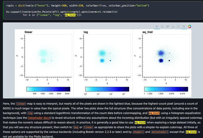
There’s also an eq_hist cnorm option in holoviews/hvplot
https://hvplot.holoviz.org/user_guide/Customization.html
1 Like
@ahuang11 thanks so much, so far I’ve gotten by using a hook to a custom_plot() but it involves reaching into the “belly” of bokeh.
1 Like

