Hi @cdtennant
You would use the BoundsXY stream. I don’t know how to use it on a plot created via the .interactive api (@philippjfr, what is the best way to do this?). But I can do it via Panels pn.bind api.
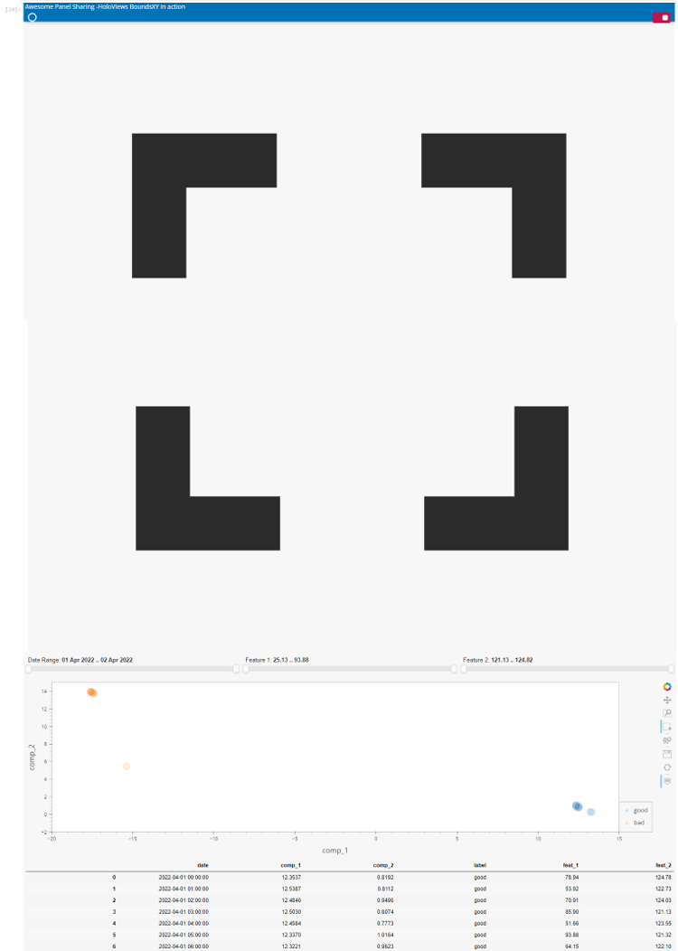
Check out the live app or share your own version.

import numpy as np
import pandas as pd
import holoviews as hv
import panel as pn
import hvplot.pandas
from holoviews import streams
from io import StringIO

pn.extension(sizing_mode="stretch_width")

CSV="""\
date,comp_1,comp_2,label,feat_1,feat_2
4/1/2022 0:00,12.3537,0.8192,good,78.94,124.78
4/1/2022 1:00,12.5387,0.8112,good,53.92,122.73
4/1/2022 2:00,12.4846,0.9496,good,70.91,124.03
4/1/2022 3:00,12.5030,0.8074,good,85.90,121.13
4/1/2022 4:00,12.4584,0.7773,good,51.66,123.55
4/1/2022 5:00,12.3370,1.0164,good,93.88,121.32
4/1/2022 6:00,12.3221,0.9623,good,64.15,122.10
4/1/2022 7:00,12.3640,1.0885,good,28.28,123.27
4/1/2022 8:00,13.3045,0.2689,good,25.13,121.45
4/1/2022 9:00,13.2106,0.2591,good,84.35,122.39
4/2/2022 1:00,-17.5646,13.9261,bad,28.30,124.82
4/2/2022 2:00,-17.5749,13.9354,bad,90.55,123.00
4/2/2022 3:00,-17.5770,13.9370,bad,67.88,123.92
4/2/2022 4:00,-17.6055,13.9652,bad,57.61,124.74
4/2/2022 5:00,-17.5726,13.9330,bad,70.61,124.36
4/2/2022 6:00,-17.4796,13.8359,bad,54.23,124.73
4/2/2022 7:00,-17.4407,13.7976,bad,76.09,121.82
4/2/2022 8:00,-17.4092,13.7663,bad,32.92,121.38
4/2/2022 9:00,-17.4462,13.8017,bad,90.20,121.76
4/2/2022 10:00,-15.3808,5.4642,bad,25.75,121.92
"""

df = pd.read_csv(StringIO(CSV), parse_dates=["date"])

def get_plot(date_start, date_end, feat_1_start, feat_1_end, feat_2_start, feat_2_end):
    filtered_df = df[
        (df["feat_1"] >= feat_1_start)
        & (df["feat_1"] <= feat_1_end)
        & (df["feat_2"] >= feat_2_start)
        & (df["feat_2"] <= feat_2_end)
        & (df["date"] >= date_start)
        & (df["date"] <= date_end)
    ]

    return filtered_df.hvplot(
        "comp_1",
        "comp_2",
        kind="points",
        c="label",
        s=250,
        alpha=0.15,
        responsive=True,
        height=400,
        tools=["box_select"],
        hover_cols=["feat_1", "feat_2"],
        xlim=(-20, 15),
        ylim=(-2, 15),
    )


date_range = pn.widgets.DateRangeSlider(
    name="Date Range", start=df.date.iloc[0], end=df.date.iloc[-1], step=60 * 60 * 1000
)
feat_1_range = pn.widgets.RangeSlider(
    name="Feature 1",
    start=df.feat_1.min(),
    end=df.feat_1.max(),
    value=(df.feat_1.min(), df.feat_1.max()),
)
feat_2_range = pn.widgets.RangeSlider(
    name="Feature 2",
    start=df.feat_2.min(),
    end=df.feat_2.max(),
    value=(df.feat_2.min(), df.feat_2.max()),
)

iplot = pn.bind(
    get_plot,
    date_start=date_range.param.value_start,
    date_end=date_range.param.value_end,
    feat_1_start=feat_1_range.param.value_start,
    feat_1_end=feat_1_range.param.value_end,
    feat_2_start=feat_2_range.param.value_start,
    feat_2_end=feat_2_range.param.value_end,
)

source = hv.Curve({})
boundsxy = streams.BoundsXY(source=source, bounds=(0, 0, 0, 0))

@pn.depends(boundsxy.param.bounds)
def data_view(bounds):
  if bounds==(0,0,0,0):
    return "Please select some points using the BoxSelect tool"
  x_start, y_start, x_end, y_end = bounds
  return df[
    (df["comp_1"].between(x_start, x_end)) &
    (df["comp_2"].between(y_start, y_end))
  ]
  return bounds

component = pn.Column(
    pn.Row(date_range, feat_1_range, feat_2_range),
    hv.DynamicMap(iplot) * source,
    data_view,
)

pn.template.FastListTemplate(
    site="Awesome Panel Sharing",
    site_url="https://awesome-panel.org/sharing",
    favicon="https://raw.githubusercontent.com/MarcSkovMadsen/awesome-panel-assets/320297ccb92773da099f6b97d267cc0433b67c23/favicon/ap-1f77b4.ico",
    title="HoloViews BoundsXY in action",
    main=[component],
).servable()