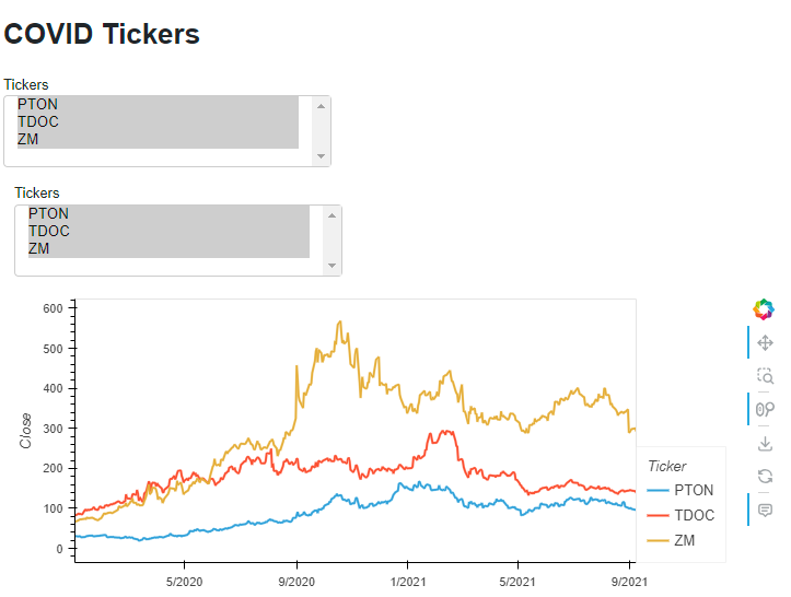
import pandas as pd
import hvplot.pandas
import panel as pn


csv_file = "https://raw.githubusercontent.com/metaperl/pure-python-web-development/main/examples/covid-ticker-data/data/ticker-data.csv"
ticker_df = pd.read_csv(csv_file, parse_dates=["Date"], index_col="Date")
all_tickers = ticker_df.Ticker.unique().tolist()

# Create a MultiSelect widget
selected_tickers = pn.widgets.MultiSelect(name='Tickers', value=all_tickers, options=all_tickers)

# Use the hvplot interactive API to create a pipeline that depends on this widget
one_tickeri = ticker_df.interactive()
one_tickeri = one_tickeri[one_tickeri['Ticker'].isin(selected_tickers)]
chart = one_tickeri.hvplot.line(x='Date', y='Close', by='Ticker')
# Displaying/Serving this pipeline includes its inputs (one widget in this case)
# and its output (one plot).
pn.Column('# COVID Tickers', selected_tickers, chart).servable()
The reason you are seeing two is still because of the .interactive. Try: pn.Column('# COVID Tickers', selected_tickers, chart.output()).servable() or alternatively pn.Column('# COVID Tickers', chart).servable().