Awesome-panel.org change log

Tabulator Widget added

The Tabulator widget is an awesome table for showing, editing and streaming data. Checkout tabulator.info for inspiration.

Please note that this is experimental. I believe it will already work great for a lot a use cases on the server. It does not yet work in the notebook though. And I believe the api and implementation should be made more robust and reusable. There are a lot of awesome data grids and pivot analyzers out there that would be simple to wrap using the code I’ve created.

If any one (including @philippjfr) would like to add it to Panel via a PR feel free to do so. I think it could be an important addition. For now I will use it, learn and improve it from the awesome-panel-extensions package.

Use it via from awesome_panel_extensions.widgets.tabulator import Tabulator.

1 Like

And @philippjfr. Implementing this I realised that all the Python code I developed really had nothing todo with tabulator. It’s just functionality to show, edit, stream, patch and select tabular data and dataframes.

So if I, you or somebody else could refactor and create a BaseTableWidget then a lot of grids, pivot analyzers etc. could be be so easy to wrap. We would only need to implement the .ts bokeh model. And that is much simpler.

And maybe also think about how this could get into HoloViz. I would really, really like to use it together with linked brushing. That would be awesome.

1 Like

What? By mistake I just edited your post @philippjfr and replied to you in that one. Did not know that was possible??

Ha, no worries. You do have moderator privileges so you can edit.

1 Like

Wow. I think some where I will change one of your comments to promise that “I will support a dark theme for all panes and widgets in the next release” :slight_smile: @philippjfr

2 Likes

Found workaround for getting Tabulator working in Notebook

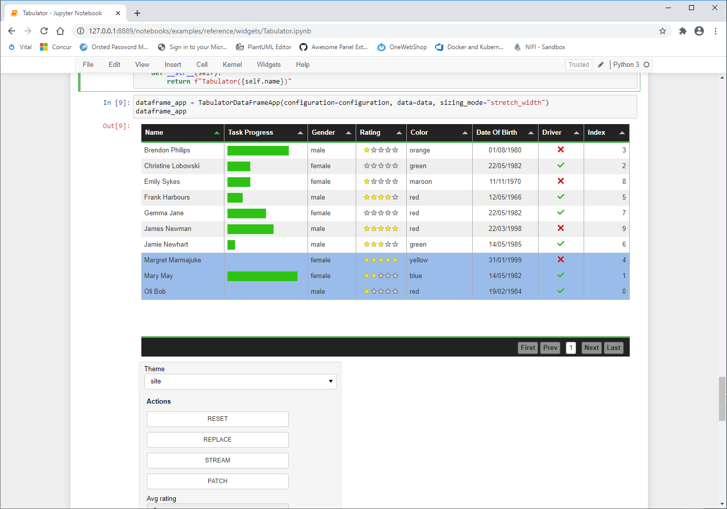
For now with the help of @philippjfr I’ve found a workaround and updated the reference notebook.

1 Like

I’ve added an example of a Custom Panel Template with a Modal/ Dialog.

Check it out live here https://awesome-panel.org/dialog_template

or in the gallery https://awesome-panel.org/gallery

which also contains links to the code

2 Likes

Make Over and Upgrade to Panel 0.10

You can checkout a remade version of awesome-panel.org using the Templates and other features from Panel 0.10.

I will not promote the site yet as I want it a bit further improved first. But I just want you to be able to check out the new Templates, Themes, ECharts, Cards etc. More to come.

One of the consequences of the make over is that the app is no longer a multipage app. It’s a site of individual apps that I can now share direct links to. That is a major improvement I think. And it’s also more in line with the normal way of using panel with pn.serve.

Thus now I can have a gallery like https://awesome-panel.org/gallery with direct links. The gallery is taking advantage of the fact that you can develop custom jinja templates in Panel. It’s yet another not so widely known super power of Panel. Powered by Fast Components

I think the Gallery has become really slick. I would like the Fast Widgets supported directly in Panel. I have implemented some of them. Check out https://awesome-panel.readthedocs.io/en/latest/packages/awesome-panel-extensions/index.html#fast

I hope and think awesome-panel.org and the Panel Templates are on a journey of improvement together. I think they can be even more easy to use, powerful and awesome than they already are. This is just the beginning.

If you find bugs then please help me fix them by reporting them via https://github.com/MarcSkovMadsen/awesome-panel/issues

FYI @nghenzi, @Jhsmit, @philippjfr, @Leonidas, @xavArtley and the Panel community.

2 Likes

That is awesome! I like the switching between light/dark and (almost) any Template. Curious to see your code, I was also thinking of putting some buttons in the header bar.

1 Like

Thanks @Jhsmit

I think switching between Default and Dark can make sense in general. Actually the Gallery template just stores the preference in the browser and uses that.

But for Templates as they are so different. They require extra work from your side to structure you List or GridSpec of items. The react template puts the constraint on your to collect things into “sections”. You don’t have a long list of items starting with a single line Header, then a markdown block, then an image, … Because that is not a good user experience. I think the Card will come in handy for organising into sections.

The problem I have is that Bokeh/ Panel does not layout images in Markdown nicely. See https://github.com/bokeh/bokeh/issues/10033#issuecomment-718408756. So structuring a page with Markdown and images into sections is not possible currently.

IF ANY ONE KNOWS A WORKAROUND OR FIX I WOULD REALLY LIKE TO KNOW.

Impressive gallery!

1 Like

Template Settings Component Added

I’ve added a little nice TemplateSettings component to the header of awesome-panel.org that allows you to switch between the different templates and themes.

awesome-panel-template-settings

I use the new SyncLocation object which makes it super easy to bind widgets and parameters to url query arguments. See the example https://panel.holoviz.org/gallery/simple/sync_location.html#simple-gallery-sync-location

I use the Icon and AwesomeButton from the awesome-panel-extensions package. Check Out the reference Guide on Binder https://mybinder.org/v2/gh/MarcSkovMadsen/awesome-panel-extensions/master?filepath=examples%2Freference%2Fmodels%2FIcon.ipynb

If you would like to the see source code of the TemplateSettings component check out https://github.com/MarcSkovMadsen/awesome-panel/blob/master/application/template/template_settings.py.

If you would like to know more about how I integrate the Panel templates with awesome-panel.org, then take a look at https://github.com/MarcSkovMadsen/awesome-panel/tree/master/application/template.Note:

This code will be refactored and moved to the awesome-panel-extensions package eventually :slight_smile:

Feel free to share on Twitter if you like. https://twitter.com/MarcSkovMadsen/status/1322033787560230913?s=20

Awesome Panel Intro Sections Added

I’ve added Intro Sections to almost all apps. The intro sections contains an introductory text together with links to the author, the code and maybe some additional resources like .gifs or .mp4s.

https://awesome-panel.org/

Added Short Introductions and Links to Gallery

https://awesome-panel.org/gallery

Added DataFrame, FileInput, Progress Extension and Social Buttons Apps

General clean up and new apps.

Checkout

Introductory Video Added

I’ve created an introductory video to awesome-panel.org.

It’s a first try. Just trying out the format. And feel free to SHARE THE TWEET if you like it. Thanks https://twitter.com/MarcSkovMadsen/status/1325522553587306496?s=20.

FastGridTemplate app added

This is WORK IN PROGRESS. Does not work on mobile.

Try it out at https://awesome-panel.org/fast-grid-template

My goal is to create a template that you can also use. You actually can already if you like trying out new things. Check out the code link in the app if you want to try it out.

Stay tuned for more.

1 Like

Loading Spinners App added

The Loading Spinners helps provide a nice user experience by indicating activity.

This app showcases the look and feel of the loading spinners.

  • You can select the look and color of the loading spinner in the sidebar.
  • If you end up with a design you would like to add in your app, then you can just copy the style css and append it to pn.config.raw_css in your app.

Check out https://awesome-panel.org/loading-spinners

The functionality is currently available via the awesome-panel-extensions package. If you want it included in Panel please upvote PR 1730 - Panel loading indicator.

1 Like

Awesome Panel is now “Fast” and comes with the Panel Component Explorer

I’ve gone through a lot of the Bokeh and Panel CSS styling and created a “Fast” style for Bokeh and Panel. There are also two templates so far FastTemplate and FastGridTemplate corresponding to the existing VanillaTemplate and ReactTemplate.

https://fast.design is Microsofts new, open source web component and design framework. It’s very easy to change the style. So if you need a brown background, yellow accent color or very round corners on your widgets then it should be relatively easy to change. That is at least what I am aiming at.

And if you are working at Microsoft you can get your branding by replacing fast with fluid across all templates and style files.

One of the things that made this relatively straightforward to do was that I created the Panel Component Explorer below. Check it out at https://awesome-panel.org/panel-component-explorer

I added a periodic callback to update the style files every 1sek. So I could see the effects of changing the style immediately. The period callback is a super power of Panel. I should use it more :slight_smile:

app = PanelComponentExplorer()
pn.state.add_periodic_callback(app._update_css_panel, period=1000)
app.view.servable()

Next steps for me is to style the remaining Panel components, fine tune the existing styling and make it easier for all of us to use. Stay tuned.

FYI. @nghenzi, @Hoxbro, @philippjfr, @xavArtley, @Jhsmit, @Leonidas, @jbednar, @Material-Scientist

3 Likes

Looks very nice, great work @Marc!

1 Like