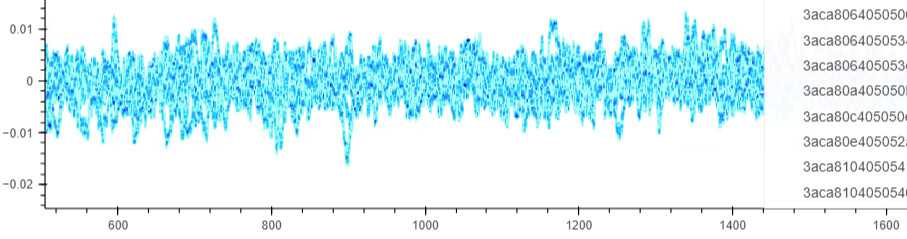
When I set datashade=True, I get color by group but the group legend disappears.
plot = subset_df.hvplot.line('frequency', 'signal', by='id', dynamic=True, datashade=True, colorbar=False, rasterize=True, shared_axes=False).opts(**ropts)
when I set datashade=False, then the legend appears but the colors by group disappear. Is there any way to fix this?
Can you try removing rasterize? I don’t think they should be used together.
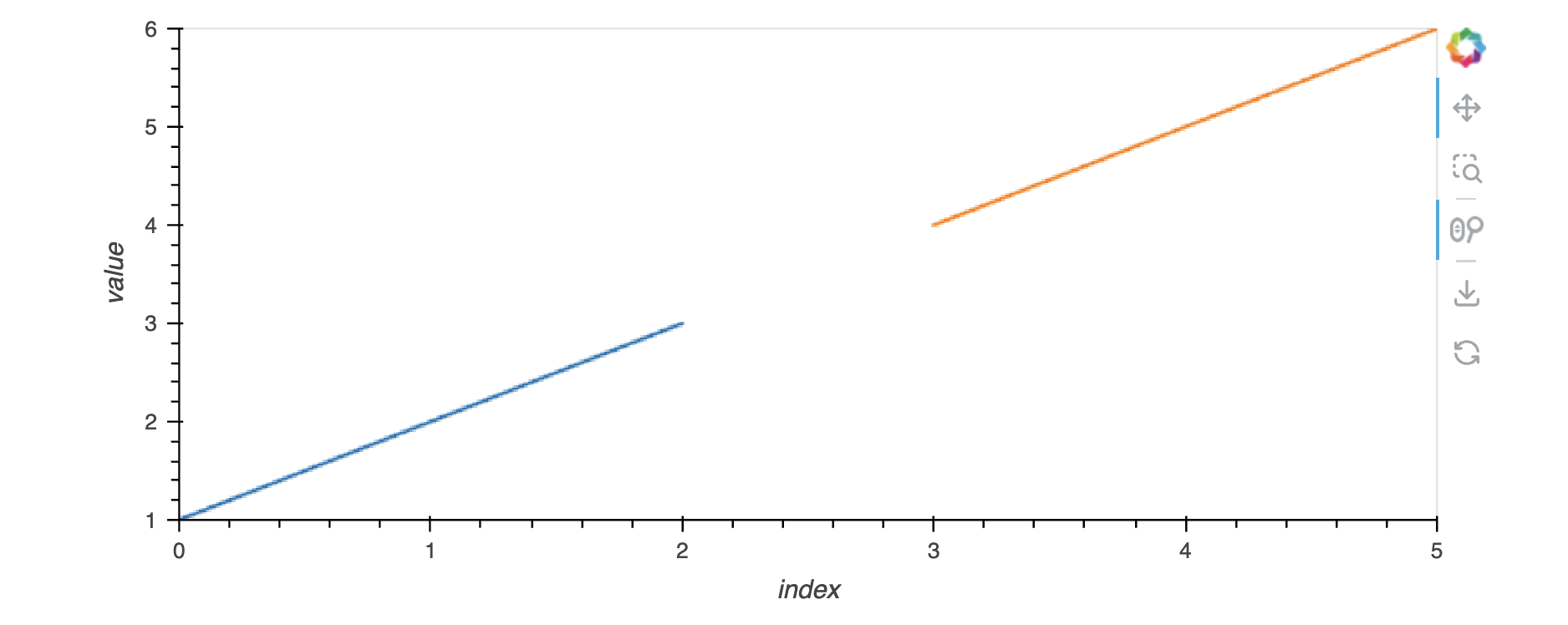
import pandas as pd

df = pd.DataFrame({"a": [1, 2, 3], "b": [4, 5, 6]})
df = df.melt()

df.hvplot(by="variable", y="value", datashade=True)
This seems to work:
Yes but without Datashader plotting big data is impossible
Sorry if I wasn’t clear. I meant removing rasterize=True, but keeping datashade=True; they should not be used simultaneously.
Yes they can be used simultaneously according to the docu: Customization — hvPlot 0.8.5a1 documentation
Datashader=True will set Legend=False which is crap.