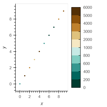
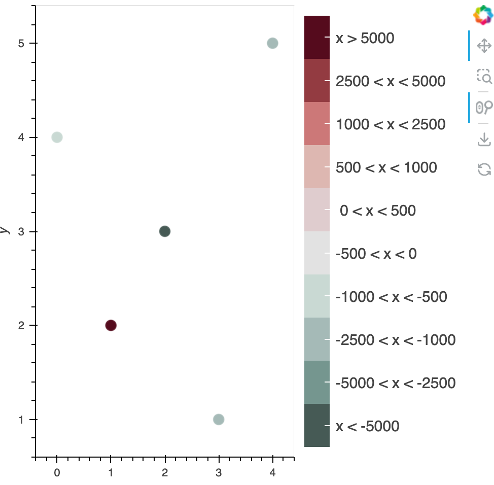
Just kidding, found a way, but extremely verbose and tedious.
The idea is to first map the colors first.
Then artificially add a custom colorbar as a hook.
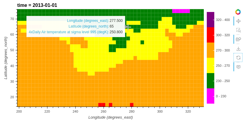
Let me see if I can reproduce with a map…
import holoviews as hv
import pandas as pd
from bokeh.models import (
CategoricalColorMapper,
ColorBar,
)
hv.extension("bokeh")
def cbar_hook(hv_plot, element):
plot = hv_plot.handles["plot"]
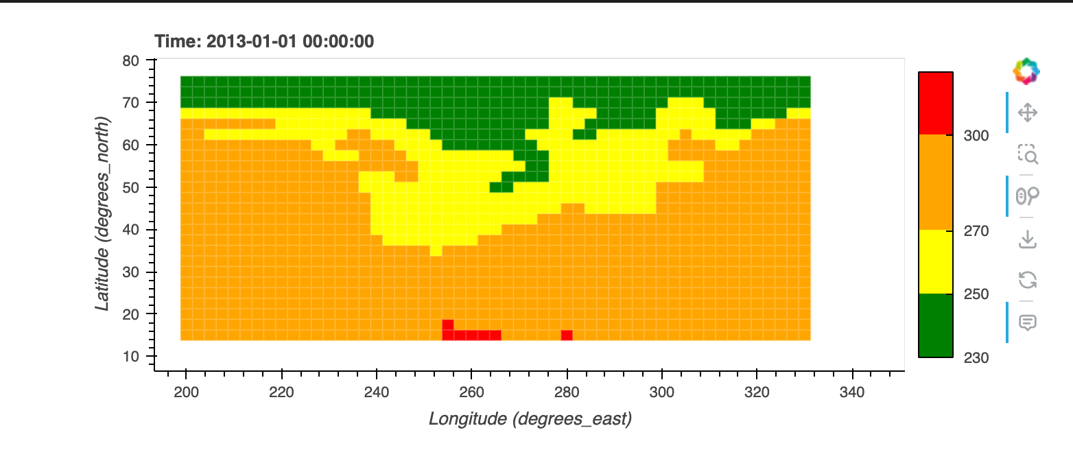
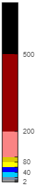
cdict = {
"#465a55": "x < -5000",
"#75968f": "-5000 < x < -2500",
"#a5bab7": "-2500 < x < -1000",
"#c9d9d3": "-1000 < x < -500",
"#e2e2e2": "-500 < x < 0",
"#dfccce": " 0 < x < 500",
"#ddb7b1": "500 < x < 1000",
"#cc7878": "1000 < x < 2500",
"#933b41": "2500 < x < 5000",
"#550b1d": "x > 5000",
}
# mapper = LinearColorMapper(palette=colors, low=min(data_heatmap), high=max(data_heatmap))
mapper = CategoricalColorMapper(
palette=list(cdict.keys()), factors=list(cdict.values())
)
color_bar = ColorBar(
color_mapper=mapper,
major_label_text_font_size="15px",
# ticker=BasicTicker(desired_num_ticks=len(colors)),
# formatter=PrintfTickFormatter(format="%d"),
label_standoff=6,
border_line_color=None,
)
plot.add_layout(color_bar, "right")
data_heatmap = [-647, 25756, -7600, -1235, -1345]
data_x = [0, 1, 2, 3, 4]
data_y = [4, 2, 3, 1, 5]
df = pd.DataFrame(data={"heatmap": data_heatmap, "x": data_x, "y": data_y})
bins = [
min(data_heatmap) - 1,
-5000,
-2500,
-1000,
-500,
0,
500,
1000,
2500,
5000,
max(data_heatmap) + 1,
] # define your bins (need to -1 from min and +1 to max to get all inclusive)
palette = [
"#465a55",
"#75968f",
"#a5bab7",
"#c9d9d3",
"#e2e2e2",
"#dfccce",
"#ddb7b1",
"#cc7878",
"#933b41",
"#550b1d",
] # define your colors (length should be = len(bins)-1)
ldict = {
bins[i]: x for i, x in enumerate(palette)
} # makes a dictionary mapping the left bin to a color
# do the binning
df["b"] = pd.cut(df["heatmap"], bins)
# get left bin for colormapping
df["b"] = [x.left for x in df["b"]]
# use ldict to get color now
df["color"] = df["b"].map(ldict)
hv.Points(df, kdims=["x", "y"], vdims=["heatmap", "color"]).opts(
color="color",
cmap=palette,
width=500,
height=500,
size=10,
colorbar=True,
hooks=[cbar_hook],
)