I’m trying to recreate this blog post using the HoloViz tools. I would like to add it to awesome-panel.org and use it for work.
One of the things I cannot recreate is
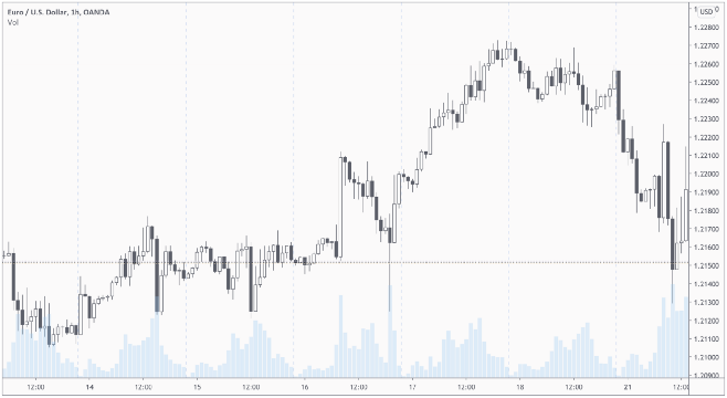
I don’t nescessarily have to overlay the two. But at least I would like the candlestick and bar plots to use the same x-axis. Such that zoom etc. is linked.
But I’m not able to.
I can get to this. But the x-axis are not linked
candle_and_bar
from datetime import timedelta
import yfinance as yf
import hvplot.pandas as pd
import holoviews as hv
import numpy as np
hv.extension('bokeh')
import pandas as pd

def _extract_raw_data(ticker="MSFT", period="6mo", interval="1d"):
    extractor = yf.Ticker(ticker)
    return extractor.history(period=period, interval=interval).reset_index()

def _transform_data(raw_data: pd.DataFrame):
    data = raw_data[["Date", "Open", "High", "Low", "Close", "Volume"]].copy(deep=True).rename(columns={
        "Date": "time",
        "Open": "open",
        "High": "high",
        "Low": "low",
        "Close": "close",
        "Volume": "volume",
    })
    t_delta = timedelta(hours=1)
    data['time_start'] = data.time - 9*t_delta # rectangles start
    data['time_end'] = data.time + 9*t_delta    # rectangles end
    data['positive'] = ((data.close - data.open)>0).astype(int)
    return data

def make_candle_stick(data):
    _delta = np.median(np.diff(data.time))
    candlestick = hv.Segments(data, kdims=['time', 'low', 'time', 'high']) * hv.Rectangles(data, kdims=['time_start','open', 'time_end', 'close'], vdims=['positive'])
    candlestick = candlestick.redim.label(Low='Values')
    return candlestick.opts(hv.opts.Rectangles(color='positive', cmap=['red', 'green'], responsive=True), hv.opts.Segments(color='black', height=400, responsive=True))

def make_volume_plot(data):
    return data.hvplot(x="time", y="volume", kind="line", responsive=True, height=200)

raw_data = _extract_raw_data()
data = _transform_data(raw_data=raw_data)

candle_stick_plot = make_candle_stick(data)
volume_plot = make_volume_plot(data)
import panel as pn
pn.pane.HoloViews((candle_stick_plot+volume_plot).cols(1), sizing_mode="stretch_both").servable()
If I change kind="bar" to kind="line" the two axis are linked. But everybody in Finance would expect to have a bar plot - not a line plot.
candle_and_line