How to customize histogram for linked (large) time series Curve plots (with full code example for newbies like me)

I am just getting started this week with Holoviews (although I have used Panel to deploy an app).

N.B. I also asked about this on stackoverflow, if anyone answered there I will cross-post the answer here.

I have a number of time series in text files loaded as Pandas DataFrames where:

  • each file is for a specific location
  • at each location about 10 time series were collected, each with about 15,000 points

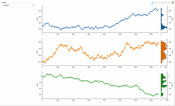
I am building a small interactive tool where a Selector can be used to choose the location / DataFrame, and then another Selector to pick 3 of 10 of the time series to be plotted together.

My goal is to allow linked zooms (both x and y scales). The questions and code will focus on this aspect of the tool.
I cannot share the actual data I am using, unfortunately, as it is proprietary, but I have created 3 random walks with specific data ranges that are consistent with the actual data.

## preliminaries ##

import pandas as pd
import numpy as np
import holoviews as hv
from holoviews.util.transform import dim
from holoviews.selection import link_selections
from holoviews import opts
from holoviews.operation.datashader import shade, rasterize
import hvplot.pandas
hv.extension('bokeh', width=100)

## create random walks (one location) ##
data_df = pd.DataFrame()
npoints=15000
np.random.seed(71)
x = np.arange(npoints)
y1 = 1300+2.5*np.random.randn(npoints).cumsum()
y2 = 1500+2*np.random.randn(npoints).cumsum()
y3 = 3+np.random.randn(npoints).cumsum()
data_df.loc[:,'x'] = x
data_df.loc[:,'rand1'] = y1
data_df.loc[:,'rand2'] = y2
data_df.loc[:,'rand3'] = y3

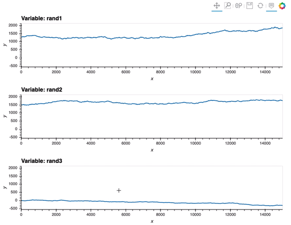
This first block is just to plot the data and show how, by design, one of the random walks have different range from the other two:
data_df.hvplot(x='x', y=['rand1', 'rand2', 'rand3'], value_label='y', width=800, height=400)

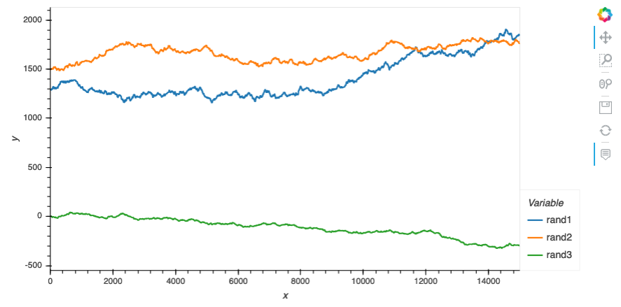
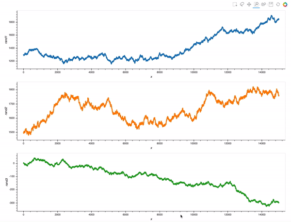
As a result, although hvplot subplots work out of the box (for linking), ranges are different so the scaling is not quite there:
data_df.hvplot(x='x', y=['rand1', 'rand2', 'rand3'], value_label='y', subplots=True, width=800, height=200).cols(1)
subplots

So, my first attempt was to adapt the Python-based Points example from Linked brushing in the documentation:

colors = hv.Cycle('Category10').values
dims   = ['rand1', 'rand2', 'rand3']
layout = hv.Layout([
    hv.Points(data_df, dim).opts(color=c)
    for c, dim in zip(colors, [['x', d] for d in dims])
])
link_selections(layout).opts(opts.Points(width=1200, height=300)).cols(1)

points

That is already an amazing result for a 20 minutes effort!

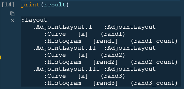
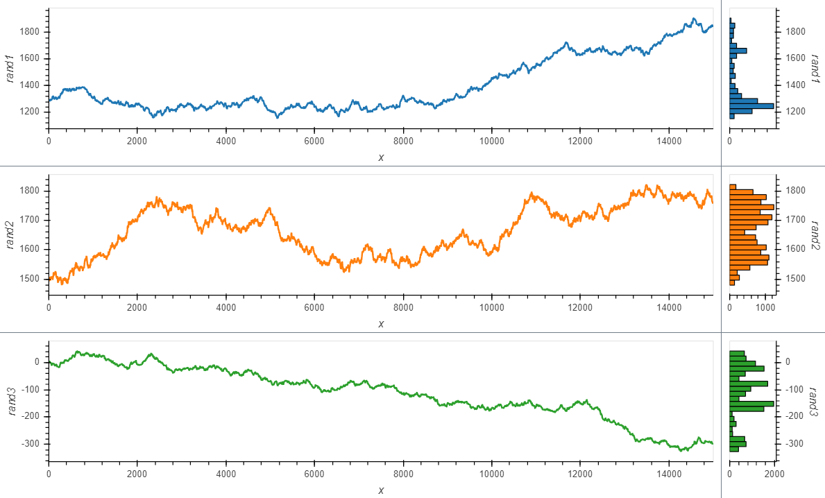
However, what I would really like is to plot a curve rather than points, and also see a histogram, so I adapted the comprehension syntax to work with Curve (after reading the documentation pages Applying customization, and Composing elements):

colors = hv.Cycle('Category10').values
dims   = ['rand1', 'rand2', 'rand3']
layout = hv.Layout([hv.Curve(data_df, 'x', dim).opts(height=300, width=1200, color=c).hist(dim) for c, 
                dim in zip(colors,[d for d in dims])])
link_selections(layout).cols(1)

lines

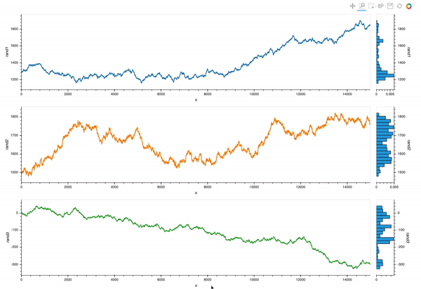
Which is almost exactly what I want. But I still struggle with the different layers of opts syntax.
Question 1: with the comprehension from the last code block, how would I make the histogram share color with the curves?

Now, suppose I want to rasterize the plots (although I do not think is quite yet necessary with 15,000 points like in this case), I tried to adapt my first example with Points:

cmaps = ['Blues', 'Greens', 'Reds']
dims   = ['rand1', 'rand2', 'rand3']
layout = hv.Layout([
    shade(rasterize(hv.Points(data_df, dims), 
                    cmap=c)).opts(width=1200, height = 400).hist(dims[1])
    for c, dims in zip(cmaps, [['x', d] for d in dims])
])
link_selections(layout).cols(1)

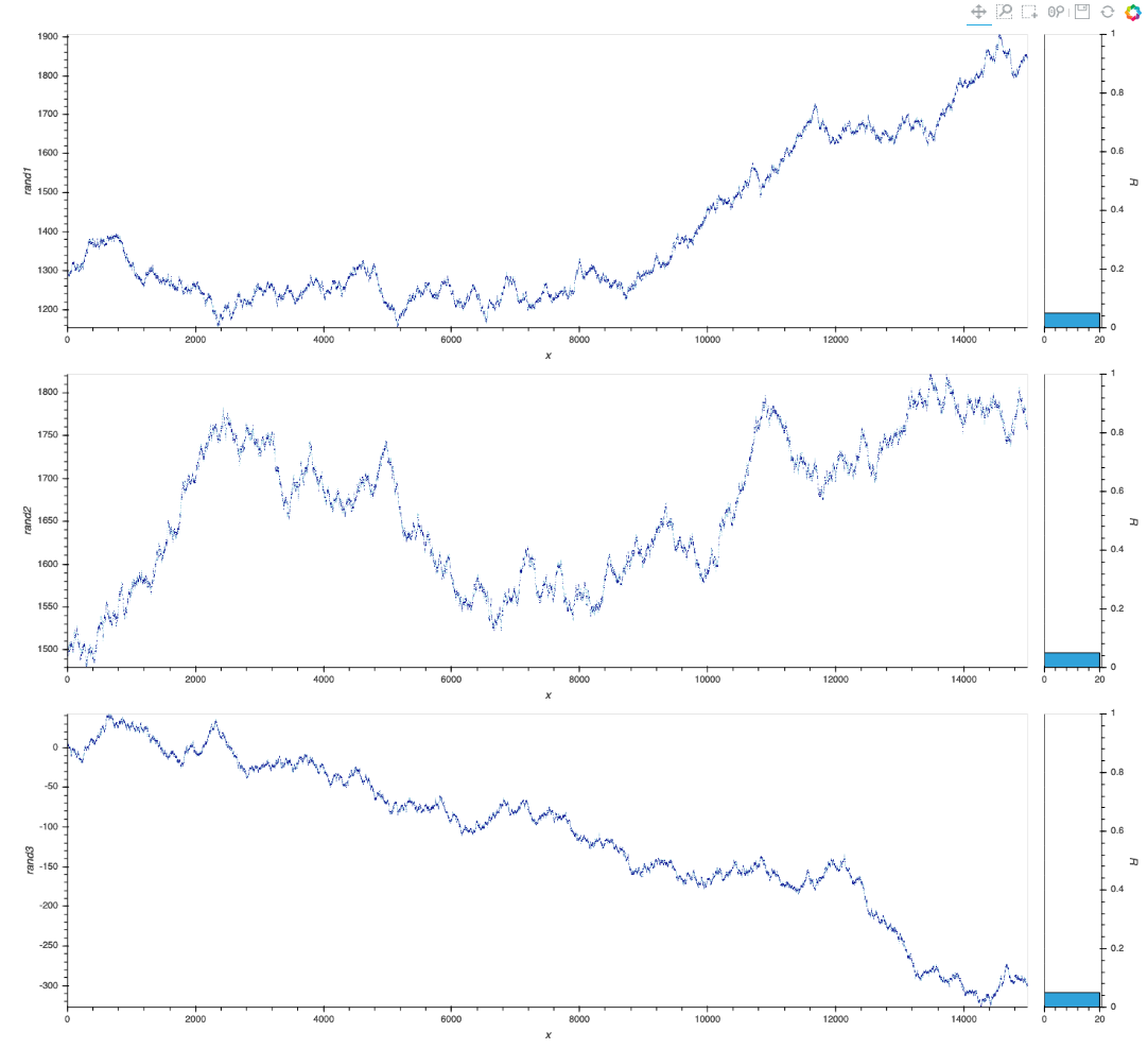
This is a decent start, but again I struggle with the options/customization.
Question 2: in the above cod block, how would I pass the colormaps (it does not work as it is now), and how do I make the histogram reflect data values as in the previous case (and also have the right colormap)?

Thank you!

Regarding Question 1

If you print the resulting layout you can see how to access the different parts

image

so after a little bit of exploring something like

## preliminaries ##

import holoviews as hv
import hvplot.pandas
import numpy as np
import pandas as pd
import panel as pn
from holoviews.selection import link_selections
from holoviews.util.transform import dim

hv.extension("bokeh", width=100)

## create random walks (one location) ##
data_df = pd.DataFrame()
npoints = 15000
np.random.seed(71)
x = np.arange(npoints)
y1 = 1300 + 2.5 * np.random.randn(npoints).cumsum()
y2 = 1500 + 2 * np.random.randn(npoints).cumsum()
y3 = 3 + np.random.randn(npoints).cumsum()
data_df.loc[:, "x"] = x
data_df.loc[:, "rand1"] = y1
data_df.loc[:, "rand2"] = y2
data_df.loc[:, "rand3"] = y3

colors = hv.Cycle("Category10").values
dims = ["rand1", "rand2", "rand3"]
items = []
for c, dim in zip(colors, dims):
    item = hv.Curve(data_df, "x", dim).opts(height=300, responsive=True, color=c).hist(dim)
    item[1].opts(color=c)
    items.append(item)
layout = hv.Layout(items)
link_selections(layout).cols(1)

will make it look like

2 Likes

That’s great help @Marc I will give it a go!!

Then there’s also @SandervandenOord ’ s answer on StackOverflow suggesting to tackle it directly with opts in the first place:

colors = hv.Cycle('Category10').values
dims   = ['rand1', 'rand2', 'rand3']
layout = hv.Layout(
    [hv.Curve(data_df,'x',dim)
         .opts(height=300,width=600, color=c)
         .hist(dim)
         .opts(opts.Histogram(color=c)) 
     for c, dim in zip(colors,[d for d in dims])]
)
link_selections(layout).cols(1)

Two different approaches; both useful in facilitating a growing understanding (one of how to use opts, one illustrating that we are working with an object that can be further used, not “just” a plot, or a dead end, to quote @jbednar 's . And yet, this is another example of where a new user can be confused / overwhelmed.

Please do not misunderstand my intentions: I merely want to show the point of view of somebody still relatively new, perhaps who’s learned Python more on a per-need basis rather than organically, and I think there are many doing scientific computing that are in similar situations.

BUT, I write these comments still with joy in my heart at the possibilities all this offers, and actually having already gone from a few weeks to make my first app (the colormap one) to only a couple of days for my second one (based on this example but with real data, and a lot more interactivity) and being able to use it for real exploration and gaining insights with my work colleagues.

3 Likes

@Marc

Hi Marc

With regards to this specific bit in your code below, I see you included responsive which is great as I’d forgotten, having not usedit since the summer.
Question: is there any option for responsiveness in height?

1 Like

Yes. if you remove the height argument to .opts it will be responsive in height as well.

1 Like

Unfortunately it does not work for me. It was not yesterday either but thought perhaps I needed to update my environment.

I have a holoviews environment with:

    Name         Version            Build                    Channel
    bokeh        2.2.3              py37h03978a9_0           conda-forge
    holoviews    1.14.0             pyhd3deb0d_0             conda-forge
    panel        0.10.2             pyhd8ed1ab_0             conda-forge

And this is my updated code:

pn.extension()

loctn=pn.widgets.Select(options = locations, value = locations[0], name = 'location')

@pn.depends(loctn.param.value)
def plot_locations(loctn):
    dt = data_df.loc[data_df['location']==loctn]
    colors = hv.Cycle('Category10').values
    series   = ['rand1', 'rand2', 'rand3']

    layout = hv.Layout([hv.Curve(dt, 'x', lc)
                        #.opts(height=300, width=1200, color=c)
                        .opts(responsive=True, color=c)
                        #.hist(lc).opts(opts.Histogram(color=c, width = 200))
                        .hist(lc).opts(opts.Histogram(color=c))
                        for c, lc in zip(colors,[d for d in series])])
    return link_selections(layout).cols(1)

app=pn.Row(loctn, plot_locations)

pn.serve(app)

But this is what I get:
responsive_sort_of

Perhaps I need to submit an issue but before I do, can you think of anything else I do not see?

You can try adding sizing._mode=‘stretchboth’ to the Row

I tried app=pn.Row(loctn, plot_locations, sizing_mode='stretch_both') and it did not work